Submitted by thatguyrenic t3_z0ectf in MechanicalKeyboards
Comments
thatguyrenic OP t1_ix5a3wq wrote
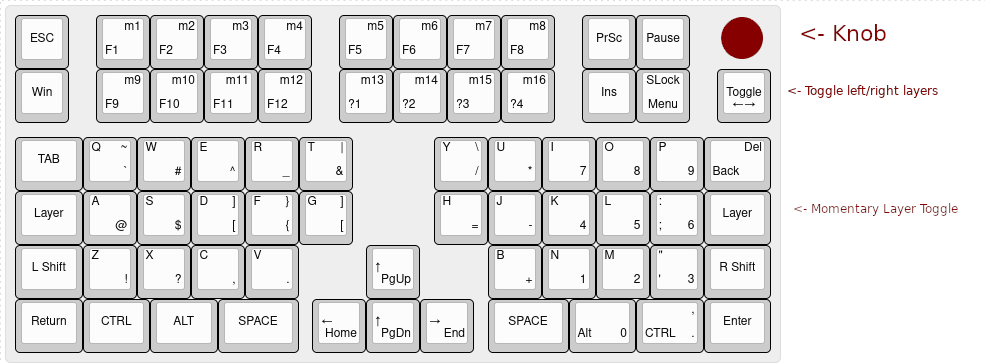
that looks awesome. this idea started with the idea of extending the numbad and flipping it for symmetry... leaving the nav cluster in the center.... but it keeps evolving... not sure if getting better or worse :)
jak0lantash t1_ix7xjza wrote
You could do something really close to that layout with an XD75.
NoOne-NBA- t1_ix6cdz5 wrote
I designed my layout specifically for me, for use in my work environment.
It is designed to be as efficient as possible in that environment.
Minimum hand movements were the primary goal, and keeping everything as true to a standard staggered board as possible was the secondary goal.
I wanted to minimize the amount of movement necessary, while maintaining my 40+ years of muscle memory.
With the layers I have, I can switch between the right hand alphas, arrow keys (on IJKL, with nav cluster keys surrounding those arrows), and numpad, on the fly, without moving my hands from the home position.
jak0lantash t1_ix7xesq wrote
I really struggled with not having the \| left of the Z key, so I settled for moving that row 1U right (V is under G). I can understand how that feel horrible to others, but I found it the best compromise for me. My left 2U is space and right 2U is enter.
NoOne-NBA- t1_ix8g7y4 wrote
An alternate solution to that would have been to use a Mod Tap command on your left Shift key.
That would let it do Shift when held, and \| when tapped.
The only downside I see to that solution is it would require you to hold the Right Shift key, while hitting the Left Shift key, to type the | character.
That should seem at least relatively natural though, assuming you don't use Left Shift to type your shifted characters on the left side of your board.
v81 t1_ix53nid wrote
Why not go up to F16?
Also would you consider modifying it to use readily available key sets ? The 1.25 U keys on the edges are going to be a challenge to source.
thatguyrenic OP t1_ix54fnx wrote
I had issues with getting upper F keys to function properly when using them on a custom board before. had planned on those four being media keys like a 108. I would be building this and using an opensource firmware, so the keys would all be re-programmable anyways.
As far as the edge keys being hard to source at 1.25 for anything other than row 1: thanks. hadn't thought of that yet.
v81 t1_ix60lga wrote
Upper F keys aren't well supported in some applications, having 4 media keys might actually work nicely.
Something about this design had my interest... I'd love to see you follow it through.
tertius_decimus t1_ix8m97m wrote
On the fence regarding centric position for arrows. Not gonna be pretty ergo.
FairwayFinderGolf t1_ix5nv55 wrote
I honestly like it. I think the Ortholinear setup is nice. Also the customizable macro keys at the top would be a great addition as well. Honestly would love this
readyplayeraon t1_ix62m1d wrote
I like the idea of a nav cluster in the middle (I've been playing around with that myself with a macro pad between the halves of my splits), but I agree with another commenter about BNM being wonky. I love "left" and "right" as layer names; I wish I had thought of that! It makes a lot more sense than "raise" and "lower" if you've got the MO switches on separate sides like most builds seem to.
LukeSilverwolf t1_ix6dpqm wrote
This looks really cool actually!
AncientBattleCat t1_ix6kycx wrote
How do you design these? What software do you use?
thatguyrenic OP t1_ix6zou8 wrote
in this case I used http://www.keyboard-layout-editor.com and gimp... you can made cad files from their data and get plates cut, but making a circuit boards is an entirely different adventure.
AncientBattleCat t1_ix724pm wrote
TY
gwenbeth t1_ix7ed52 wrote
Looks like you will be giving your pinkies a workout with the layers. If it was me, I'd lose the f keys and add a number row (but also it's not me, you do you)
thatguyrenic OP t1_ix52kj0 wrote
The idea here was to fit the functionality of an entire 108 into something much smaller (and ortho)...
darknessblades t1_ix5enoh wrote
are you gonna make the keys angled [alice layout], or is it like the current layout
thatguyrenic OP t1_ix5fl1t wrote
I'd be more likely to split into two pieces than to give it a fixed angle.
free2game t1_ix6fzmr wrote
You guys ever had to actually use CTRL+ALT+DEL?
thatguyrenic OP t1_ix6jt17 wrote
yup :)
I don't see how it would be hard to hit ctrl+alt+delete ... it would still be ctrl+alt+delete if on right layer, and would become ctrl+alt+layer+delete if on left layer - (if four buttons is too many for you, you could press that toggle button first)
AutoModerator t1_ix52clq wrote
I am a bot, and this action was performed automatically. Please contact the moderators of this subreddit if you have any questions or concerns.

NoOne-NBA- t1_ix58ych wrote
Being a touch-typer, your alignments would drive me insane.
The worst ones would be the BNM block, not having the Enter key in the proper spot on the right, and the operators being on the wrong side of the numpad.
Here's my version of this project, minus the knob.
https://preview.redd.it/487h6lk6o71a1.jpeg?width=1208&format=pjpg&auto=webp&v=enabled&s=79beb8e71631ef577fa7ee95e604fd02fd896919