 [OC] Fastest Nürburgring Nordschleife Lap Times: Production and Street Legal Cars
Submitted by seamacke t3_10zu2yv in dataisbeautiful
pookiedookie232 t1_j8565pi wrote
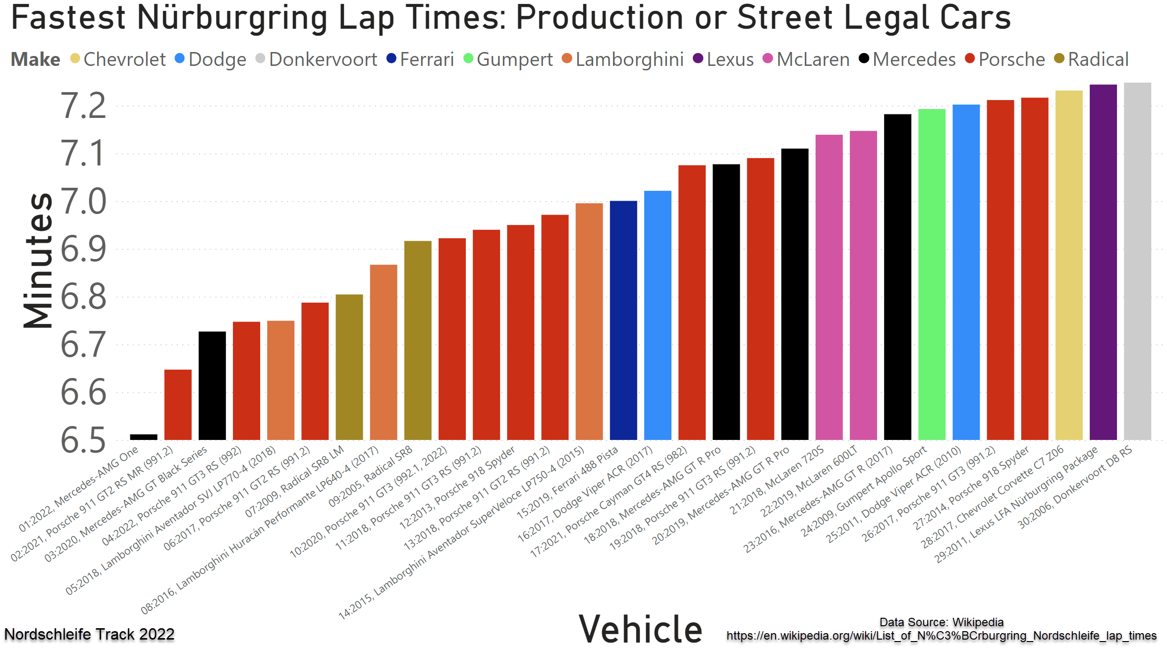
Y axis not starting at 0 can be misleading.
Also, why would you not use red for Ferarri? I'm calling the cops
darkmooink t1_j87rzsk wrote
The Y at 0 is more excusable since they used the fastest as near enough Y origin but as for Ferrari, they are either Red or Yellow. The only time Ferrari can be blue is at a protest.
seamacke OP t1_j893psl wrote
Or if you’re Justin Bieber? Wait, wasn’t he blacklisted by Ferrari for that.. lol damn I should have looked at the colours more closely while making this.
seamacke OP t1_j85en74 wrote
Yeah starting from zero may have been better, though it produced a pretty flat graph. I chose gold for Chevy.. but had to demote the Corvette one spot as the numbers in the set appeared to not be in order!
pookiedookie232 t1_j85kk2m wrote
I also think this y-axis makes sense because the law of diminishing returns means that every second quicker is harder and harder to get.
AbueloOdin t1_j86mtvs wrote
Then the chart should be in Minutes:Seconds. Seeing 6.5 but thinking 6:30 is weird.
LucasQuaan t1_j88jqa0 wrote
You could have just put it as "difference to fastest car", which is a common way to display track times anyway.
Viewing a single comment thread. View all comments