I think this is a weird way of doing it. If I understand correctly, the jump in Ballmer's line at the end of his tenure (i.e. approaching Feb 2014) is an artificial jump that you as the data visualizer caused by forcing the Ballmer line to go back to where the Nasaq's line is at so that Nadella's portion of the line gets a equal starting point to Nasdaq, yes? The price didn't actually jump up at end of Ballmer's tenure like that, right? That's deceptive, if so, even if the visualization is captioned to try to explain it.
I would've just made two different charts and then put them side by side. One for Ballmer vs Nasaq and a second for Nadella vs Nasdaq. That way you get the intended effect without that unintended deception.
This is from July of 2020 so I am sure its a little different now but it was 11.3%. Of note 6 tech companies (Apple, Microsoft, Amazon, Alphabet, Facebook and Tesla) made up almost 50% of the index.
Poincare_Confection t1_j8j8yj5 wrote
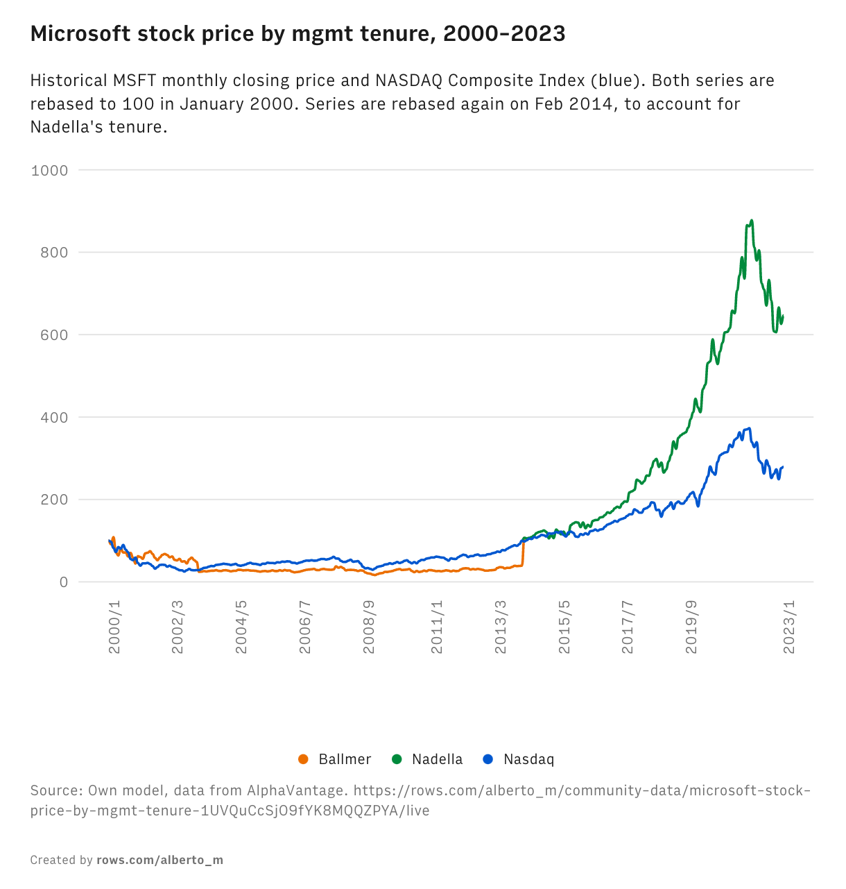
I think this is a weird way of doing it. If I understand correctly, the jump in Ballmer's line at the end of his tenure (i.e. approaching Feb 2014) is an artificial jump that you as the data visualizer caused by forcing the Ballmer line to go back to where the Nasaq's line is at so that Nadella's portion of the line gets a equal starting point to Nasdaq, yes? The price didn't actually jump up at end of Ballmer's tenure like that, right? That's deceptive, if so, even if the visualization is captioned to try to explain it.
I would've just made two different charts and then put them side by side. One for Ballmer vs Nasaq and a second for Nadella vs Nasdaq. That way you get the intended effect without that unintended deception.