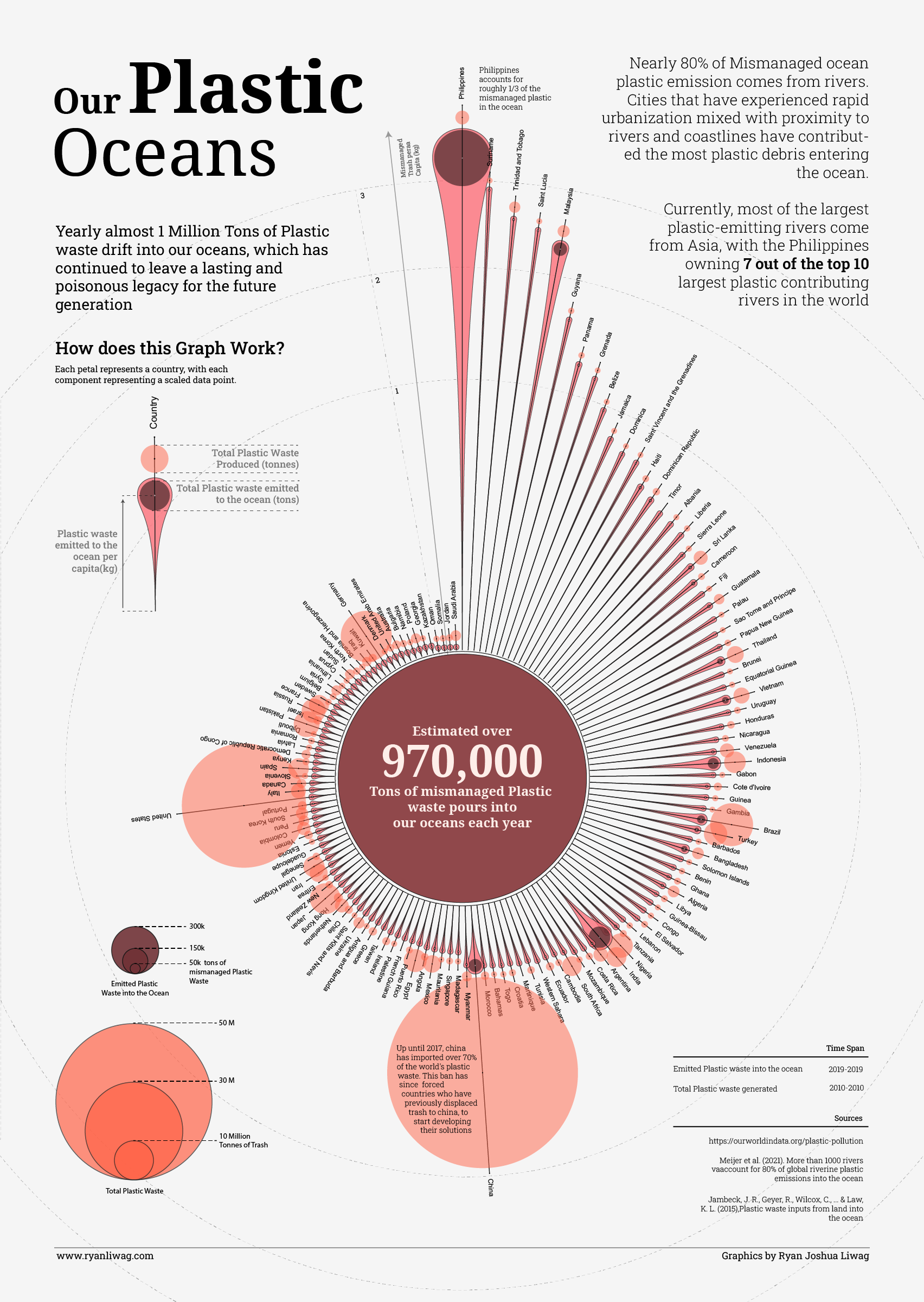
[OC] Plastic waste emitted to the ocean per country Submitted by sometiara1 t3_113mvpx on February 16, 2023 at 9:45 AM in dataisbeautiful 161 comments 1,035
dml997 t1_j8ubzv0 wrote on February 17, 2023 at 12:19 AM Interesting data but why did you ruin the presentation by putting it in a circle and making it really difficult to read half the entries? A simple bar chart would be more informative. Put it on a log scale if there is a wide range. Permalink 2
 [OC] Plastic waste emitted to the ocean per country
Viewing a single comment thread. View all comments