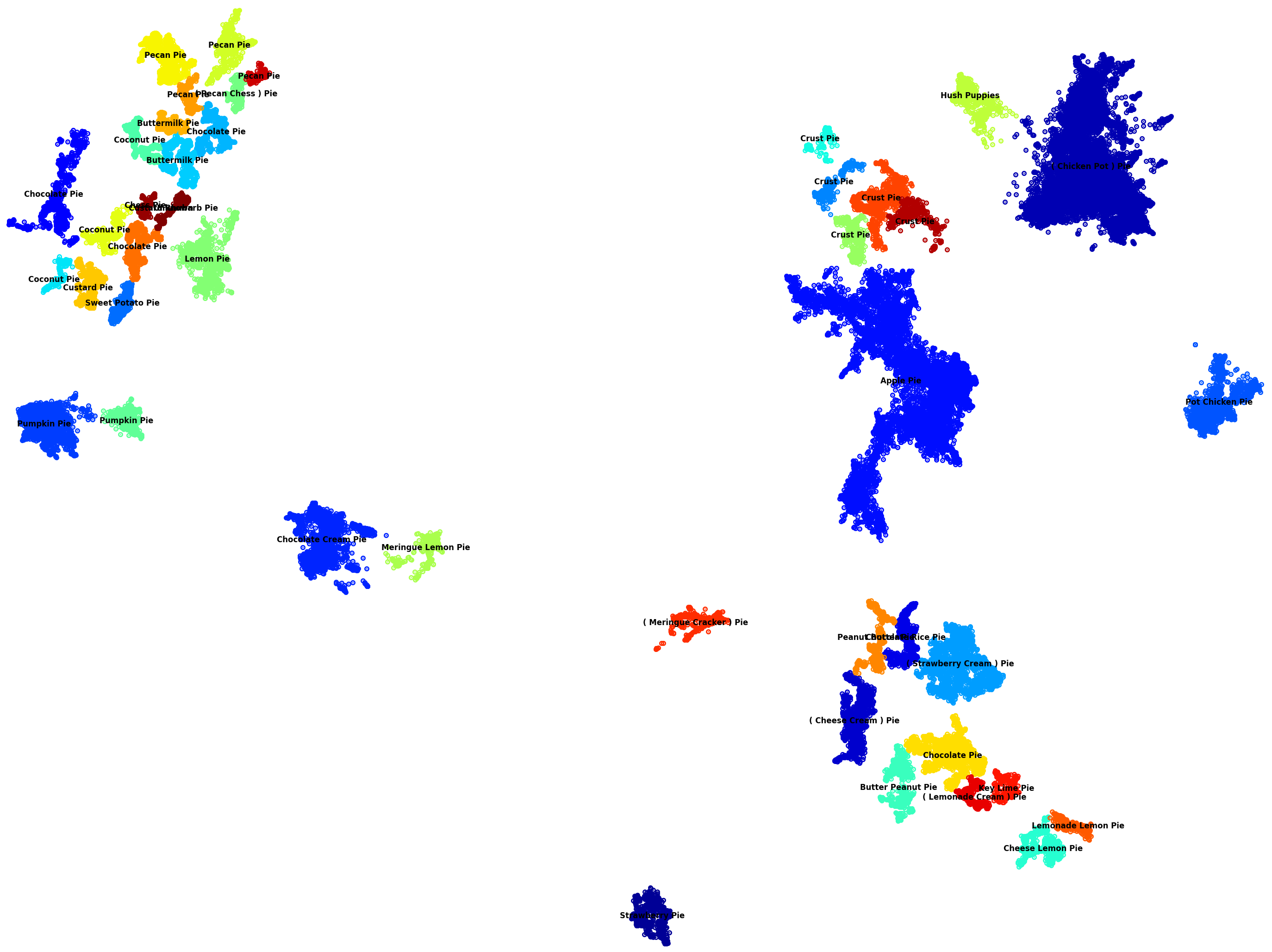
 [OC] Pie recipes clustered by ingredients
Submitted by yourmamaman t3_116bi6b in dataisbeautiful
BujuArena t1_j95xyvh wrote
This is incomprehensible in its current form. It doesn't seem to link anything to anything else in any way that makes sense. I am utterly baffled trying to decipher it.
tilapios t1_j96a1te wrote
"...viewers need to be able to understand what is being visualized based on information provided in the visualization and its title."
This is in the sub's rules. Let's see if it gets enforced.
yourmamaman OP t1_j96bict wrote
>what is being visualized
Maybe if I reordered the words to "Recipes for Pie clustered by ingredients"?
holdenontoyoubooks t1_j96c06u wrote
I promise that wasn’t the problem. What are the sections visualizing?
yourmamaman OP t1_j96dbaf wrote
Each dot is a recipe, The clusters are similar recipes.
The distance is the difference in ingredients.
holdenontoyoubooks t1_j96gw91 wrote
I think the downfall here is these look like countries and people thought you were saying this country has this recipe
PrimeNumbersby2 t1_j96hq4z wrote
Yeah, I was really hoping this was a map.
yourmamaman OP t1_j96k2r5 wrote
You might be right. But some of the comments are helpful. Like the one recommending to put a legend that indicates a dot is an individual internat pie recipe. And a scale diagram on the bottom like you find on maps to indicate the distance is differences in the recipe ingredients.
Deepfriedwithcheese t1_j96bwgq wrote
I thought it was the primary pie type by country and the dark red splotch in the upper right was Italy, but it unraveled from there.
yourmamaman OP t1_j9602jy wrote
HHmm, I may need to add more backstory. Like "Euclidean distance represents ingredient similarities"
BujuArena t1_j960i8o wrote
Even with that, it would seem to have the level and quality of meaning I could attribute to any given audio track on Autechre's album, "Draft 7.30".
yourmamaman OP t1_j960xbk wrote
Ahh, you're not trying to help , you are just opinionated
BujuArena t1_j9626ue wrote
I don't know how to even approach consideration of this curiosity. It is intriguing in its layout, and yet indescribably baffling. Did the author intend any structure? Is there meaning in the clusters and islands? The work intrigues, but leaves the viewer hopelessly lost in the depths of its mystery.
I'm just enjoying commenting at this point. I am actually interested in the full essay that would enlighten us about exactly how this chart can be interpreted.
Edit: Also, I disagree with the insinuation that a viewer has any obligation to help with the presentation of the data. We have awarded feedback, and with that, you may make a choice: Will you try again and improve the work, portraying the glory of excitement that you've felt upon pondering the mystery you've sought to dispel? Or will you leave the viewership to ponder the mystery of the graphic they see before them, and the origin of the authorship which led to its creation? It is up to you, and you have no real obligation to choose the former option. The only difference you will see is in your Reddit point count, which you may or may not see as consequential, but which absolutely is inconsequential in the grand scheme of life.
yourmamaman OP t1_j9658wn wrote
To be honest, I had trouble visualizing this concept, hence the post. The idea was the take 3700 different recipes for pie, but understand how much variation there is in terms of their ingredients.
So the algorithm will cluster recipes that have very similar ingredients and give them one color, and place the cluster in such a manner that clusters with very different ingredients are far away from each other
Andie787 t1_j96u29u wrote
How does the colour work? What does it mean that there are so many blue clusters far apart from on another?
goodluckonyourexams t1_j971pj5 wrote
the colour means nothing, only the distance matters
and the distance is reduced in its dimensions
LinusMendeleev t1_j964yg4 wrote
No my friend, he is trying to help. It doesn't make sense at all.
goodluckonyourexams t1_j971ctx wrote
euclidean distance of baking ingredients
Viewing a single comment thread. View all comments