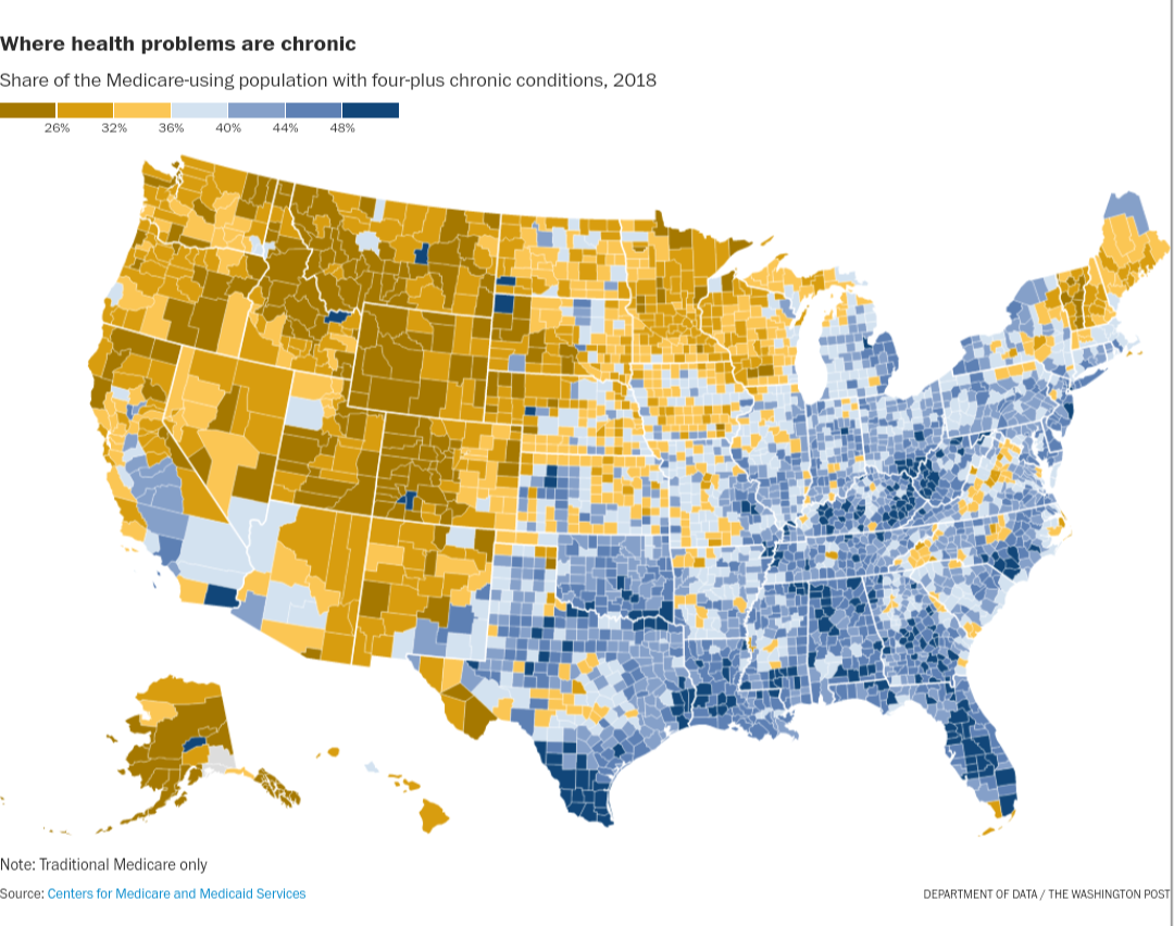
 percent of medicare users with 4+ chronic medical conditions [OC]
Submitted by RompingOtter t3_116itjy in dataisbeautiful
KoeiNL t1_j97282m wrote
Reply to comment by theottozone in percent of medicare users with 4+ chronic medical conditions [OC] by RompingOtter
Yes, if you need to look at the scale to actually understand what is going on then you made a mistake in your visualisation.
theottozone t1_j975l9a wrote
I disagree that's what the scale is for, to inform the audience on how the interpret the graph.
KoeiNL t1_j97bo0d wrote
Your colouring should reflect the story you want to tell. What you are basically saying is that you are ok with a visualisation where red means good and green means bad as long as there is a scale/legend.
theottozone t1_j97oyi9 wrote
And your saying yellow is the opposite of blue here? Theres no inherent meaning to colors. We give them that meaning and we document it in the legend.
sei556 t1_j98syum wrote
Thats just bad/lazy design that can easily end up being manipulative. With any form of design, you always have to assume that whoever looks at it later on is the laziest person on earth. Because thats the average.
Your argument is like saying intuitive design for smartphones is useless because people can just read the manual.
Viewing a single comment thread. View all comments