Submitted by RompingOtter t3_116itjy in dataisbeautiful
Submitted by RompingOtter t3_116itjy in dataisbeautiful
The link is for credit scores, but it doesn't vary much from the chronic health issues. I guess we can conclude that if they don't take care of their credit, they don't take care of their health.
Or if they cant afford to live, they cant afford to live healthy
Color scheme seems like it should be flipped.
Yeah I was confused at first.
Also I don’t understand the use of a diverging color scale. I’ve only use diverging scales in chloropleths if there is a logical middle point (eg 0 if my scale includes neg and positive numbers). I guess in this case it makes it easier to distinguish the value of each county.
Minnesota built different
Population density should also factor in. This map is misleading.
Ok, so these are all people over 65 (although disabled people are eligible for Medicare, too), but there's a big difference between a 65 year old and an 85 year old in terms of likelihood of chronic medical problems.
I wonder if the Medicare populations in the blue areas are older in general than the Medicare populations in the other areas? The older you get, the more likely you may be to head south for warmer weather.
[deleted]
[removed]
It is a proportion so it implicitly is normalized though right?
Not saying that density doesn't impact chronic health conditions but--I don't know if its misleading per se.
I would've expected Wisconsin to be on the high end with all the binge drinking.
And of course the cheese shouldn't help matters either.
The link covers all that. And has the OP graph further down.
The conclusion made in the article is that medical debt is the cause of bad credit, and areas where Governers didn't expand Medicaid are particularly bad.
Can't get on Medicare if you're dead in a snowbank at 28.
Blue areas (on this map) have lower life expectancy. The average age should be lower, so it is likely the exact opposite of your thesis.
BuT GoVErnMenT HAnD OuTS R Bad
I'm curious how this map would look if it was all people with 4+ chronic medical conditions. I mean, I just counted more than 4 for myself, and I'm only 36.
Isn't this just showing us population density?
Should’ve kept blue for lower numbers and red for higher numbers…. Could easily highlight the political irony of this chart!
The West needs their own system. I could be saving a lot more on my taxes.
Does it matter if you provide the scale legend?
Also a seems to be a correlation with obesity
No, it’s percentages. Population density looks very different.
[deleted]
The Appalachians seem to be good for what ails you.
Trees rarely get heart disease or lung cancer
I thought that too.
Hotspot in CO is interesting.
Why is it that US statistics maps always look exactly like the election map lol
I wonder if differing atitudes toward self-reliance lead to underutilizing health services. A western rancher can't get diagnosed with 4 chronic diseases if he's only gone to the doctor that one time when his arm fell off.
Can we just get rid of the south? They cost the rest of us money and provide basically nothing. Plus they’d be more than happy to leave.
Why do old Americans go east?
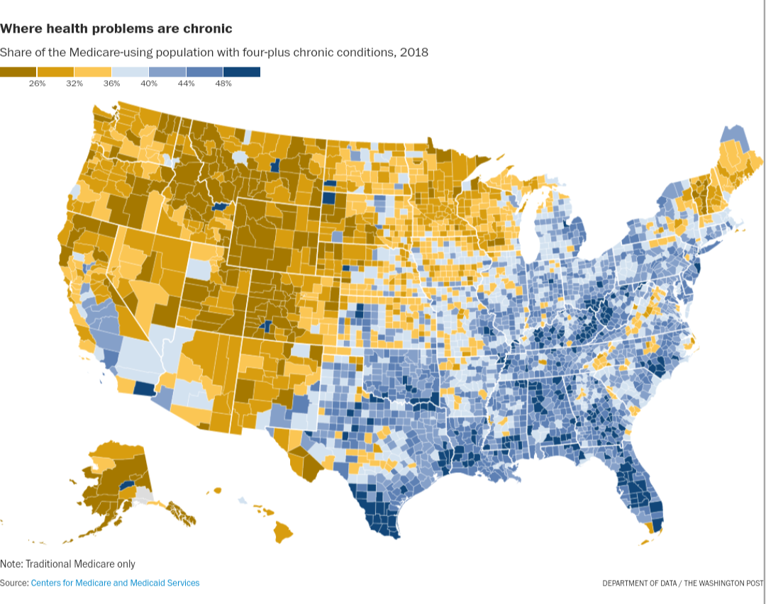
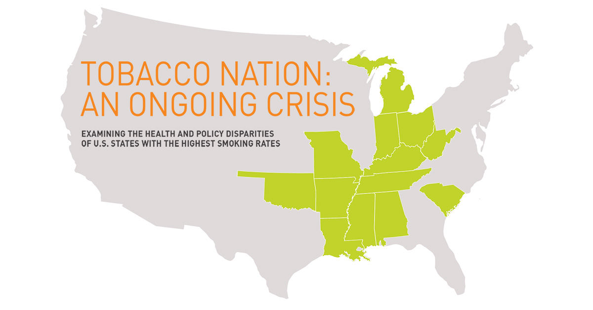
The correlation with the geographic distribution of obesity has already been noted in the Comments. Notice, too, the association with Tobacco Nation:
Yes, if you need to look at the scale to actually understand what is going on then you made a mistake in your visualisation.
[removed]
:/ it doesn’t… Texas, Florida, Massachusetts, New Jersey all same color, West Coast, Wyoming, Montana, Vermont all same color.
First, tripplecheck that the west isn't underdiagnosed and shouldn't join the east in having a more complete identification of health issues.
Are you suggesting there are more or better doctors in Louisiana? This map tracks with every health map I’ve seen.
This probably has more to do with diagnosis than anything...
I wonder how much Ohio will change in the next 12 months
It provides a larger number of visually distinguishable classes than a single color in different shades.
I would use the warm colors for higher risk areas vs cool colors. That seems a bit backwards but an interesting result
No, just that there may be more ways to read the map than the west needing their own system.
Poor and agriculture areas.. exposure to more artificial chemicals and immigrants that don’t trust the government/medical system.
And the most populated areas.
I think it creates an arbitrary line that intuitively feels like, "this is where there's problems, this is where things are good." At that point, whether intentionally or not, the color scale is editorializing the data presentation.
I disagree that's what the scale is for, to inform the audience on how the interpret the graph.
😮👉...dammit, you're right.
I thought I’d seen this map somewhere:
I’m curious whether this map is pre or post COVID
No. The crescent of high black population does not show strongly and West Virginia is strongly represented here while also being mostly white.
i mean most older people move south, so makes sense.
Places like cancer alley aren’t doing people any favors.
Definitely a phenomenon in rural mountain west…it doesn’t seem to affect life expectancy though (according to data linked earlier in this thread)
Both San Juan and hinsdale counties have under 800 people
And poverty, whether rural or urban.
Interesting there is a lot more blue in the states with lowest education, highest obesity rates, smoking alcoholism etc.
The color scale could well have been blue for low to red for high, which would have brought out the consequences of how people vote.
So, places with lots of fat people have more health issues
You are correct. It’s not an appropriate use of diverging color scheme. It’s more appropriate if you were looking at something like “change in percent of four condition Medicare recipients between 2010 and 2020”. Then one color would show trending up and the other trending down.
[deleted]
I bet this data correlates decently with obesity rates
Big ups to, checks notes Wyoming?
> Where is your data coming from?
And per your link, they are right? The south east does have lower life expectancy.
Yeah, I was just asking.
[removed]
Obesity, crime, life expectancy, education, wealth, tobacco use, alcoholism, political ideology, religion...etc
pick your metric, and it probably correlates to "worst in the south east".
Your colouring should reflect the story you want to tell. What you are basically saying is that you are ok with a visualisation where red means good and green means bad as long as there is a scale/legend.
>Wyoming
Nah, /r/wyomingdoesntexist
Fascinating because this doesn't exactly break down with any specific map trend I've seen. They often break down on political axes and the New York/Connecticut/New Jersey area looks very different from the south.
It looks like a combination of obesity and urbanization.
Looks like the data source is from 2018.
I've been staring at this for a bit, but still have no clue what to take away.
This isn't OC, this is a screenshot of from WaPo.
https://www.washingtonpost.com/business/2023/02/17/bad-southern-credit-scores/
[deleted]
Poor and agricultural areas have more immigrants.
Also, healthcare access. There are two scenarios in particular: people who can’t get a diagnosis because they can’t go to the doctor, and people who have a diagnosis but can’t get treatment.
I left Connecticut because I couldn’t afford to live there anymore. My Appalachian community has many people from CT, and a lot from NY.
Definitely better air and water here
The higher percentages in California’s Central Valley are a little concerning, since we have issues with drug and pesticide exposure in those areas already.
It does seem to be agriculture correlated…
And your saying yellow is the opposite of blue here? Theres no inherent meaning to colors. We give them that meaning and we document it in the legend.
I don't think average life expectancy of the general population would have anything to do with this. This is just looking at the Medicare population, and who has more chronic conditions.
The average life expectancy in a particular area is impacted by how many people die before they even reach Medicare age, right?
See:
Presumably poor health leads to (or means) more complications/conditions and early morbidity. A bit of a vicious cycle
[removed]
Maybe some parts are for the other reasons I listed.
Thats just bad/lazy design that can easily end up being manipulative. With any form of design, you always have to assume that whoever looks at it later on is the laziest person on earth. Because thats the average.
Your argument is like saying intuitive design for smartphones is useless because people can just read the manual.
RompingOtter OP t1_j96mw8y wrote
Source: https://archive.is/Fuslg/again?url=https://www.washingtonpost.com/business/2023/02/17/bad-southern-credit-scores/%3Futm_source=reddit.com