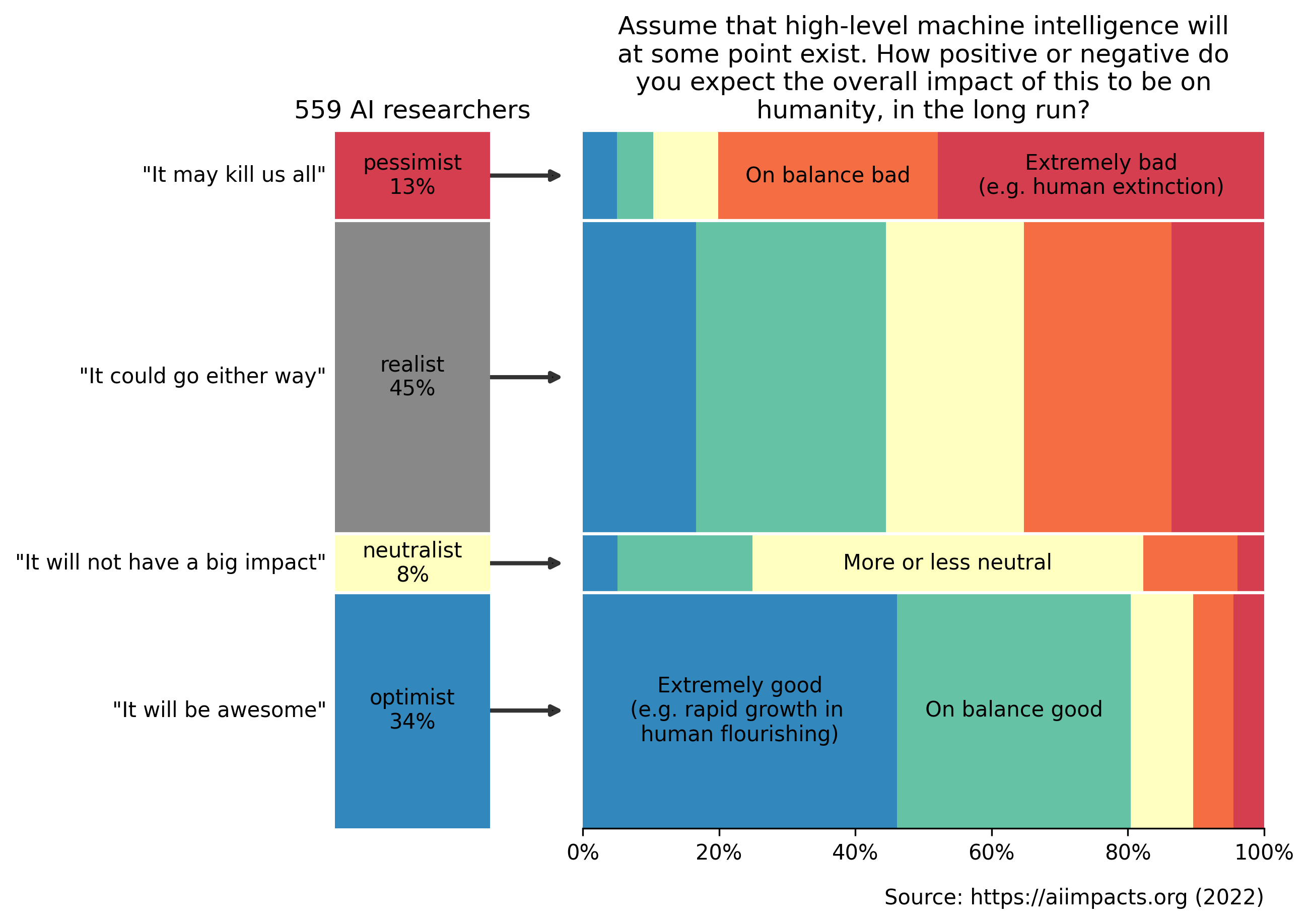
 [OC] AI researchers' expected impact of superintelligence on humanity in the long run
Submitted by bitmoresalt t3_126vnvp in dataisbeautiful
bitmoresalt OP t1_jeb6zmb wrote
Reply to comment by mil24havoc in [OC] AI researchers' expected impact of superintelligence on humanity in the long run by bitmoresalt
Even the optimists are unsure, so they still give about 10% chance of bad effects (on average). Similarly for the pessimist.
The data actually works in the other way: the right is the raw data, and the left subdivision is based on that.
Original visualization (which is also pretty beautiful but perhaps a bit harder to interpret): https://twitter.com/KatjaGrace/status/1635280174748164096/photo/1
torchma t1_jebbfa1 wrote
In other words it's arbitrary groupings. The original visualization doesn't suffer from that.
BernieEcclestoned t1_jebn0zn wrote
That is actually beautiful data, thanks.
Viewing a single comment thread. View all comments