Submitted by adashofdata t3_11g4aym in dataisbeautiful
Comments
molbion t1_jaof9nf wrote
Why are y’all booing him. He’s right. I didn’t even see the album covers till he mentioned them.
lolikamani t1_jaot92p wrote
Me too
aghajarnia t1_japkp31 wrote
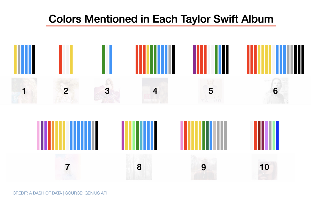
This data visualization is about the colors mentioned in the lyrics. I think it makes sense that the album covers are grayed out so as not to distract from the “data”
Daydream_Meanderer t1_jaqpyew wrote
Okay but why the numbers
[deleted] t1_jaqvsll wrote
Right? Does it go in order of albums she produced or what?
Daydream_Meanderer t1_jaqx4vt wrote
I mean they’re in chronological order, that’s what the number are, but unnecessary because it obscures the album cover and it can be assumed they’re chronological.
[deleted] t1_jar7mto wrote
Yeah but “beautiful data” shouldn’t have to be assumed it should be presented
Daydream_Meanderer t1_jar85c4 wrote
Then my recommendation is put an annotation that albums are listed chronologically in the bottom margin, and keep the albums below each data set, translucent at like 20% opacity.
[deleted] t1_jara0v2 wrote
That would be a good fix to the problem
fruitist t1_jao9uum wrote
Would love to know if there are any additions in the Taylor's Versions for Fearless and Red. I know she released more songs and extended some lyrics in each one.
adashofdata OP t1_jamjxsr wrote
- Data source: Genius API
- Tool: Keynote
- Source article: http://adashofdata.com/2023/03/01/a-data-scientist-breaks-down-all-10-taylor-swift-albums/
kompootor t1_jaop8jn wrote
This is actually really cool, in terms of just literary analysis. If you're the first person to put up a visualization on colors in songs/albums like this then definite ultramega kudos -- and I think albums might be even better than songs for comparing across artists and careers.
To critique the visualization itself, I feel like there is a better way to show the evolution of a set over time that doesn't feel like they're all kind of in their own little corner, independent, on a white background (which makes the grey hard to see btw). If the emphasis is indeed on evolution, or perhaps a fan might, knowing Swift's bio, coordinate the use of colors to her perceived emotional state, then placing the colors vertically and connecting them smoothly along a horizontal time axis like a rainbow of thickening and thinning bands might work. Just a thought -- I'm sure you or others will have better ideas.
And good job of course for including the citation information on the image itself. (I'd recommend including a year or date or backlink, though, which helps people find your original post if they want.)
dirtvvulf t1_jaq76f8 wrote
i think my favourite discovery may have been the FOURTH pen type - the permanent marker revenge song 😆
on_ t1_jamn9yw wrote
Interesting. So what she sang about, pink, lilac , mauve , violet, lavender, plum?
adashofdata OP t1_jan0u1d wrote
Close! Light pink, indigo, ultraviolet, maroon, burgundy and lavender.
Dillweed999 t1_jaof7t5 wrote
I am a Taylor Swift fan but this is better than most of the content here
KingDusty72 t1_japqndm wrote
Disappointed in the number of times red shows up in red
ResearcherLivid3535 t1_jan6f1o wrote
I adore this.
I fully went down the rabbit hole. The YouTube video, the blog, everything.
Awesome job.
SininenCinnamon t1_jaoiy79 wrote
"I myself am a fan of her yellowish grey period"
notice27 t1_japq9ny wrote
more proof midnights is her best work
dollhousemassacre t1_jaqmzt8 wrote
It's odd you should say this. I'm 'bit of a Swiftie myself, and "Midnights" just doesn't do it for me. No shade, just interesting how people can listen to the same thing and hear something completely different.
notice27 t1_jarver2 wrote
i'm not a swifty and probably just listening for different reasons! really thought she captured a lot of more popular music trends on this from radio, film, tv, etc., but all while still being herself. might not actually be her best album but its like she's just having fun with her craft and stepping to the industry
[deleted] t1_jan335w wrote
[removed]
[deleted] t1_jaofe4u wrote
[removed]
Gtslmfao t1_japuuag wrote
Girl certainly loves yellow
Ianilla1 t1_jarec4f wrote
This is a very odd thing to put together, but it's weirdly fascinating.

emilbm t1_janimkg wrote
Why the numbers? They obscure the album covers and they add literally nothing to the visualization