Submitted by briansteel420 t3_11lbof7 in dataisbeautiful
Submitted by briansteel420 t3_11lbof7 in dataisbeautiful
It's Jan, 6th!
oh whoa. i’m unaware of this jan 6 bill gates event. now i need to know! 👀
I think this is Bill Gates’ sentiment - i.e. he tweeted negatively about Jan 6th? Not sure though.
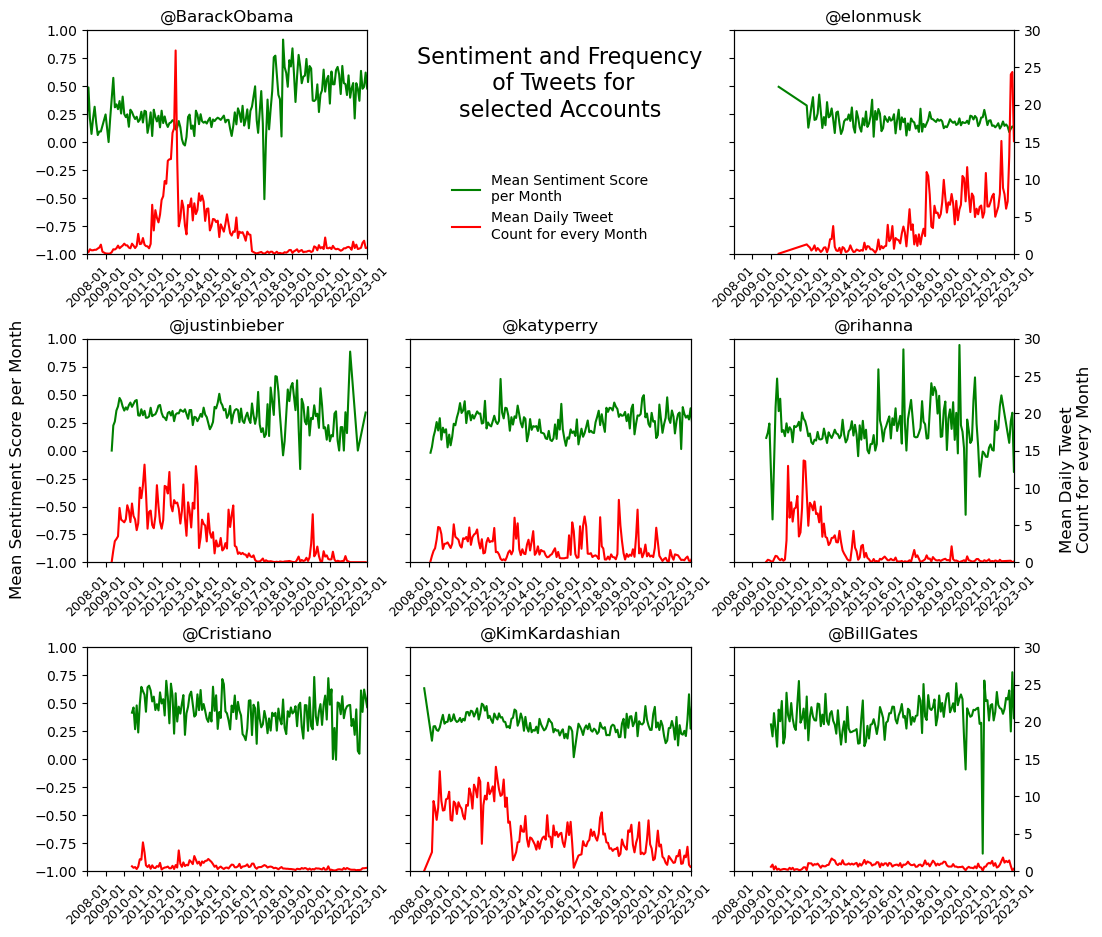
Done with Python/Matplotlib. Tweets scraped with snscrape. I'd love to hear some constructive criticism on how to improve the visualization, I am very new to this. Also, if you have some fun ideas on tweet data analysis, pls let me know :)
Interesting! Horizontal grid lines (from the left y axis ticks) would be helpful for me, or at least one at 0 on the left y axis. Red/Green imply bad/good and some people can't tell the difference (colorblind). I might try showing sentiment with a black line and showing the count with a gray line or even gray area.
What are you measuring for the sentiment score, exactly?
With VaderSentiment Package - the SentimentIntensityAnalyzer.
The Score is the compound score for every Tweet in a month and then the mean of that.
[deleted]
thats exactly what I have done, what do you suggest?
[deleted]
[removed]
[removed]
[deleted]
South_Barnacle_9760 t1_jbbsldh wrote
interesting! i wonder what event led to that bill gates dip. also elon is so embarrassing! lolol