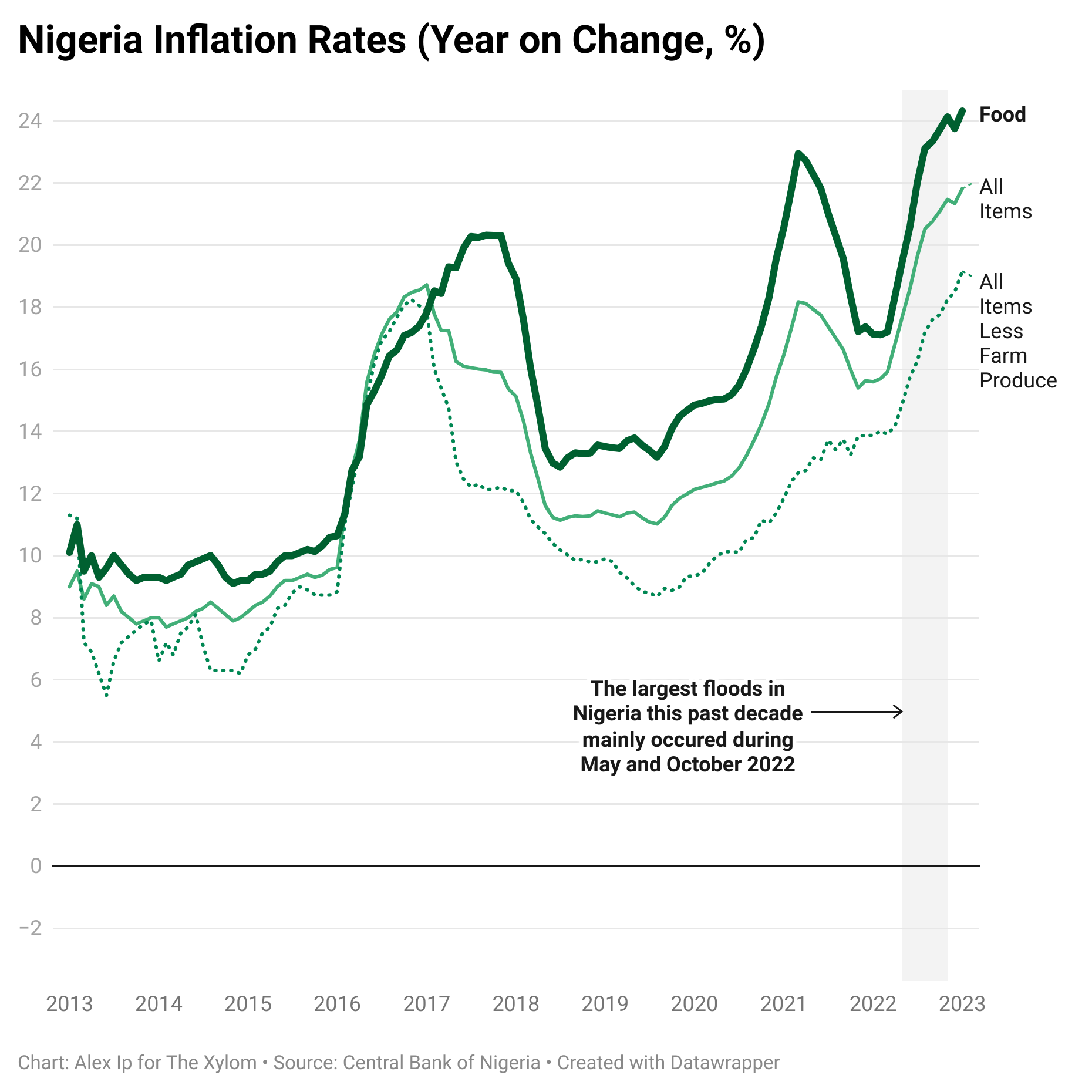
 [OC] Nigeria's inflation rate has raised to levels not seen in a decade, following devastating floods.
kompootor t1_jbrq4yy wrote
Reply to comment by thexylom in [OC] Nigeria's inflation rate has raised to levels not seen in a decade, following devastating floods. by thexylom
You really need to have vertical ticks indicating January for each year (and make that clear). Importantly, this will indicate that the dataset only runs through January 2023 (otherwise, that information must be indicated explicitly somewhere).
Also, if the thesis of the visualization is about the recent floods, then the time scale seems overly large, since you can pretty well capture the prior upward trend and volatility information by cutting off at 2018 or so. If however you were to include markings shading other major disasters and political turmoil, that would justify the time scale, and it would lend support to your thesis if, for example, you find other major events that don't correspond to dramatic changes in these economic indicators, and mark them as well. (You should be impartial in choosing events however. Significant events like the oil crash from 2014--2016 that sent Nigeria into a spiralling recession in 2016, should not be ignored.)
Viewing a single comment thread. View all comments