 [OC] police killings VS suicide rate – 2020 election
Submitted by terrykrohe t3_11zsqqi in dataisbeautiful
terrykrohe OP t1_jde3aja wrote
Reply to comment by SlowCrates in [OC] police killings VS suicide rate – 2020 election by terrykrohe
1
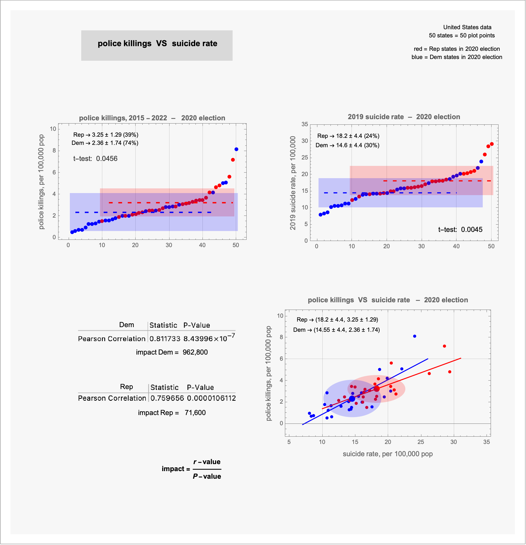
top, left: shows the fifty states separated by their 2020 election vote (red/Rep and blue/Dem); the source data is worked up to determine the police killings per 100,000 pop and tabulated; the ranked table is visually presented ... identifying the states is not important: the importance is in the non-random, top/bottom pattern of the data
2
the top, right: is a visualization of source suicide per 100,000 pop data
3
– the means and standard deviations of the Rep and Dem data are represented by the dashed lines and the shaded boxes
– the t-test compares means of Sample populations: low t-test values indicate that the means are NOT due to random data fluctuations
4
the bottom plot
– plots the (suicide, police killings) coordinates for each state
– a best fit line is determined for the Rep and Dem coordinates
– the Pearson correlation calculates how 'strong' the data fits the best-fit line (0.81 and 0.75 are strong correlations)
– the "P-value" is the probability that the Pearson "r-value" represents random fluctuation of the data
– smaller P-values indicate less random character of Sample data
5
the "impact value" use the r-value and the P-value to quantify the data fit
– just looking at the plot coordinates, the best fit lines, and the Pearson values ... it is (for me) hard to see that the Dem correlation is so much stronger than the Rep correlation; but the impact value informs me so.
Viewing a single comment thread. View all comments