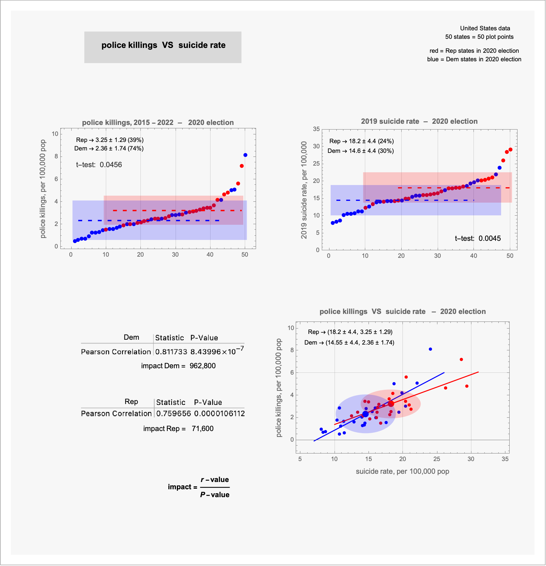
 [OC] police killings VS suicide rate – 2020 election
Submitted by terrykrohe t3_11zsqqi in dataisbeautiful
headhouse t1_jde97ax wrote
Reply to comment by terrykrohe in [OC] police killings VS suicide rate – 2020 election by terrykrohe
Have you tried mapping all the other causes of death?
Also, you're comparing two disparate stretches of time leading up to the same endpoint. That seems like bad practice.
I'm also not seeing where the wapo link you provided gives data on the party affiliation of the people who were shot. Is that data just a reflection of the location, then?
I'm not a data scientist, but this feels very pegboards-and-strings-across-the-room kind of scenario.
terrykrohe OP t1_jdi13yi wrote
... the WaPost data indicates the state of each death; the total of deaths for each state was calculated. If that state was Indiana, it is a red plot point; if Vermont, it is a blue plot point, etc
Viewing a single comment thread. View all comments