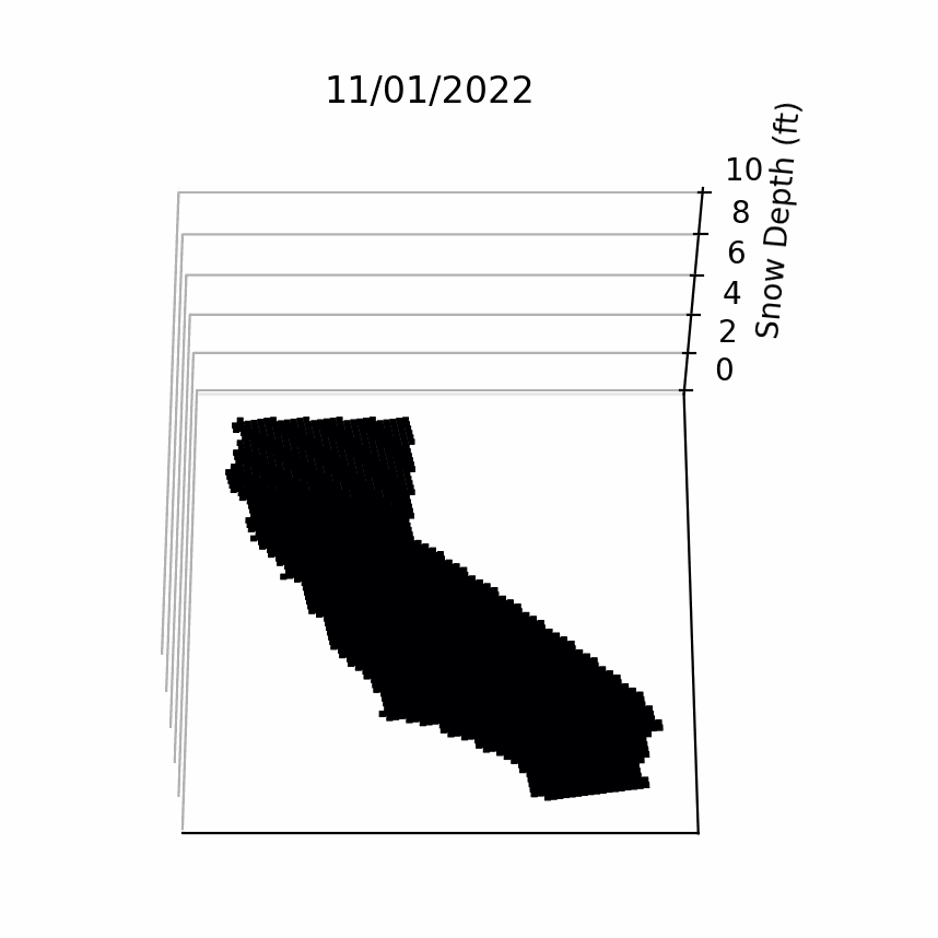
 California Snow Depth Visualized (Winter '22-'23) [OC]
Submitted by plantboy97 t3_1229ltx in dataisbeautiful
chomerics t1_jdqfqfd wrote
Beautiful? This is a poor visualization.
This should be a top view map, contour, not 3D. I have no idea what the totals are, where they are, no legend, bad colors etc.
What does the news show when explaining snowfall totals? Not this. Reproduce what others do, while this may look cool, it’s a bad visualization for understanding data.
The ONLY time I saw a 3D isometric work was when it was showing real time by minute #of tweets based on location during the World Cup. When a goal was scored, the bars shot up like cheering. This was the ONLY time this map ever made sense to use.
Viewing a single comment thread. View all comments