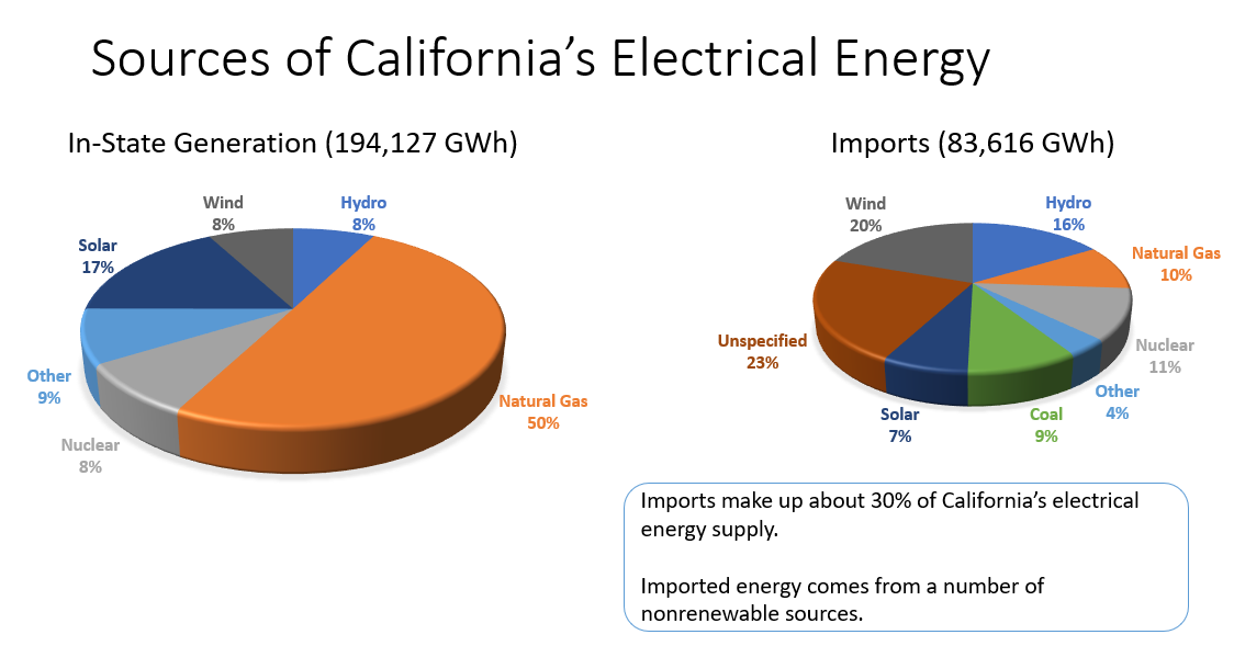
Submitted by HammerOfTheMoops t3_ycytpr in dataisbeautiful
Comments
[deleted] t1_itr8rd0 wrote
[removed]
askLubich t1_itvy08w wrote
!piechart
AutoModerator t1_itvy09w wrote
You've summoned the advice page on !piec. There are issues with Pie/Doughnut charts that are frequently overlooked, especially among Excel users and beginners. Here's what some experts have to say about the subject:
- In Save the Pies for Dessert, Stephen Few argues that, with a single rare exception, the data is better represented with a bar chart. In addition to this, humans are terrible at perceiving circular area.
- ExcelCharts argues that the pie chart is simply a single stacked bar in polar coordinates, and that there are many pitfalls to using this type of visualization. In addition, the author also argues that pie charts are better displayed as bar charts instead.
- Edward Tufte, data viz thought leader, states about pie charts "A table is nearly always better than a dumb pie chart; the only worse design than a pie chart is several of them, for then the viewer is asked to compare quantities located in spatial disarray both within and between charts [...]. Given their low density and failure to order numbers along a visual dimension, pie charts should never be used." (excerpt from The Visual Display of Quantitative Information).
- Cole Knaflic in this article rants about her hate of pie charts, and boldly states they should not be used.
- Joey Cherdarchuk in this article shows how easily pies can be easily replaced by bar charts.
If you absolutely must use a pie, please consider the following:
- Avoid using too many classes. And order your classes, too.
- Try to follow Randy's Correct Ways to Use a Pie
-
Avoid the third dimension. Summon my help page
!3Dif you want more information. - Avoid exploding slices, and use a direct label instead of a legend.
I am a bot, and this action was performed automatically. Please contact the moderators of this subreddit if you have any questions or concerns.
askLubich t1_itvy2z2 wrote
!3D
AutoModerator t1_itvy2zr wrote
You've summoned the advice page on !3D. There are issues with 3D data visualizations that are are frequently mentioned here. Allow me to provide some useful information:
- Usually, 3D pie charts throw off perspective.
- Even 3D bar or 3D line plots throw off perspective, studies have shown.
- Plots like this are far better off as heatmaps or trellis plots instead.
You may wish to consider one of the following options that offer a far better way of displaying this data:
- See if you can drop your plot to two dimensons. We almost guarantee that it will show up easier to read.
- If you're trying to use the third axis for some kind of additional data, try a heatmap, a trellis plot, or map it to some other quality instead.
I am a bot, and this action was performed automatically. Please contact the moderators of this subreddit if you have any questions or concerns.
HammerOfTheMoops OP t1_itw4eeq wrote
Interesting points - I appreciate the feedback.

HammerOfTheMoops OP t1_itp2y0k wrote
PowerPoint charts.
Data source: https://www.energy.ca.gov/data-reports/energy-almanac/california-electricity-data/2021-total-system-electric-generation