Submitted by DavidWaldron t3_ywqs2b in dataisbeautiful
Comments
GeneralMe21 t1_iwkv9tz wrote
How does this account for hybrid positions?
DavidWaldron OP t1_iwkvqng wrote
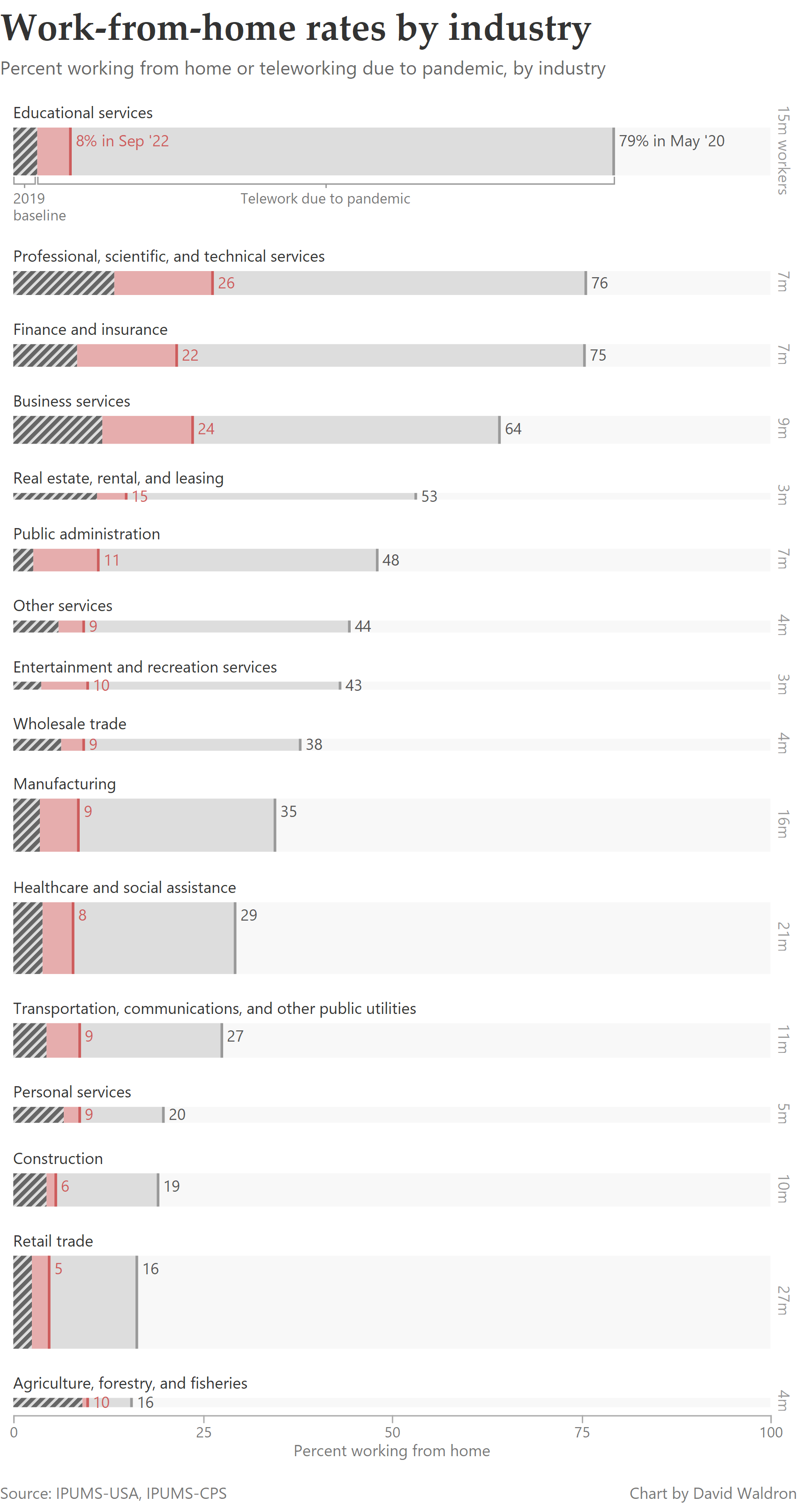
I think it will tend to count them as teleworking. The question text for the telework due to COVID-19 part is:
>At any time in the LAST 4 WEEKS, did (you/name) telework or work at home for pay BECAUSE OF THE CORONAVIRUS PANDEMIC?
For the 2019 baseline it is likely to be less inclusive, as the question is:
>How did this person usually get to work LAST WEEK?
EasternGuyHere t1_iwpdosl wrote
Hybrid is a broad definition.
3-days in office? 1-day?
How is your shift? 5/2, 2/2, 1/3?
But it could be accounted, yeah.
eat_my_shorts_Reddit t1_iwlo0ds wrote
Where are the labels to distinguish the different colors?
rustyvin t1_iwmmydw wrote
They are in the top chart for educational services, it's just a little sneaky and takes some time to parse.
Nice work to OP with mimicking Economist styling (to my eyes)
DavidWaldron OP t1_iwktlv1 wrote
Here's a short post describing these estimates, with some more charts.
The data is from IPUM-USA and IPUMS-CPS. Code for calculating the estimates is here.
[deleted] t1_iwl4uma wrote
[removed]

KeepTangoAndFoxtrot t1_iwky3ef wrote
NGL, I kind of hate these stacked bars. It really doesn't feel like it makes sense to use here. (Or am I misinterpreting the display...?) Also, what are the percentages for the baselines? Literally none of those are labeled.
Edit: looks like I'm indeed misinterpreting them. They aren't stacked, they're overlapping. The display could certainly be more clear. My point stands on the "baseline" values needing labels, though.