
Comments
spiral8888 t1_izfsxmw wrote
The problem is that in some plotting programs that's the default. That's why it's hard to know if the journalist presenting the graph is deliberately trying to mislead or is just incompetent and doesn't understand that if he/she doesn't tell the plotting program not to suppress zero, the graph will be misleading.
Thundorius t1_izfwo9z wrote
Criminally negligent or just criminal.
Sines314 t1_izg0ojz wrote
Journalists should know this, it’s not complicated. Assume intent to mislead. Or that they’re too dumb to be doing their job.
ConstantinSpecter t1_izg8lot wrote
Halon’s Razor would like a word.
“Never attribute to malice that which can be adequately explained by stupidity.”
Historical_Shop_3315 t1_izivcm7 wrote
But my article is more convincing if the difference looks bigger.....i feel like the difference is this big...
Strength-Speed t1_izkbn73 wrote
I wonder if there is room for some journalism exam that requires passage. How to properly display data, etc. It wouldn't have to be exceptionally complicated but I think there are zero entrance requirements to being a journalist. At least you could say 'certified' or some such. Maybe there is qualification exam out there I don't know of.
Sines314 t1_izkpz2h wrote
I think we need less official credentials, really. No reason why hair dressers need a license. But newspapers shouldn’t hire journalist, people who deal in fact finding, if they are easily deceived.
Korwinga t1_izh2wb7 wrote
Not every graph needs to start at 0 though. A graph of temperature, for example, shouldn't ever start at 0 K unless you're dealing with temps in that range.
spiral8888 t1_izi9gkc wrote
I agree that there are a few exceptions, temperature being one of them. However, most misuse of suppressed zero is not with these quantities.
mick4state t1_izjz9hm wrote
I think there are good reasons to cut a y axis short, but you have to know your audience. If there are small differences, but you want to draw attention to those differences, it can make sense. I've done it in academic papers before, comparing scores in one group around 80% and scores in the other group around 87%. Statistically significant, but the full-scaled graph just doesn't present that information clearly. Scientists can handle looking at the y axis to check, but your everyday person likely won't.
Andoverian t1_iziusmb wrote
Maybe it's not always intentional, but as journalists they have an obligation to do it right.
JoHeWe t1_izg4qb3 wrote
There are instances where starting the Y-axis not at zero is okay. I'm bad at examples, but zero is used as a baseline. Which means that it would be better to start the Y-axis at another value, it being similar to the baseline.
An example might be the concentration of something, like CO2 molecules in the atmosphere. It is impossible and irrelevant to get to 0. Besides, it's not about the absolute values but the relative values.
But in general, yeah, it is misleading.
Korwinga t1_izh32ez wrote
Temperature is another one. Unless you're doing experiments at absolute zero, 0 degrees K shouldn't be on your graph.
marsman t1_izizcu7 wrote
It's often true if you want to show the differences between similarly (usually large..) numbers. Whether it is misleading or not tends to be in the presentato and context. The same applies to things like log scales etc...
Elocai t1_izjzzcj wrote
The moment you compare those temperature, either in graph or in percent, you need to switch to K first.
10°C is not half as cold as 20°C
_str00pwafel t1_izjl62a wrote
For my data presentation it's usually only okay to start above 0 when doing so would make it hard or impossible to see necessary details in the plot.
Skulltown_Jelly t1_izgcsff wrote
By wrongly scaled you mean starting with a value different than zero? Because they are very different things
Matrozi t1_izg1d4l wrote
You see it a lot on scientific papers, it was more common before but you do still have a few papers that come out with a badly scaled Y axis to insist on the difference between group A and group B.
good_research t1_izg86w8 wrote
In scientific papers they'll generally have some measure of variance, and a readership that knows how to interpret it.
bippidyboppidyboo4u t1_izgd8aq wrote
You didn’t answer their question: they asked about zero as the baseline.
What’s so special about zero?
KinkyHuggingJerk t1_izj1dm1 wrote
It's usually less about what the starting Y value is as it is about the scaling for the overall data, coupled with a plot point to close to the starting y value.
I mean, people should be able to critically think through this, but if that were the norm, we would probably have flying cars robot slaves better living conditions less bullshit to deal with.
FartingBob t1_izjjjnj wrote
On a scale of 9.5 to 10 how annoying is that?
IONIXU22 t1_izjn4ln wrote
It depends - is it a log scale?
[deleted] t1_izg2bxr wrote
[deleted]
[deleted] t1_izjll52 wrote
[deleted]
rajimoto t1_izfncwq wrote
Who benefits from the analysis and the persuasion presented?
What data are omitted?
Those are the most important questions to answer first. With those ideas in mind, the obvious flaws in the presentation are glaring.
wonder_bear t1_izfqzv2 wrote
A lot of times I see people manipulating results to align with what leaders want in an effort to look good.
rajimoto t1_izfz1ji wrote
You don't even need to manipulate the results.
The visualization is a selective presentation of a dataset.
It's trivial to spin a narrative with a slice of a dataset, and once you see how easy it is, you can't unsee it.
_AlreadyTaken_ t1_izka1vj wrote
Or activist groups trying to put a spin on dara to boost their cause
Smythe28 t1_izg7l7q wrote
You can use all the correct scales, the correct timeframes, the right type of graph. But you should always attempt to understand the context behind why the data is being presented to you at all.
frollard t1_izfyy5v wrote
In conjunction with what are omitted // all steps in generating the data; particularly if formulaic. Several functions crush or expand domain and range in misleading (sometimes useful) ways.
jagedlion t1_izk9km9 wrote
Adding extra data is also a great way to be deceptive.
Really none of these three categories are always deceptive. Often each of these is maybe even required for clear data presentation. But they can be used for deception.
_AlreadyTaken_ t1_izk9ue0 wrote
Big problem with journalists and medical studies. The paper will have all sorts of conditions on the data but the press will report one finding without these conditions. "Drug X had negative effects on 40% of people with condition Y who take drug Z" becomes "Drug X has negative effects!"
AbouBenAdhem t1_izflj2q wrote
> Starting Y-axis near the lowest value can make insignificant differences look massive
It’s worse than that: if you’re just comparing two values, the resultant graph will look exactly the same regardless of what the input values are. The graph is conveying no information whatsoever.
spiral8888 t1_izfti8d wrote
I'd say you're almost right. The graph would still tell if A bigger than B or B is bigger than A. By juggling the Y-axis you can't hide this.
PB4UGAME t1_izgdobw wrote
What if you make the Y axis negative, so something that looks bigger is actually smaller?
danielv123 t1_izivnsf wrote
How about a bar graph with split Y axis?
[deleted] t1_izgcyjk wrote
[deleted]
AtLukesDiner t1_izfjdyd wrote
3 has this actually- no axis at all is a red flag I often call out to my less data-minded friends! I love this graphic!
Thundorius t1_izfwtiq wrote
Don’t you raise your voice at me.
[deleted] t1_izfxqh9 wrote
[removed]
RoosterImportant4283 t1_izfwi0e wrote
you mean to make it real big like that?
AtLukesDiner t1_izg4qby wrote
I mean there's nothing to the left of the bars specifying the unit and scale... Is it percentage points? 0-100 or 0-10? We have no clue. It ties into the first point noting how important the scale is to putting the data in context.
EDIT: I also have no idea how I made the text large but I have been watching a 6 day old baby since 4am and cannot be held responsible 😂
Internet_Adventurer t1_izgelop wrote
You used the # symbol which makes it big and bold
AtLukesDiner t1_izgio4r wrote
Now I know haha
[deleted] t1_izg9osd wrote
[removed]
Stannic50 t1_izitkp4 wrote
2 has this problem as well, just on the horizontal axis.
this_moi t1_izgbnqo wrote
Attempting to start a sentence with # angers the Reddit markup gods.
DevinCauley-Towns t1_izj67t6 wrote
I would rebuttal this point a bit, since eliminating an axis and replacing it with labels directly on the data points can be an example of improving the data-ink ratio of a data viz, which is generally regarded as a positive in the field.
Edit: Obviously eliminating the axis and having 0 labeling is a no no since the values need to be specified.
AtLukesDiner t1_izj6wdk wrote
Don't disagree with this nuance!
MrMitchWeaver t1_izfknkm wrote
1 is perfectly OK for when you need to zoom in to see the difference. Perhaps it can be better notified that the axis doesn't start at zero
2 is perfectly OK when you want to show correlation between to series that don't necessarily have the same unit or magnitude.
3 is the most questionable one because three years is a very short time frame (for some things). You can address that by adding a previous trend line.
I don't know if it qualifies as cherry picking though, or at least it's not what people mean when they use that term.
All in all these are not deceptive if you know how to look at a chart and if there's a modicum of context to the chart.
I appreciate the effort but not necessarily the execution.
draypresct t1_izflrr7 wrote
>1 is perfectly OK for when you need to zoom in to see the difference.
Agreed. There are lots of examples where you really shouldn't start the Y axis at zero, e.g. if zero is not a reasonable value of whatever measure you're displaying. If I want to display the past few years' average temperatures in Miami, I should not start either the X-axis (year) or the Y-axis (temperature) at zero.
bosschucker t1_izg17rg wrote
I have to disagree with #2. I'm a fan of this blog post by datawrapper, which features this graphic (and has more arguments against dual axis charts besides being misleading). you can manipulate the axes to show literally any correlation that you want, which is a pretty fatal flaw imo for any data visualization
MrMitchWeaver t1_izgmap3 wrote
Of course it can be manipulated. As I said, it can be OK if the units are different or if the series have different standard deviations.
In every case it's important for the reader to look at the axes and draw their own conclusions.
I guess the larger lesson is Do Your Own Research.
Stannic50 t1_iziugzl wrote
If the units are different, then you can't plot the two series with only one vertical axis and so of course two different axes is ok.
But this example is in percent, so the units are not different. If the purpose is to compare the magnitude of series A to the magnitude of series B, then they should use the same axis. Using different axes would be acceptable if the purpose were to compare change over time (or whatever horizontal axis is) within A to change over time within B (as you might with, say, % of state budget spent on education vs % graduation rate). In this case, it's useful to zoom in on each series independently so the change over time is maximized.
MrMitchWeaver t1_iziwq8f wrote
If the unit is the same but the magnitude is very different it does not make sense to use the same axis.
Take housing growth YoY, unemployment, loan delinquency, labor force participation rate, yield curve.
These are all expressed in percentage points but they have wildly different ranges and magnitudes. It would make no sense to use one single axis for two or more of those.
As I said in my first comment. If the series justify the double axis chart it makes sense to use it.
Creator needs to be honest and consumer needs to be vigilant. Same as it ever was.
marsman t1_izj00gg wrote
>These are all expressed in percentage points but they have wildly different ranges and magnitudes. It would make no sense to use one single axis for two or more of those.
And importantly, there is the potential for trends to be highlighted by that sort of chart that wouldn't otherwise be visible, and that are accurately reflected in the data (so its not a manipulation).
Stannic50 t1_izjhx9m wrote
I agree. That's what I meant by "change over time within A/B." If the purpose of a graph is to show whether dogs or cats are preferred, then there should be a single % of households containing [pet] axis so the magnitude of the values can be directly compared. Whereas if the purpose is to show the effect of the 2008 recession on pet ownership, it may be more appropriate to have two separate axes so the magnitude of the change in values can be compared.
MrMitchWeaver t1_iziz6qy wrote
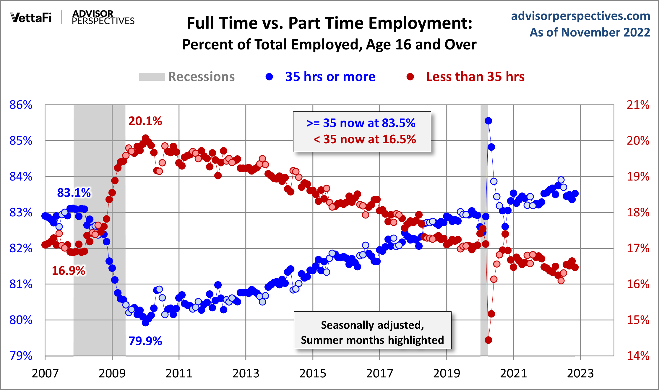
Here's a great example I just ran into https://www.advisorperspectives.com/images/content_image/data/a3/a310f2c1738037eb2e55deb0b7a54134.png
bosschucker t1_izkebe4 wrote
I don't really love this example tbh. look at where the lines cross at 82.5% - what does that tell you? the viz is clearly saying that there is some significance to 82.5% of workers being full time by nature of having that be where the lines meet - but what does it actually mean? you could move the axes so that the lines cross at whatever arbitrary point you want. if your viz is going to imply that a certain data point is significant, I think it actually should be
MrMitchWeaver t1_izklsm9 wrote
I think it's a good example insofar it shows two series that need different axes of the same unit and are absolutely correlated. I'm not talking about the data itself. It's more a response to the other person's points.
spiral8888 t1_izfurx3 wrote
- As someone commented. If you make the Y-axis such that the left one is 10% of the top and the right one 90%, you can make any change, big or small look exactly the same on the graph. In those cases the conveys zero information. You might as well give the values as numbers.
The only situations where it could make sense to suppress the zero are those where the absolute value of the plotted thing has no meaning, such as air temperature. So,.most likely you would never want to plot air temperatures starting from 0K. In most cases the absolute values have meaning, which is why the suppression of the zero just misleads the reader.
MrMitchWeaver t1_izgn5wo wrote
I agree that it can be used to mislead but that isn't always the case.
Take disposable income. Straight from Fred. https://fred.stlouisfed.org/series/DSPIC96
If you click on "view last 5 years" your Y axis is going to start way above zero. It just makes sense. If you click on "view max" you will get Y axis closer to zero because the range of values justifies it.
spiral8888 t1_izi4gl0 wrote
First, I have to say that there is something wrong with the data behind the graph. I can't believe the yearly disposable income could have 20%+ jumps in a month.
Second, yes the 5 year graph is misleading as it makes it look like the disposable income doubled in a month and then fell back to the old level.
MrMitchWeaver t1_izim1f2 wrote
First, that's because of the stymulus payments. It's an anomaly. We're not here to talk about the data itself though.
Second, if you actually look at the y axis it's not even a little bit misleading. This is the default setting for all Fred graphs. If you're showing a value starts at 15.000.000.000 you are not going to start the Y axis at zero...
spiral8888 t1_izivw2d wrote
Yes, you can look at the Y-axis. But if you think that just by having the Y-axis values available removes all misleading, then no suppression of zero is ever misleading. For instance, by your logic the OP's first graph is not misleading as the values are there.
Regarding the Fed graph, the thing that you named as anomaly is amplified when you suppress the zero. When you don't the effect of the stimulus is put more context of how much effect it actually had on people's disposable income.
Skulltown_Jelly t1_izgdzp4 wrote
That's not the only situation. Trend lines are graphs that are used to show...well.. the trends, and the absolute quantities are not as important in many cases.
Stock prices from a certain year are a good example. It's not that it doesn't have meaning, the price of the stock is valuable information, it's just not as important as the trend and depending on the amounts it could make the trend hard to read
spiral8888 t1_izi3wng wrote
Two things. First, the stock prices are a bit like temperature in a sense that the absolute value of the share price has very little meaning. The share price of $10/share doesn't really tell you anything. It only tells you something in relation to the past.
Second, the relative change of the share price does matter. So, 50% drop in price is a different thing than a 1% drop. If you suppress the zero, they look the same on the graph.
MrMitchWeaver t1_izgoma0 wrote
In OP's chart the problem is more the scale than the start point, but it's always about context.
MeltBanana t1_izgdpfb wrote
I use 2 all the damn time, because it's very frequently necessary.
Like, I'm trying to show the strong correlation between Current(A) and Motor RPM. My Current values range from 8-15, and my rpm ranges from 10,000-18,000. I'm absolutely scaling or normalizing them so the correlation between the two is visually clear.
ellWatully t1_izj0kk4 wrote
I was thinking the same thing. Having two y axis scales left and right is only misleading if the two sets of data are displaying the same information for different groups. If they're displaying two different attributes of a system, different axes are often the only way to make the plot useful.
TownAfterTown t1_izg7dzj wrote
This is a good point in that these presentations CAN be used to mislead but can be used to highlight useful information. But they should be transparent and provide that context.
bruff9 t1_izfye8o wrote
I have an issue with 3. It very much depends on the data set and what is actually being portrayed/the context. Who is to say that 6 years is enough vs 2? We need to know a lot more in order to say xyz is bad because it’s 3 years.
Andoverian t1_iziw4pk wrote
Part of the point with 3 is that it assumes whoever made the chart has access to the data going back much further, meaning they knew the last few years are not representative of the longer trend. By only showing the last few years anyway, they're deliberately misleading people.
dark_o3 OP t1_izfpdjr wrote
I made a seperate comment explaining the idea of the infographic, and yes sometimes it is OK to do it but
#1 is for me the most common way people lie and its not ok in majority of cases.
#2 I would say its only ok for correlation but even here it can mislead users.
#3 maybe there is a better example, the idea is that users should know the full story.
farsh19 t1_izfswa7 wrote
I agree with both points, depending on the context; although, I would caution against phrases like, "majority of cases" unless you have the data to support such a claim.
These are responsible rules for graphs aimed towards the general public. However these are not good rules to follow in, for example, scientific literature. Hence, the context and intent of a graph is also important.
shmerham t1_izg5udz wrote
I’m not sure I’d agree that 1 is not ok in most instances. It’s okay if you’re comparing values against a reference, particularly if you’re trying to show outliers.
Take, for example, 100 meter dash times. There’s a huge difference between 10.0 and 9.9 seconds (a body length). …and if you’re trying to compare Usain Bolt’s record against the other fastest times, you would need to truncate the axis to see that his fastest stands out against the next 9 fastest runners which are clustered together.
There just one example but there’s plenty of others.
marsman t1_izizrmv wrote
3 is fine if the period covered is the relevant period, it's not fine if you are trying to display a continuous trend. It could be problematic, or fine if you are showing a point of change where the previous period isn't relevant (so you aren't after a change in trend from a previous period).
TheProf t1_izh28jx wrote
To show differences, you use a line graph. To show magnitude you use a bar graph (as a general rule).
The principle of proportional ink states that sizes should be relative, meaning bar graphs should all start at zero.
If you wish to demonstrate the change in a variable, use a line graph.
Units matter as well. If zero means a lack of quantity for the variable, zero is a valid starting point. If zero does NOT represent a lack of quantity, you do not have to start at zero.
Think temperatures: zero degrees does not mean a lack of degrees. Also, we typically consider the change in temperature over time. Hence, temperatures should be represented in a line graph.
[deleted] t1_iziy9fj wrote
[deleted]
saschaleib t1_izg6tgh wrote
The problem is that while all these issues can indicate a manipulative data presentation, there are also use-cases where each of them does make sense.
For example, if you look at stock prices, it is usually not informative to see them plotted as absolute numbers, as the viewer is normally only interested in the changes - which would be under-represented or even invisible with two almost identical bars.
Same with the double Y-axes: it can be useful to plot two different types of charts on top of each other, and then it is useful to have two axes. For example, you can have absolute values on one chart and percentage change on the other.
And last but not least: sometime only the last three years are indeed interesting.
But in general: very good overview :-)
Jinal0 t1_izg8ckq wrote
so basically what half of the graphs on this sub do
Golden_Mandala t1_izfnqdt wrote
This is so important. A lot of these things are only problematic because most normal people don’t know how to read graphs. But some are bad for all audiences.
One I have seen occasionally that truly shocks me is non-linear labeling of numbers on an axis—for example, 2, 4, 8, 10, 14, 16, 20. With equal space between each given number.
EaterOfFromage t1_izk2pl0 wrote
I rented a car the other day where the speedometer did this. Equal spacing of 0, 5, 10, 15, 20, 25, 30, 40, 50, 60... Just suddenly switched from 5 to 10 kmph increments with no visual indicator.confused the hell out of me.
Golden_Mandala t1_izk4yr5 wrote
Wow! Makes wonder how accurate the speedometer is.
dark_o3 OP t1_izg0jzo wrote
Exactly, there are many examples on how they do it. People should be aware of this.
_AlreadyTaken_ t1_izka7kc wrote
Or people not realizing it is logorithmic
dark_o3 OP t1_izfoeja wrote
The purpose of the infographic is to show some common examples on how charts can be misleading and on what should readers pay attention to.
Yes, there are cases where this is appropriate but more commonly it is just bad design OR (and this is my main point I want to address) sometimes charts are designed like this on purpose in order to mislead users deliberately.
Common population does not possess statistical literacy to read and interpret numbers accurately. Politicians, for example, love to abuse that by showing charts like these. I wanted to present how they commonly do it.
MamboPoa123 t1_izj0j6k wrote
Would be useful to highlight where the difference is - I knew where to look from the titles but someone else might find it confusing. I'd also consider using colors or stronger dividers, something to show the different vertical sections.
1BannedAgain t1_izfrcsp wrote
Fox News has posted some infamous bar graphs
imapassenger1 t1_izfx0d5 wrote
And pie charts.
HippoLover85 t1_izfmbni wrote
All examples in 1, 2 or 3 can be used when appropriate. A good example is sometimes 150k vs 155k is a massive difference and matters a lot. Sometimes it doesnt. It all comes down to what you are trying to present and if it is helping to inform or misinform.
Just make sure axis are clearly labeled with values and units. Use your best judgement on how to present data. As a viewer just make sure you observe the axis and the details. Dont just glance at a chart, glancing is useless and you will get bamboozled sooner or later . . . Almost certainly sooner.
zestyping t1_izg5v96 wrote
This recent r/dataisbeautiful post is an excellent example of misleading data visualization:
See this comment for explanation:
Mattie725 t1_izgfn68 wrote
Haha did they scale the height and totally ignore the massive surface increase?
MrMitchWeaver t1_izhonye wrote
That's not even misleading, that's a first-year graphic designer who smoked crack with a 14-year-old day trader and decided to make charts.
ima_lil_stitious t1_izfknqo wrote
The second image in #2 has different values so I’d keep them the same to show that the data can mislead based on the display not the image. And #3 I would have 2015-2019 descending to better prove the point.
ahtemsah t1_izfynhc wrote
on point 2 : I'd like to point out that the 2 axes of Y do not have to be the same thing or share the same unit. Hence their values and zero points may not necessarily align. That is to say, there are genuine charts that look like the 2nd on the left. The requirement is that a point need only satisfy (x,y1) and (x, y2) together but that doesn't mean the point has to satisfy (y1,y2) as well. You can find lots of charts like this in experimental research (especially engineering) where an author may condense multiple experiments onto a single graph for comparison, or compare between more than 2 discreet variables.
notkevinjohn t1_izfvunk wrote
I dislike example 2. There are many valid reasons to have multiple axis on a graph, and this might make people think that it's a shady practice. There is also no reason to have the second axis in the example given, since the 'accurate' version ends up scaling them together.
Andoverian t1_izix7ie wrote
If the units are different (e.g. a percentage and a number, or a number and a currency), a second scale on the same axis is basically a must. Also, I can't recall ever seeing a real graph break this rule and put two scales on the same axis when the units were the same. As such, calling it out in this guide might do more harm than good.
Westcork1916 t1_izgd05x wrote
You can also increase the maximum value of the Y Axis to make a big difference seem smaller than it really is.
BestBeforeDead_za t1_izj8o20 wrote
My only takeaway from studying 1st year statistics at university was that I can confidently not believe any statistics that I see anywhere anytime. Statistics has methods of completely re-representing (is that a word?) the data to the literal opposite of reality, if one simply chooses to do so.
PirateCoveMan t1_izjdgp5 wrote
That dastardly side I don't agree with does this all the time. Good thing the side I agree with never does!
ulixes_reddit t1_j09f4cq wrote
If we are in the same side, I will upvote you infinitely. But if you are in the dastardly side, I will downvite you until the counter overflows!
PirateCoveMan t1_j09gkk2 wrote
Right back at you. They need to add a button for useful comments rather than the current "opinion does or doesn't match mine" buttons. /s
groove_seeker t1_izjiivt wrote
Two data points don’t make a trend
tinySparkOf_Chaos t1_izjjz9g wrote
I appreciate the warning. And it is helpful to show these to people.
Just be aware that some of these graphs DO have legitimate use cases.
Double y axis is used for things that aren't the same units. For example if you wanted to graph GDP and population over time in a country.
Sometimes a small change in a very big number is important to show. I like to use residual/difference graphs for these, but most people find that type of graph even more confusing. This is where the offset y-axis can be used legitimately.
Another one you could add to this chart is logarithmic with my graphs. Logarithmic y axis graphs are another favorite of mine, but can also be very confusing/misleading to people who are not familiar with them.
[deleted] t1_izfi3eq wrote
[deleted]
[deleted] t1_izfm6gd wrote
[removed]
DeTrotseTuinkabouter t1_izfrea6 wrote
That's not misleading, just wrong.
realzequel t1_izfoddp wrote
I've seen a lot of charts in my time but never seen a double y-axis. Is that a thing?
DeTrotseTuinkabouter t1_izfsans wrote
Definitely! Especially with mixed charts (bar and line) or two different units (e.g. price and quantity).
But they're not terribly common.
MrMitchWeaver t1_izhpvhn wrote
Extremely common. One of the two series will clarify RHS to let you know that its axis is the one on the right.
I've even seen charts with three or more Y axes like two on each side.
underlander t1_izfoog6 wrote
This isn’t a data visualization, it’s an infographic. There’s no data here.
[deleted] t1_izfp9fv wrote
[removed]
DRE_CFab t1_izfpc4s wrote
I remember when I did debate as a freshman in high school and hated it because it was all about doing exactly this, as well as censoring lines from documents that didn't agree with your stance and using them. And then when you actually got to debating it was just who could say "nope that's wrong" more convincingly (read: louder and more angrily). Little did I know that's what the world is like
Series_G t1_izfqfw1 wrote
I like it.. informative and helpful.
[deleted] t1_izfxivw wrote
[deleted]
[deleted] t1_izg1beh wrote
[deleted]
haisufu t1_izg1n93 wrote
for the accurate chart in point 2, is the Y-axis not evenly spaced out? the gap between 60 and 80 seems much smaller than 20 and 40, even though they're the same increment of 20%
[deleted] t1_izg4bmu wrote
[removed]
babakadouche t1_izg6g8i wrote
I think I'm going to do this in my next data meeting. You may have just saved my job.
dark_o3 OP t1_izg7tvp wrote
I’ve got your back, bro
TownAfterTown t1_izg7jmz wrote
Baseline selection. I see this one alot where people will show values relative to a baseline year or whatever, but the baseline is cherry-picked to fit their narrative.
good_research t1_izg8cuz wrote
Most of the issues with these would be resolved by including indicators of variance (e.g., error bars).
Sleep_adict t1_izg8htn wrote
I mean this is what FP&A and investor relations do as a job. It’s great
somethingrandom261 t1_izgd3ag wrote
These aren’t necessarily misleading, they’re focused, and they tell a story. For example with the first, unless if you squint at the labels you might not even be able to tell if there was an increase. For the second, yea idk. The third I’d assume that you’d be wanting to look at things after a major break. The most common I’ve seen is, yes, Covid happened and it hurt. We don’t need every chart to show how much worse off we are, we want to see how recovery is progressing. As with everything, you’ve gotta use some critical thinking to see if it’s being being misleading, or if it’s adjusted for clarity.
not-me-i-swear-to-me t1_izgeexu wrote
Read The Visual Design of Quantitative Information by Tufte
[deleted] t1_izgv8km wrote
[removed]
dark_o3 OP t1_izi8js7 wrote
Tool: Canva + Tableau Source: made up examples.
Kaltane t1_iziug2s wrote
(1) THe first panel is not misleading if you wanna show that tho values are almost similar
Santasam3 t1_iziusne wrote
1 - A selective Y-axis is not as misleading as the other examples, also it gives the huge advantage of presenting smaller details.
2 - very misleading
3 - very misleading
yumyumnom t1_iziv1ql wrote
Really the most important thing is having a degree of familiarity with the data set so that you know which relationships are important and which aren’t.
Tiny_Arugula_5648 t1_izix4qp wrote
This sub is overloaded with bad data viz and there are many other problems that aren’t as obvious as these are.. it’s really easy for untrained people to make bad graphs that look good.
The other big issue is a lack of data skepticism.. even if you know best practices, if you use bad data it’s still a bad data viz.
Unsurprisingly the posters always get pissed when you explain where they are making their mistakes.. more interested in getting an upvoted than learning the art.
pyriphlegeton t1_izix7d6 wrote
Quite good! In the last example though, I think you should make the big picture a downward trend. So add a few smaller bars to the right of the cherrypicked ones, etc.
BurnedStoneBonspiel t1_izj0xec wrote
On the second table why is there even a need for a y2 axis on the right table?
usually a secondary axis is better is the units of measure are different between y1 and y2
Embarrassed-Loss-118 t1_izj3va6 wrote
Spanish state TV data be like
uselessteacher t1_izjau82 wrote
There are scammers who manipulates axis representations and data selections, then there are honest man who’s using “T” as standard errors bar and tell you the data is just made up.
HYThrowaway1980 t1_izjb4ep wrote
I’d actually look at the choice of metric as a key way that data is used to mislead, eg reporting on transactions per hour rather than transactions per staff member, which takes no account of shift patterns, number of staff, etc.
bob2235 t1_izjbm6s wrote
I will say one of the first questions I ask people is “what do you want the data to say” because visualization of data can tell whatever story you want it to if the end user isn’t paying attention
Sonova_Vondruke t1_izjklj7 wrote
In the first one they both can be comfortable considered "misleading". Depends on the subject matter and what information you're trying to convey.
BassMaster516 t1_izjl3ga wrote
Double Y axis jfc. You should get your ass kicked for something like that. You’re a goddamn liar if you do that.
WholeClock7365 t1_izjl78s wrote
Charts with two or three data points are either suspicious or pointless
cuteman t1_izjpatn wrote
Aka "how to lie with statistics"
Good book. I suggest everyone read it.
oldmanshep t1_izjriv9 wrote
Stuff like this is why I think an intro data science/intro stats course should be mandatory in high school.
Uumm_wat t1_izjs9li wrote
If the republicans didn’t have misleading charts, they have no charts.
LoathsomeNeanderthal t1_izjtvp8 wrote
How to lie with statistics by Darell Huff. It was originally published in 1954 but it still as relevant of ever, highly recommend. The book discusses some of the most common misleading statistics.
Relyst t1_izjwb2e wrote
Another one that chaps my ass is representing 1-dimensional data with 2-dimensional areas. Almost always misrepresents the data.
Bugfrag t1_izjz4fh wrote
What's your opinion on hand-drawn charts?
Common-Tangerine754 t1_izk2rur wrote
This is great. I see a lot of these misleading charts (surprise surprise) when people discuss political issues. Additionally a lack of variables.
Great depiction. Sharing with fellow nerds.
Least_Application_93 t1_izk8p38 wrote
How to spot bad charts easily: take Statistics
I’m being facetious but as someone who knows a lot about stats, trust me, if you’ve never taken a stats class, they can definitely fool and mislead you with charts and graphs anytime they want most likely
_AlreadyTaken_ t1_izk9ddk wrote
Presenting percentage changes of very small numbers as representing trends in a much larger group is something I see too often.
throwingitaway724 t1_izkbk3p wrote
Every day I’m grateful of taking stats in high school. Most valuable “real world application” class I’ve ever had.
603cats t1_izkxvny wrote
The worst is when they tilt a pie chart
dml997 t1_izno7nt wrote
You can also add gratuitous 3-D columns that make it impossible to compare items.
dml997 t1_izno671 wrote
I don't necessarily agree with (1). When all values are similar it is difficult to perceive anything with a 0 based Y axis. There's no point in having a plot if you can't visually see the data. A non-zero based axis is better as long as it is clearly labeled.
Points 2 and 3 are good, though.
SoshiLuver t1_izflbi0 wrote
Number 2 is not necessarily misleading. It depends on the comparison
[deleted] t1_izgv54g wrote
[removed]
notkevinjohn t1_izfwnch wrote
I think the effort here is generally misguided. I don't think you can make a list of fast and easy rules for determining graphs that are intentionally misleading you versus ones that are trying to accurately inform you. There are perfectly valid reasons to do all the things in this list, and you really have to have a deeper understanding of the data and the context to be able to look back and see if something is misleading. It would be like trying to come up with a list of 'misleading phrases' in English and telling people to watch for those red flags, without a deeper knowledge of the conversation and context, that probably wouldn't work.
dark_o3 OP t1_izg2w9t wrote
If I travel to another country, I would like to know about common tourist scams, so if for example someone wants to sell me a bracelet on the street, I will be extra careful with the purchase. I’ll approach carefully, ask questions, evaluate situation, etc. Why cant we apply same principle here?
notkevinjohn t1_izg4zbw wrote
Because that analogy just doesn't map to the situation here. There aren't certain plotting/graphing practices that are more likely to be associated with misleading data then they are with accurate data (except maybe not putting labels on your axis). You are making the assumption that if you see plots that do this, they are more likely to be misleading than accurate, but I don't think the data support that claim. I do everything on this list all the time in my job as an engineer, and I am doing it because it's the most accurate way to answer the questions that my data were collected to answer.
dark_o3 OP t1_izg6aaj wrote
There are number of common practices which are used to mislead on purpose. The point is to show main tricks they use and to educate users to critically think about data thats presented to them.
notkevinjohn t1_izg831t wrote
Can you show me your data that these 'common practices' are being used to mislead more often than they are being used to accurate represent data?
dark_o3 OP t1_izgg6kg wrote
I cannot support it with data nor did I claim they are more often on purpose. Sometimes it is just a bad design and different programmes have different default settings for labels and axis.
notkevinjohn t1_izgh4hs wrote
Okay, if you don't actually believe that these are practices that are more likely to be used to mislead than to accurately inform, then what is your justification for labeling them as misleading practices?
One of the most common misunderstandings I dealt with when I was doing STEM education with people reading graphs is when the data are presented non-linearly. If you present people with, for instance, a logarithmic graph it's much more likely they will get the wrong impression of the data. But I would never consider log graphs to be misleading. It seems to me like you are doing something analogous here.
dark_o3 OP t1_izgihub wrote
These examples can be used to mislead and the purpose is to show to users how it can be done so the next time users sees truncated bar chart on TV, maybe they will think more carefuly before making judgment about visually represented data.
notkevinjohn t1_izgjs3y wrote
Okay, I said what I came here to say. There is nothing special about the examples you selected. If a user encounters, for instance, a bar chart that's been truncated not to start at zero, it's no more likely that this has been done for legitimate reasons than it is that it's been done for illegitimate ones. Similarly, it's just as likely that a bar chart which begins at zero had it's axis selected to mislead about the data as it is that is has it starting at zero to accurately represent the data. Flagging one of those options as potentially misleading is itself a potentially misleading statement.
If you feel like you need to get the last word in here, feel free. I think I've presented the best form of my argument so I am done now.
notkevinjohn t1_izgkk4r wrote
Actually, I will try and add one more thing to present more constructive criticism:
If you included an example of data being misrepresented by both options, I think you would solve the issue of misleading people into thinking certain plotting practices are intrinsically misleading. So, for instance, if you showed that data can be distorted by truncating a bar graph, but also that data can be distorted by NOT truncating a bar graph, I think you would make a far more valid argument about how to analyze graphical data skeptically.
IONIXU22 t1_izfhwq4 wrote
Wrongly scaled Y axis are the thing I see most often.