 [OC] Around 30% of countries spend more than 2% of GDP on their military
Submitted by IndeterminateYogurt t3_zzp93v in dataisbeautiful
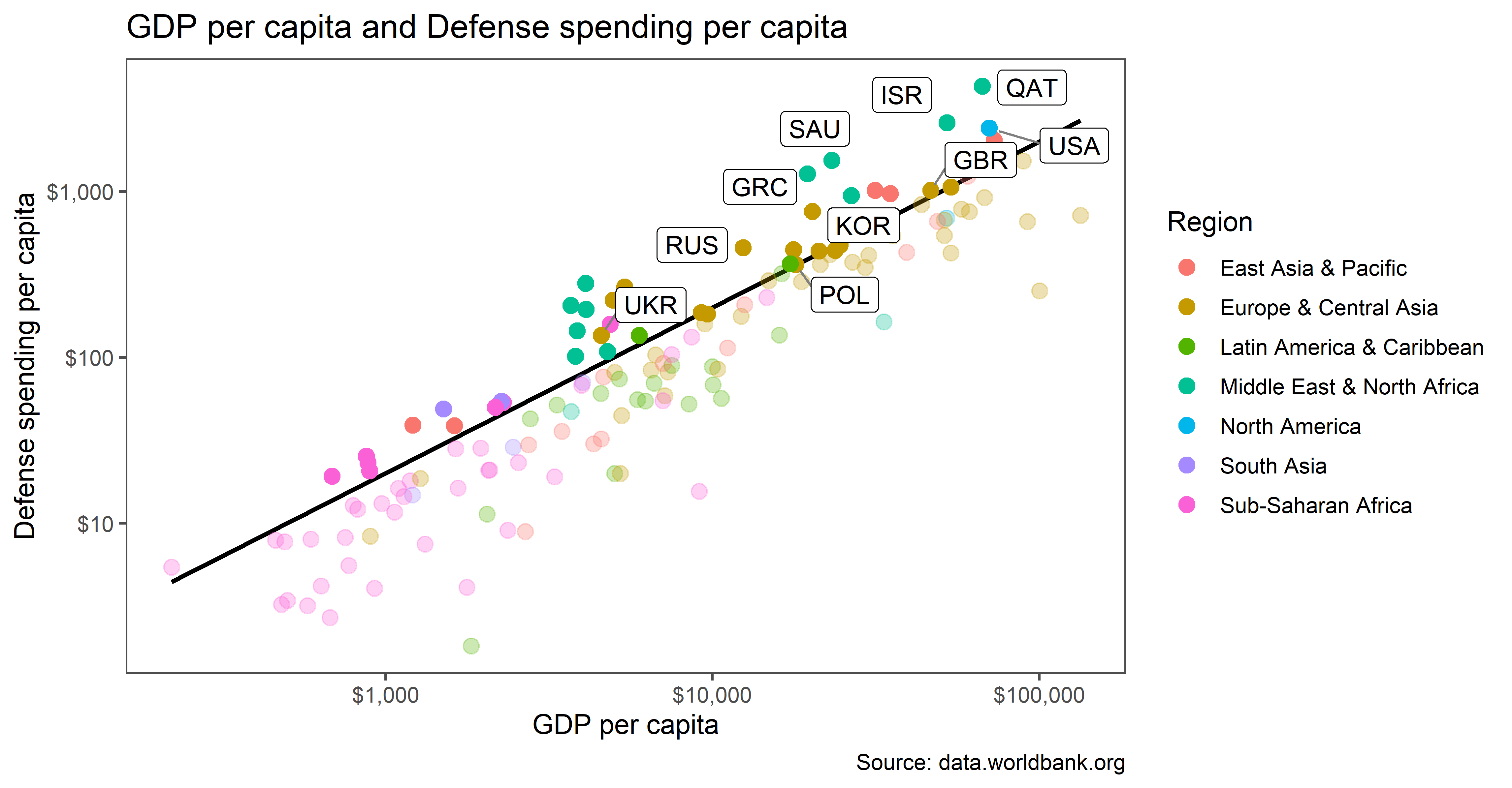
IndeterminateYogurt OP t1_j2cvgov wrote
Data: data.worldbank.org, data sets for gdp, population, defense spending, percentage of defense spending.
Tools used: R with ggplot2
Explanation: The black line represents 2% of GDP spent on the military, hence countries above that line spend more.
Therealdickjohnson t1_j2dl65s wrote
A little note on the graph saying the black line represents 2% would help.
soveraign t1_j2ec0ew wrote
Agreed. Once you figure that out the presentation is quite interesting.
popejubal t1_j2dqrqx wrote
The US spends more than $4500 per capita on military. Your chart looks like the US spends about $1000 per capita. What number did you use for US military spending for this chart?
[deleted] t1_j2dtqwb wrote
[deleted]
popejubal t1_j2e9fr1 wrote
It should still be noticeably higher because each measure is only 10 times the last. Not having horizontal lines makes it hard to see as well.
This data is interesting, but it is not beautiful.
Better__Off_Dead t1_j2fgf2r wrote
In 2020 it was $2,187 per capita on the military, but they spent $11,945 per capita on healthcare.
As far as % of GDP, in 2020 it was 3.7% on military and 16.8% on healthcare.
newaccount721 t1_j2d2w39 wrote
Very cool. Thanks for sharing.
mungerhall t1_j2d9juw wrote
Is this one of the data sets you used?
[deleted] t1_j2dbgf5 wrote
[removed]
Viewing a single comment thread. View all comments