Submitted by houndrunner t3_102exls in dataisbeautiful
Comments
querry22 t1_j2tx6g0 wrote
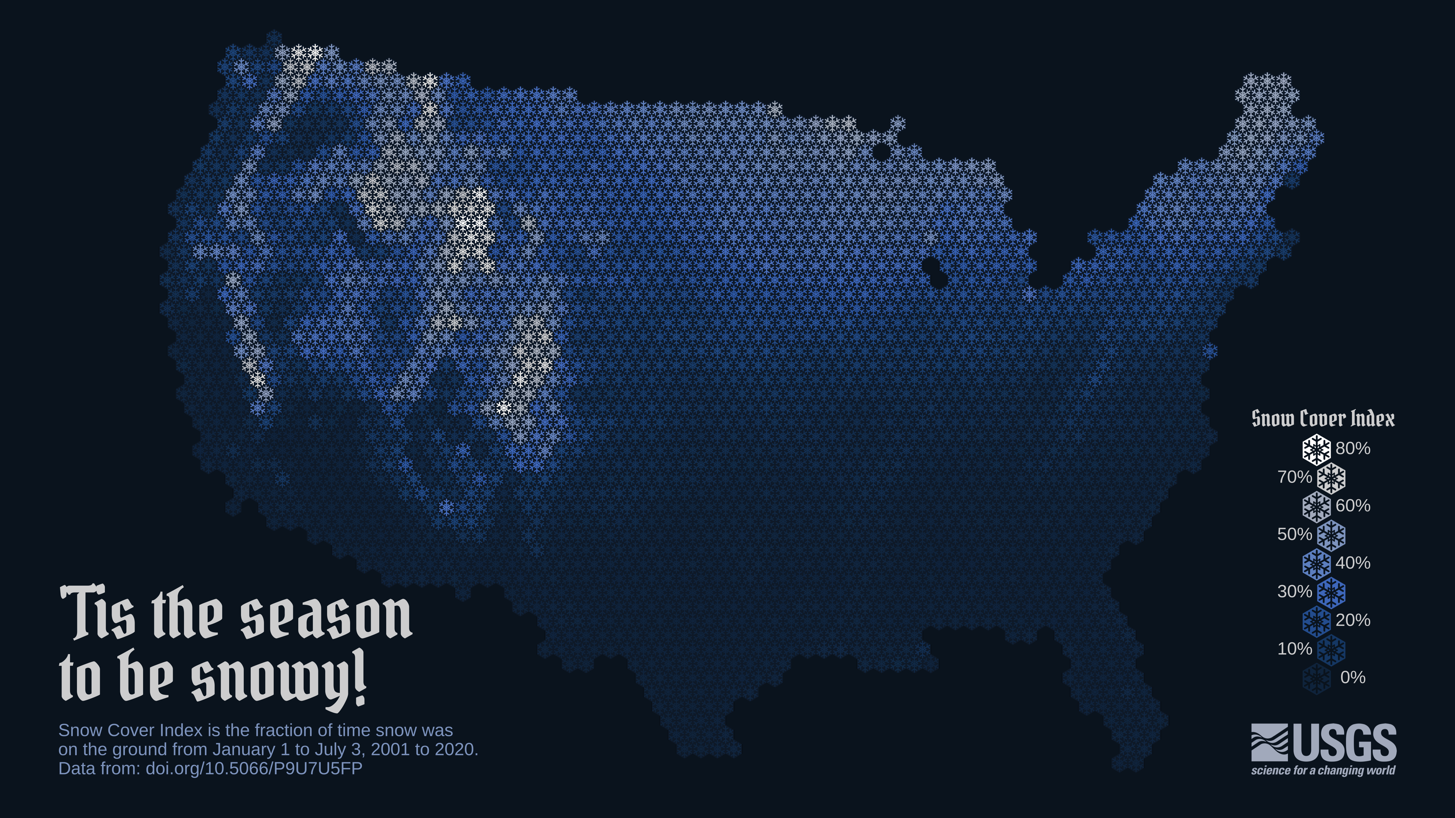
Why would the graph be during this time? Why not start it in October or November
kooky_creative t1_j2vkxiw wrote
Love the modern, sleek style of this data!
wnaj_ t1_j2w7iz4 wrote
yeah really weird timeframe
jayuhl14 t1_j2xeqcy wrote
Nov-May would make more sense definitely
Jumpshot1370 t1_j3ipubf wrote
October to May, or November to April. For the core of the winter season I suggest December-February.

houndrunner OP t1_j2sp1x7 wrote
A map of the contiguous U.S. using a snowflake hex pattern to show snow persistence over a 20-year period. Snow persistence is measured as the snow cover index, or the average fraction of time snow was on the ground from Jan 1 to July 3 from 2001-2020. Snowier places are white with snow, emphasizing the Rocky Mountains and Sierra range in the western U.S., and Maine in the northeast. The majority of the southern half of the country is within a 0-10% snow cover index.
Made using the sf, terra, ggplot2, ggimage, scico, magick, and cowplot packages in R.
Data from: https://doi.org/10.5066/P9U7U5FP