Comments
nyyanx020701 t1_j6mm3g6 wrote
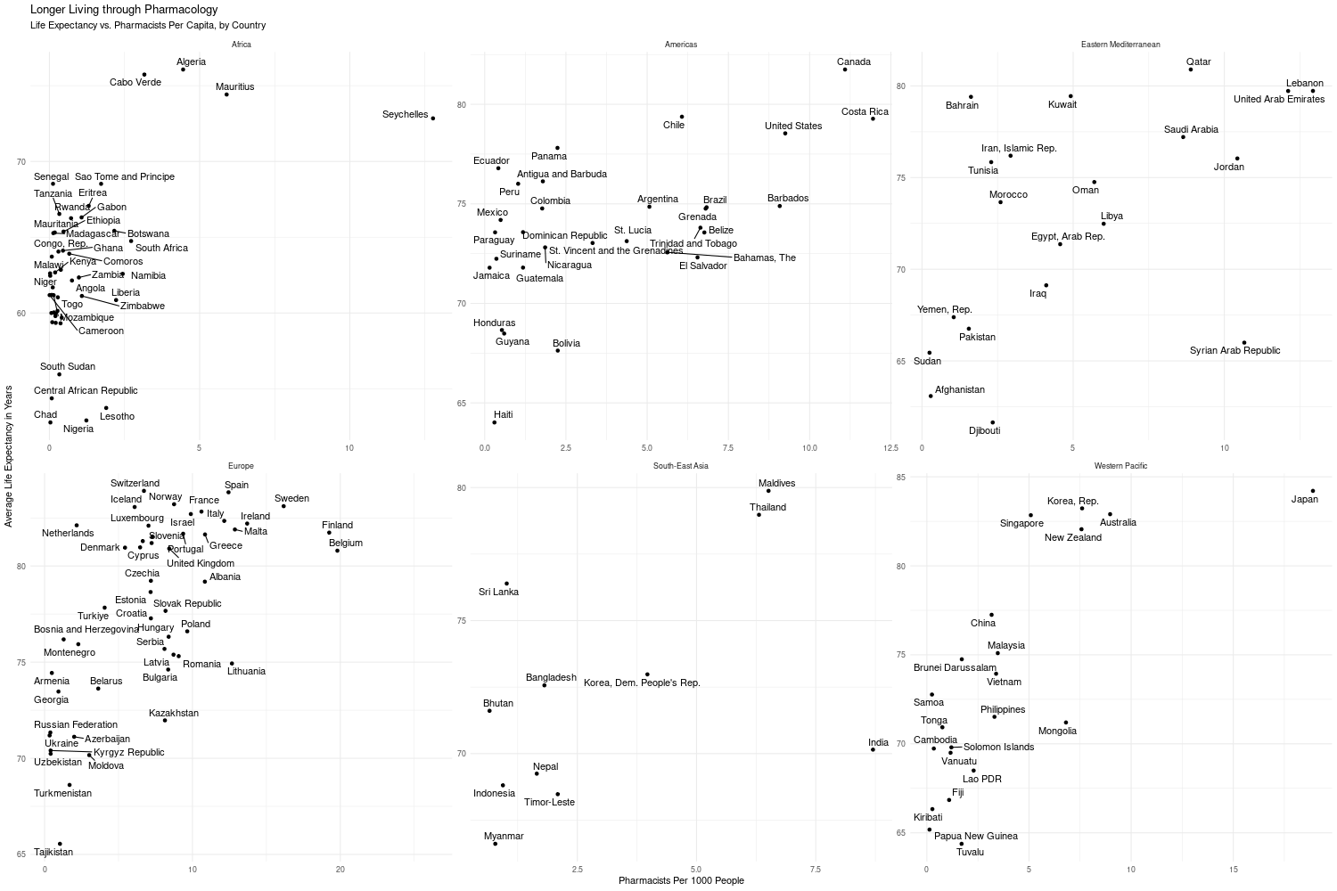
It’s not incomprehensible, but it’s not easily comprehensible either. There are 6 charts that at first glance (and second, third, fourth glance etc…) looks like one chart.
It’s an absolutely horrendous visual
Dorkus_Mallorkus t1_j6e709k wrote
Might be interesting information...but I'd never know, because this may be the least beautiful data I've ever seen.
caroticum t1_j6cx5q0 wrote
I don't like it. It is a case where correlation does not imply causation. The fact that there are fewer pharmacists does not necessarily mean that people have more/less access to medication. The most significant factor is the wealth of the average person and their lifestyle.
pennypumpkinpie t1_j6hmv1t wrote
As a pharmacist I can confirm that I directly increase the lifespan of everyone around me.
JackdiQuadri97 t1_j6da7et wrote
Really bad division between regions, different scale in graphs makes much harder comparison between different regions.
Also the title seems to imply causation and let's be honest, the amount of pharmacists has a pretty low impact on life expectancy, the just handle out simple medicines or what the doctor prescribed, having doctors per capita would definitely be a much better comparison
wintherwheels t1_j6emebf wrote
I thought this was all one chart. I was zoomed in on mobile scrolling around trying to figure out what the hell was wrong the axis. Hurt my brain.
vocabularianrx1 t1_j6g98c0 wrote
Omg your comment saved me I thought the same thing and then I realized in the same, nondescript font at the top, it said the sections like "Americas"
EYgate8 t1_j6d1wi8 wrote
Please recheck the graphs again.
Tacomonkie t1_j6cweir wrote
It took me a good minute to realize that you didn't mean life expectancy of pharmacists.
ImpressiveShift3785 t1_j6gagz8 wrote
The weakest correlation I’ve ever seen
ImpressiveShift3785 t1_j6gamni wrote
Wait. There are 4 graphs. The absolute shit show if a post is this
HoleyBread t1_j6lqdqw wrote
It gets worse. There are six.
Dragon-Ash t1_j6gaqhb wrote
Good god that is ATROCIOUS. You have six charts not one, the x and y axis on the charts are not the same - this might be the worst graphic I've seen in a long time.
Utter rubbish.
Enola_Gay_B29 t1_j6d46rd wrote
What kind of categories are that?
You divide Asia up between Eastern Meditteranean (btw. Morrocco is as west as you can get in the mediterranean (even more than Algeria, who you put into Africa), but ok), South East Asia (why tf is one of the Koreas in that category?) and Western Pacific, but then lump Uzbekistan and Turkmenistan in with Europe? Also, how tf is Cambodia Western Pacific, but Indonesia and Timor-Leste are not? Have you ever looked at a map?
whatweshouldcallyou OP t1_j6d5cob wrote
Categories came from the data.
Enola_Gay_B29 t1_j6d756m wrote
Do you have a link to that data, too? Because the one you posted in another comment (https://www.theglobaleconomy.com/rankings/pharmacists_per_1000_people/) doesn't correlat to anything shown in your graphs at all. There is only data from 2 Asian countries (South Korea and Israel), 20 European ones, as well as Canada and Australia and New Zealand. And the values range from 0.2 to 1.3 not in the double digits like in your graphs.
DataMan62 t1_j6h2zgu wrote
Very interesting topic. Unreadable graphic.
40for60 t1_j6dznmp wrote
Canadians like maple syrup, hockey and drugs.
wildtyping t1_j6fq9mr wrote
The two graphs superimposed with different y axes is misleading and also it is lacking statistical analysis
Prahaaa t1_j6h9z5t wrote
TIL that South Korea is in SE Asia and Vietnam is in the Pacific!
pennypumpkinpie t1_j6hn12w wrote
Hey OP I’d love to see this reformatted and reposted. I’m a pharmacist so obviously I think the topic is interesting. I assume the correlation shown here has to do with better access to care overall and more sophisticated institutions. Good luck!
imadgalaxyx t1_j6htcin wrote
There’s obviously no correlation.
[deleted] t1_j6iocon wrote
[removed]
midwestck t1_j6js14f wrote
Confounding variables. Confounding variables everywhere.
BBQCHICKENALERT t1_j6ka5wr wrote
Can someone actually put this data in a visual form that’s not a weird form of torture to decipher? Thanks in advance
im_not_a_numbers_guy t1_j6lnre5 wrote
*Nowhere can have more than 1 pharmacist per capita. And I'm pretty sure they'd all be dead.
whatweshouldcallyou OP t1_j6cvla2 wrote
Data: World Bank Data for Life Expectancy. For Pharmacists Per Capita: https://www.theglobaleconomy.com/rankings/pharmacists_per_1000_people/
Tools: R, ggplot
Note: Relationship holds in panel model controlling for GDP Per Capita, with both fixed and random effects

zeiandren t1_j6cwkjh wrote
Incomprehensible graph format