Submitted by ExternalUserError t3_zwm0hr in explainlikeimfive

I read recently that Photoshop had Pantone colors, but recently Adobe's Pantone license expired, so images created using Pantone colors simply lost that part of the image.

I'm not an expert on color, but isn't almost anything represented by RGB? Why aren't those colors just ... colors? With specific number values that are encoded? Can these colors not be understood through regular web hex codes?

572

Comments

You must log in or register to comment.

breckenridgeback t1_j1vg8yr wrote

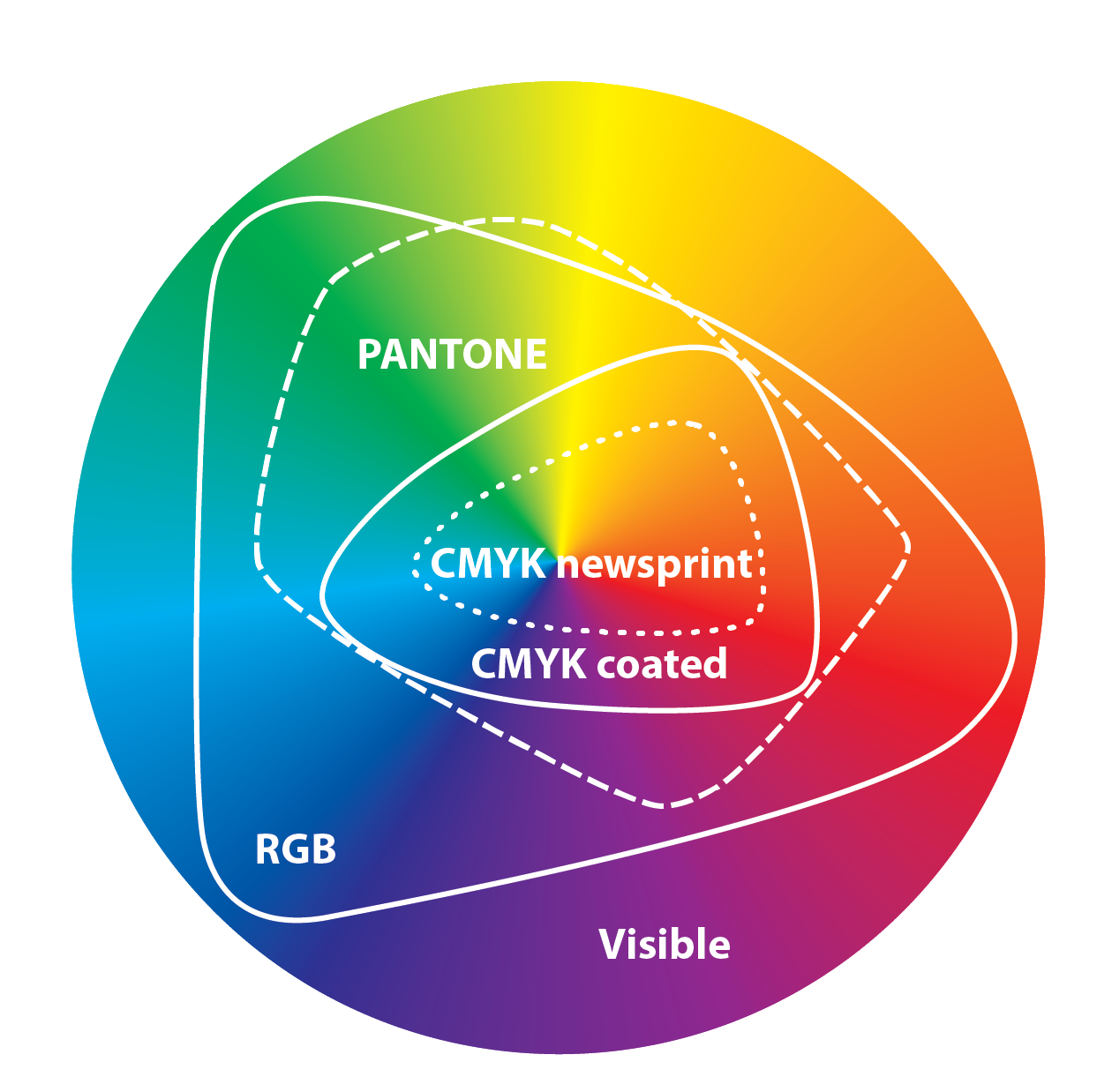
Well, one, not everything can be represented by RGB. The RGB color gamut (the colors you can produce by mixing pure red, green, and blue) does not even close to cover all possible colors. There are many colors, particularly the richer shades of teal, green, and greenish-blue, that can't be displayed that way. More generally, no finite set of primary colors can produce every chromaticity (combination of hue, which is what 'type' of color it is, and saturation, which is how intensely colored). Such a finite set would produce some straight-sided polygon in the space of possible colors, which can't represent the smoothly curved available space (and, in practice, such a set would also require maximally saturated colors, which real dyes and the like don't produce).

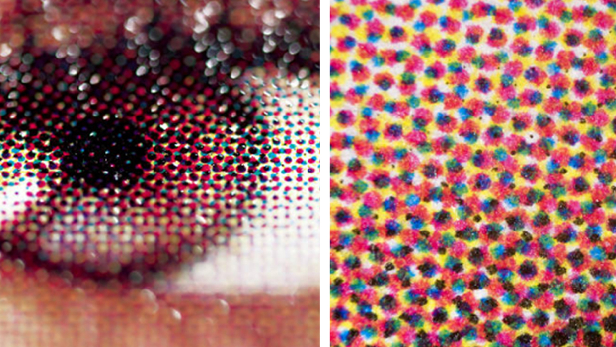
For two, since different purposes use different mixes of pigments, the spaces each thing can cover vary. Your printer colors, for example, don't align with the colors your monitor can produce, because printers are using subtractive primaries (which absorb light) rather than glowing colors in the monitor (which add light). One common color space for printers is CMYK (for cyan, magenta, yellow, and key [i.e., black, used to darken colors]), and you can see that CMYK and sRGB have different available colors.

And for three, different monitors and other forms of display show things differently. If you want to be able to design a shirt on your computer, then reproduce it in fabric dyes, you need to understand the relationship between those two color systems.


Which brings us to pantone. Pantones don't actually represent any specific mix of pigments, like RGB or CMYK. Instead, they represent an abstract idea of a color that can be consistently represented across different methods of displaying one. Each pantone has representations in RGB or CMYK or whatever else, provided that the color it represents is inside their gamuts, but the pantone is independent of those specific representations.

It's kind of like the idea of the number two existing separately from the symbol 2 (used to write it in Arabic numerals) or the symbol 二 (the Chinese character for this number), or tally marks like ||, or the spelling t-w-o. These are all representations, appropriate to specific situations, of the abstract idea of the number two.

In practice, using pantones lets you design "in pantone", and then implement that design across a wide range of possible materials and means of producing color. Each pantone can be handled consistently, and then implemented in whatever means of producing color support that pantone in their gamuts, so that purple on your screen and purple on a printed page and purple on a shirt all look exactly the same.


EDIT: Hello, /r/all. Before you feel super smart and go "um a 5 year old wouldn't understand that" you should read the sidebar:

> LI5 means friendly, simplified and layperson-accessible explanations - not responses aimed at literal five-year-olds.

403

dmazzoni t1_j1vj670 wrote

How does a graphic designer work with colors in Photoshop, knowing that many colors can't be accurately represented in RGB on their computer monitor?

Would you look at Pantone swatches to see what the "real" color will look like, then look at the Photoshop version and imagine what the final result will look like with the real Pantone color? Basically is it mostly in your mind and your ability to imagine what the abstract digital art would look like when finally realized?

Or do you use software to try to model the resulting material and render it under different lighting conditions?

Or do you print or order samples of the target media in the correct colors in order to see what it will look like and adjust?

Or something else entirely?

49

JoCoMoBo t1_j1vowex wrote

>Would you look at Pantone swatches to see what the "real" color will look like, then look at the Photoshop version and imagine what the final result will look like with the real Pantone color?

This, and spending a lot of time colour calibrating the monitor to actual colours. Apple monitors and lcd screens were great as they could be colour calibrated easily.

56

DiscoveryOV t1_j1wgcm8 wrote

I believe they also generally just came calibrated from the factory, no?

0

C47man t1_j1zvs2z wrote

>I believe they also generally just came calibrated from the factory, no?

Any serious artist using a computer monitor will calibrate it, normally using a probe and some specialized software that works with it. There's a few different brands out there. The cheaper end is iirc around 150-250 USD, like the Spyder

1

ocelot08 t1_j1w29xw wrote

Basically all of the above/whatever you have access to.

For production runs, ordering proofs of your work is very important before they run too many. You can make adjustments in a lot of different ways. But pantone is REALLY helpful so you and the printers have the same reference point for a color (theoretically).

I love this stuff, if you have any questions I'll ramble on about print production.

35

Ownzies t1_j1x8hte wrote

What do you do for work, if it is related to this?

1

ocelot08 t1_j1xd12j wrote

Graphic designer with experience with print and print production

2

Wanderslost t1_j20dwpj wrote

Is it possible to get 12 color wheels of Pantone colors that mimic specifice color spaces, such as traditional RBY, RGB, CMKY and even artistically pleasant (but theoretically unsound) spectrums?

I would prefer wheels that have different saturation in rings. I have spent a lot of time fiddling with photoshopping and pdfs of a Pantone swatch book. It has been interesting, but I have to believe this work has been done before.

1

ocelot08 t1_j20gs91 wrote

Lmk if I didn't understand your idea right, but based on my understanding of what you're proposing:

The issue with color matching is really the physical world. Mixing paints and printers aren't perfect but also leds and screen technologies are all a little different. Like one batch of leds may be a little more red, another a little more blue, so even if the computer gives the led the same color data, it will look different in the physical world.

But I think your idea could work, but you would need to control every stage of production and keep everything calibrated together:

  • all designers computers in the same color space
  • all monitors calibrated the same
  • all printers calibrated the same (both in office and at in the print shop)
  • and if you are using any digital displays, ideally those are all calibrated as well.

I think it's possible, it's just a lot of work for not much reward. And note that like anything in the physical world, it all deteriorates over time from wear or sunlight or whatever, so all those things would need to be calibrated regularly and done together.

Instead, we usually try and keep our pantone chips away from light, sometimes need to rebuy a pack, and just eyeball color matching with printers. It's generally assumed everyone in the chain has access to a well kept at least basic set of pantone chips.

Digital is a mess and basically we just don't have control (although I don't think ive ever used Pantone for anything digital). We test on as many different devices we can, but there's always going to be some folks with really terrible phone screens or something.

1

Wanderslost t1_j20vrrv wrote

Thank you for your time.

I manufacture acrylic dice. I have 3 introductory (pantone C) colors that I just picked out because I liked them. The essence of my problem is I would like to offer 3 sets of 12 colors based off of these original colors. But I don't know how to pick the future pantones, though I have the original codes.

For bonus points. I thought it would be interesting if each set of 12 colors used a different color theory. However, I would settle for just making the house standard the painter's color wheels (ryb).

Not much translation needs to happen here. I provide the Pantone number, and they do it. The final product just needs to make sense with the dice already made. My comments above about pdfs and such was just a description of my (failed) attempts to figure this out.

Thanks again!

2

ocelot08 t1_j21buey wrote

Ah interesting. I mean it's not gonna be much help, but I would basically just create a color palette in some Adobe program and then match pantone swatches to it. As it sounds like you've seen, color theory can get really complicated.

A nice tool is Adobe color. It won't give you a set of 12 but it could make for some good starting points as they have a number or ways to use different colors and push and pull them together as a set.

Anyways, good luck!

1

rabid_briefcase t1_j1wajxf wrote

> How does a graphic designer work with colors in Photoshop, knowing that many colors can't be accurately represented in RGB on their computer monitor?

First off, Photoshop itself has some tools. You can configure your color spaces while working. Photoshop will then highlight unprintable colors when they're out of gamut. It can also highlight colors that will exist in print but can't be displayed on your monitor.

Other than that, print shops use boxes and books full of printed color reference cards.

If you aren't color matching a reference system like Pantone but are instead trying to see exactly how the final print will look, shops will print out a bunch of their own reference cards and chips on the papers, cardstock, vinyl, polyester, or whatever it is they'll be printing on.

And it isn't enough to just have one and keep it forever. Papers fade and discolor, inks fade and discolor, so the colors can drift away in unacceptable ways after two or three years. Bigger print studios will budget a few thousand dollars each year to continuously update their reference colors.

Every blend ends up being slightly different. Printing a specific CYMK on one brand of cardstock will have different appearance than that same CYMK on a different brand of cardstock. Printing on glossy paper will look different from matte paper. Printing on paper versus printing on vinyl will look different. Each one will be similar, and some will be nearly identical, but visually each will still be different.

That's part of the appeal of Pantone, the print shop is supposed to account for it and fine tune for whatever inks, dyes, and media they're using so it produces a match. If someone is expecting P15-5519, but it happens that the specific paper happens to make the print a slightly greener turquoise, the shop is supposed to adjust the color mix so it matches the reference color instead of matching a specific CYMK blend. If this combination happens to need a little more black or a little less yellow, they'll adjust the CYMK to whatever it needs to be in order to visually produce the Pantone color P15-5519.

Getting the colors to match exactly is one of the reasons for proofs before a big print run, you want to verify with the customer that they're satisfied before running the full batch. It isn't just for issues like spelling and placement (although those are part of it), it's also to ensure the color is precisely what they expect on the various media used.

16

dmazzoni t1_j1wbzqq wrote

Thanks, this is really fascinating.

Are you saying that a good print shop is calibrating their equipment so that it's producing colors that match Pantone in general?

Or are you saying that the graphic designer will send them the file to print and ask them to custom-match a few specific colors in the image to specific pantone shades, specific for that job?

If the latter, I'm assuming you'd pick just a couple of important shades.

3

rabid_briefcase t1_j1wonqu wrote

It depends. Something like a corporate logo that it supposed to be exactly a specific reference color needs to match exactly. Something less precise like a family reunion banner would have more leeway. The clients, the job details, and the nature of the job tell a lot even without explicitly asking.

7

Shotgun81 t1_j1ydqgr wrote

Man, when I was in art school and learned about how crazy specific and controlled corporate colors were it blew my mind.

1

gridsandorchids t1_j1xh0di wrote

Print shops also typically have color definitions that apply to specific processes that you should follow for a job.

For example, dark blacks in print. In CMYK, where K is basically black, going 0/0/0/100 is not a very dark black. It needs other colors mixed in. But if you do too much, you can wind up with a black that's too richly mixed and won't dry properly, and wind up smearing and ruining your prints.

A print shop will typically have a specific CMYK mix you should use for the richest black without fucking things up, that looks something like 30/30/20/100. They will also often use something like 0/0/0/100 to define what is essentially an alpha layer for some other process layer like gloss or glitter or embossing. You provide a layer of the design where black is what gets embossed and white is what doesn't, for example.

3

No-Barnacle2180 t1_j1x6ks5 wrote

"Getting the colors to match exactly is one of the reasons for proofs before a big print run, "

Say, I went online and ordered printing on tshirts with image I creared in Photoshop. The Printers sent me a pdf proof via email. Now you have an image I created in Photoshop being printed on textile with a pdf proof. Impossible to know what the actual colour will be on the physical tshirt, no?

3

strawhatArlong t1_j1xj5ap wrote

Yep, this is a common problem. If you ever create a t-shirt in Photoshop and send it to a t-shirt company for printing, they'll usually provide a list of guidelines to follow to minimize the risk of this happening but a lot of non-designers won't always follow them.

3

rabid_briefcase t1_j1xjlqn wrote

That is the kind of print job that rarely requires exact matching.

If you have actual need to get a match, you will need to use a reference system like Pantone. Think along the lines of a major corporate logo. It should have been a part of the bid.

For most tshirt orders you will need to trust the person working on the other end. Ask them for their thoughts and listen to their response. They spend all day, every day working with the materials and know how yours will look.

You won't get a perfect color match from the image, but you can check everything else. Tell them your concerns and ask them questions before you sign off. If they are hesitant about your design it is a big warning. If they are confident it will look nice, go for it.

2

felis_flatus t1_j1w7948 wrote

I can’t speak for others, but I’ve found color calibrating my monitors to be a chore and not entirely accurate. So I just work in a CMYK color space in photoshop, Illustrator, and/or InDesign, get things roughly how I want, print a sample, adjust, print, etc, until the color is to my liking.

Different printers will also represent colors differently, so I either need to print on the same type I’ll eventually have the job printed off of, or understand how they treat the colors differently so I know roughly how it will change. That’s also a reason I keep multiple printers around.

Lastly, if I’m designing for screen only, I’ll just use an RGB color space and check it on multiple devices/monitors to ensure it looks good everywhere. That often means compromising on the exact color, but the goal is to make something pleasing for as many use cases as possible.

6

strawhatArlong t1_j1xj81u wrote

I work with two monitors from two different companies (my regular computer monitor and a Wacom drawing tablet). Color calibration is such a nightmare.

2

felis_flatus t1_j1xxw6p wrote

It really is, which is why I gave up on it. And with so many new types of screen technologies, it’s only gotten worse. Oh well

1

breckenridgeback t1_j1vkkgu wrote

I don't know the answers to these questions. I'm not a professional graphic designer. I do know that Photoshop and other tools support working in different color spaces, wider than those that can be displayed on the web (which uses sRGB as a standard, covering only about a third of human color vision). Some very high-quality monitors support a very wide gamut of colors, and I would assume (but don't know) that those are used for exceptionally high-fidelity graphic design work.

2

strawhatArlong t1_j1xiv12 wrote

I do the first and last one usually. If the project is given the time and resources that it needs, you'll usually order lots of test prints and make corrections as needed. But it can be a huge pain in the ass.

1

joelluber t1_j1xzbik wrote

In addition to what everyone else has said,

>Or do you print . . . in order to see what it will look like and adjust?

Many printing/publishing companies have special laser or inkjet printers that have been specially calibrated using a standard called SWOP (Specification for Web Offset Publications; not "Web" here refers to web press printing not the world wide web) to closely mimick what something will look like on the industrial scale printing presses. In the early days of my publishing career, I worked on paper page proofs made by a normal mediocre quality office printer and also got a stack of high quality SWOP proofs just of the art.

1

twohusknight t1_j1vm4jm wrote

The ability of different monitors to display the same thing in RGB as might be printed in CMYK is down to the ICC profile, not Pantone. PMS just provides the color references, it is the job of the printer company, display manufacturer, etc, to ensure appropriate mapping of the gamuts.

14

TotallyRealDev t1_j1vwh66 wrote

But the person working on the colours needs a reference or they are just sending bad data to the manufacturers

9

kingdead42 t1_j1w4fsf wrote

That's why you can buy the giant reference books from Pantone. They contain physical cards with color swatches on them and they make sure that every single color swatch they produce labeled "Pantone color <x>" matches every other "Pantone color <x>" in the world.

4

Lurker_81 t1_j1w722n wrote

Linus Tech Tips YouTube channel has a couple of great videos on the topic of Pantone colour chips and their digital equivalents (including the latest controversy with Abobe suite)

3

dmazzoni t1_j1vjkgf wrote

Also, another question: what is your opinion on Freetone and http://adaptstudio.ca/ocs/ and other potential alternatives to Pantone?

Are they inferior in any significant way, or is it purely a question of Pantone's ubiquity and the difficulty of switching?

How much time/effort would it take to switch an existing project from Pantone to some other system?

5

someone76543 t1_j1vx1x5 wrote

Having a widely supported standard is important.

Pantone is that standard, they have basically a monopoly on professional colour definitions. Everyone competent who is using colour professionally will understand a Pantone colour. Designers have lots of existing designs using Pantone colours. Manufacturers know how to produce all kinds of plastics, fabrics, paints, or anything else, to whatever Pantone colour you want.

Introducing a new standard would be very hard. All designs would need updating. All manufacturers would have to invest extra money in supporting it. Someone will have to produce the definitive colour samples that define the colours, and designers and manufacturers would have to buy them.

And there is little incentive for anyone to invest that time and money. The designers will still need Pantone to deal with the vast majority of manufacturers. The manufacturers will still need Pantone to deal with the vast majority of designers. It's extra cost for no benefit.

10

RandomNumsandLetters t1_j1w78bf wrote

No benefit except you don't have to pay for pantone...?

5

dravik t1_j1wdkn3 wrote

This gets into a cost benefit question. Pantone air carefully calibrate their prices to keep them just below where it's worthwhile to switch.

Eventually they will get too greedy, but that may take decades.

6

dmazzoni t1_j1y3emh wrote

Don't you think that the current kerfuffle with Adobe shows they erred a bit on the greedy side?

1

dravik t1_j1yqgk4 wrote

Are they charging more than it costs to change? I don't think so. I think the industry will complain, but they will pay because it's easier, faster, and cheaper.

1

someone76543 t1_j1xdzoh wrote

Pantone is used for communication between different people. If you're not communicating with someone else, then you do you and use whatever colours you like.

Usually it is for communication between a designer and a manufacturer. The designer chooses a Pantone colour, and the manufacturer makes the thing be exactly that Pantone colour.

The designer and manufacturer are usually different companies, often in different countries.

So if you are a manufacturer, you DO have to keep paying for Pantone because that is what most of your customers will be using. And if you stop accepting designs that use Pantone colours, or if you just get the Pantone colours wrong, then the customers will go to a different manufacturer.

If you are a designer, you DO have to keep paying for Pantone because that is what most of your manufacturers will be using. Unless you have the luxury of only selecting manufacturers that support <alternate colour system>, but in that case either:

  1. you're a huge company, that can dictate standards to their supplier. Huge companies will have a huge existing library of designs, and the cost of switching will likely dwarf the cost of Pantone. OR
  2. you're a tiny hobbyist or small business. Hobbyists & small businesses who care enough to use ANY colour system are a niche market. So most manufacturers aren't going to implement a whole separate colour system just for "hobbyists & small businesses who care about exact colours but can't or won't pay for Pantone". Those people don't have much money to spend getting things manufactured - if they had lots of money they could buy Pantone.

The only way you can stop paying for Pantone is AFTER the whole industry starts supporting the new colour system. And for the reasons listed above, that is unlikely to happen.

So any competing colour system is doomed.

It's a classic chicken/egg problem.

3

breckenridgeback t1_j1vksnc wrote

I don't know the answer to these questions, either. My best guess to the last one is "substantial but not totally prohibitive", but I don't know.

1

brainwave4802 t1_j1wl8e3 wrote

Is there a reason we cant just define such "abstract colours" as coordinates in one of the CIE colour spaces that encompasses human vision? Since this would represent all "useful" colours and other colour spaces such as sRGB are subsets of this. Essentially im asking if all pantone colours can be mapped to CIEXYZ or CIELAB coordinates, and if so doesnt it make pantone redundant?

5

breckenridgeback t1_j20cpqg wrote

It does in terms of representing the colors humans can see, but you still need to be able to produce those colors in a range of different media.

2

PumiceT t1_j1w63az wrote

Also keep in mind that there are fluorescent and metallic inks that can’t be represented by either RGB or CMYK. You kinda just have to imagine and hope for the best with some spot colors.

3

Suthabean t1_j1wqtmd wrote

I don't know about any of this, but I despise the word "Pantone".

3

breckenridgeback t1_j20clfo wrote

It's just pan- (Greek for "all" or "everywhere") + tone (as in, shade of color). Seems like a good name for a universal color-matching system.

1

Suthabean t1_j20d0bc wrote

Sounds like some shitty shampoo, lets be honest prof.

1

kzgrey t1_j1yaevs wrote

Every color that a standard human can perceive can be represented by RGB. These are the colors our eyes see. RGB on an electronic display screen is different from how something appears on paper because RGB represents both color and magnitude on a computer screen which is emitting light while RGB in paint pigments is not additive -- it gets darker with each pigment added. This is why red and green on a computer screen produce yellow but red and green paint will produce a crappy shade of brown. Light emission is different from light reflectance. Pantone is just a methodology for simulating how things on the screen will appear in print. There's other crazy stuff happening in our heads when it comes to color. The blue/gold dress is a good example -- the colors around an object influence what color we perceive things as.

2

breckenridgeback t1_j20chmx wrote

> These are the colors our eyes see.

No, they aren't.

The three cones in your eyes respond most strongly to deep blue-violet, green, and yellow-green. But they see a distribution of colors around those peaks.

What you're getting at here is the idea that color is about tristimulus values, not the spectral power distribution. And that's true, at least under the assumption of humans with normal color vision.

But red, green, and blue light are not the tristimulus values, and don't cover all possible stimulus values that can be produced by a spectral distribution.

1

Seaniard t1_j1wcsrh wrote

You know some very smart five year olds.

That being said, this is a very helpful explanation.

−7

turnedonbyadime t1_j1w18m9 wrote

A five year old would not understand this.

−26

DonutCola t1_j1w4nbx wrote

“Pantone is a company that tries to make sure that purple markers are the same color as purple crayons. They do other stuff too like t shirts, dresses, or even toys. That way everything matches and looks pretty”. There you go.

0

dperry1973 t1_j1vqygw wrote

RGB doesn’t translate well to print media because print inks are ether Standard CMYK or Pantone. Commercial printer inks can reproduce a range of colors which can’t be 100% reproduced with RGB because RGB is more restricted. Look up “color spaces”.

I did a logo in Pantone coated ink and the client slashed the budget which required pivoting to standard CMYK inks. The brick red I chose came out as cherry red because those two reds don’t translate. The deep teal I picked came out as navy. This is the challenge of dealing with incompatible color spaces.

372

PumiceT t1_j1w5ygj wrote

This is when a color bridge book from Pantone would have done you a lot of good. You can compare what will end up in CMYK to what you want, and adjust accordingly.

117

dperry1973 t1_j1w6byq wrote

I was using the Color Bridge book. But I had to give the PMS solid for Pantone CMYK. But said PMS spot color had no equal in CMYK and I had to embrace to suck of cherry red to make the deliverable.

Edit: grammar

82

XkF21WNJ t1_j1ws08c wrote

It's not so much representing them in RGB that is a problem, you could do it with negative values if you really wanted to. The main problem is that the computer monitor wouldn't be able to display them accurately, which I reckon is most of the value Pantone added, colours with fixed IDs that have some kind of physical reference so you know what they end up looking like even if your display says otherwise.

22

campej90 t1_j1wuyfs wrote

Printing companies often offer reference books that shows exactly how CMYK colors turn out on the media you are working on, if you want to nail a color precisely they are very useful, because the transition from a screen to a piece of paper or a slab of acrylic can play A LOT of tricks. Even if it's not from the company that is going to get the job, it will still be close enough for most practical cases.

22

bandanagirl95 t1_j1x5l8z wrote

Also RGB is not consistent across various replication formats. And CMYK inks aren't quite consistent either, which is why proof prints are so important if you need color to be correct (especially if using a translation between color spaces)

16

LightningBirdsAreGo t1_j1wqfrk wrote

I’m a offset pressman and clients can be incompetent in many ways they don’t know about colors they don’t what a press can and can’t do they just want what they want

13

redsedit t1_j1yw66u wrote

To be fair, I have been studying this, and anything other than very basic color theory tutorials are near impossible to find. Most clients couldn't educate themselves if they wanted to.

Perhaps you could do some youtube tutorials.

5

ExternalUserError OP t1_j1xvjjv wrote

Thanks for the explanation.

So was the CMYK conversion impossible or just rushed? Like if you took the Pantone color you wanted to a color matching computer or something, and printed out a CMYK, they’d still be different?

And how does this work for a computer file? The computer monitor, even if a very high end one, still just has glowing primary color pixels. If I screenshot an old Photoshop open with Pantone colors, the screenshot should look identical on screen, but it would be different printed out?

7

plaid_rabbit t1_j1y3vyb wrote

The tricky part is defining “CMYK conversion”. A strict “technically correct” conversion tends to look terrible.

The way you do colors on a screen is by blending RG and B light. This is called additive color. CMYK adds pigments that block all but a specific band of light. There are some colors that are super hard to reproduce in one or the other. A nice dark four color black is impossible to reproduce on a monitor, not just because it’s hard to get the screen super-black, but it also doesn’t absorb light reflected off of it. It’s not of it’s surrounding, it’s it’s own light source.

So you have to consider a lot of things when you talk about CMYK colors… like how white is the paper you’re printing on. A super bleach white paper vs newspaper, which is very gray-ish. If you spray a light mist of say red spray paint on each, they will come out to different colors. So what do you use for your baseline for your RGB-CMYK conversion? Now are you doing this with natural light, incandescent lights (which are slightly yellow) or LED lights (which tend to blue).

Pantone dodges this whole problem, and says what the finished product should look like. It’s right when it looks like the swatch from the book. And ink manufacturers make inks that you can put a thin solid coat down and hit the target without question.

20

ExternalUserError OP t1_j1ym42o wrote

Thanks for the explanation.

So when you use a Pantone color in Photoshop, there's extra data there about what inks to use, etc? It's not just the RGB value stored in the file, it's the actual Pantone color?

So for example, if I have a Photoshop file with Pantone colors and I take that file to a printers, they know how to print it better than RGB? Is that fair to say?

3

pselodux t1_j1z0x65 wrote

Yes, it separates the Pantone colour out almost like another layer.

When you usually send something to print, it gets converted into four colour layers—cyan, magenta, yellow and black. These become individual printing plates (or toner/ink layers in digital print), and mix together using dots at different densities to achieve the colours you used in your file.

If you use a Pantone colour, it’ll be converted into its own layer/plate, and printed using the selected Pantone formulation. This will be noticeable next to a CMYK mix because it’ll be a nice flat colour, while the CMYK mix will be made up of patterns of dots from each component colour.

edit: you don’t actually need to specify Pantone colours to do this either. You can simply set a colour as a spot colour and it’ll appear as its own plate (also known in software as a separation) for the press.

4

plaid_rabbit t1_j214ece wrote

In the file, it stores "This item is pantone-1234", and lets the software using the file figure out what to do with it. So when it's rendered to screen, it uses a lookup to pick a good RGB color. When it's printed in CMYK it uses another. When you check it against what light it reflects, that's it's own set of rules about what it's "supposed to" look like. Fancy industrial printers have the ability to load specific inks for specific colors. So a press might support 4 colors, which you normally load CMYK. But let's say you're making a bunch of pamphlets for one company, which is black and white, but they want their logo on each page. You can load Black, and 3 other customs colors in instead. Some machines support something like 8 colors, just for this reason. Sometimes you need to load white ink because your printing on non-white materials. CMYK is just the most basic way of printing color.

1

maartenvanheek t1_j1yg7dg wrote

... So a Pantone printing press has interchangeable/unique ink reservoirs for each pantone? Isn't that impossible to manage or very expensive to maintain a large stock of unique inks? Or do I misunderstand.

2

Noctew t1_j1yi5dp wrote

It is more expensive, and you would not have all Pantone colors available. But, as a printing house, when your customer like for example DHL tells you: "I need cardstock for 1 million envelopes printed with our logo, and it has to be PMS 2035 C red on PMS 116 C yellow." then you buy that exact inks from a printing ink manufacturer and print your cardstock - and if your paper was the correct brightness and the ink manufacturer has mixed the inks correctly, the colors will be perfect on the first attempt.

12

w0mbatina t1_j1yj39y wrote

A lot of pantone colors are actually a mix of more basic pantone inks. For example Pantone 7416 U can be created by mixing 16,70% Pantone Yellow, 16,70% Pantone Rubine red and 66,60% Pantone Transparent white.

You still need to carry a lot more inks than just the standard CMYK, but its somewhat manageable. For large runs you just buy the pre mixed inks, but for smaller jobs you can mix them yourself.

7

plaid_rabbit t1_j26rg3p wrote

You’re not quite envisioning the setup right. These machines use buckets/barrels of ink at a time. You pour the ink in.

And you don’t have one for each Pantone, but you can have a few tanks that you basically set up per run. So in the example where the guy is talking DHL, you might load it with black, pms 2035c and pms 116c. (I assume those are the official colors). When you’re done printing out the million envelops, you dump out any extra ink, and clean the Pantone ink out of the press, and load it with the correct colors for the next job.

2

dperry1973 t1_j212ojk wrote

Any commercial printing press will have capacity for CMYK ink plus multiple Pantone inks. A machine called a raster image processor reads say a PDF and generates individual printing plates for every color specified by the designer/client. A designer will apply Pantone color stickers to the ink jet or laser printout that the designer sends along with the digital file so that the print shop can prepare the printing plates and Pantone inks for the job. A machine like the automated paint mixers in a hardware store are used to mix up Pantone inks that a print shop doesn’t have on hand. There’s obviously an upcharge for custom inks which the cost is tacked into the bill. Clients will fire a designer for allowing the wrong Pantone colors to go to press. If a Pantone code is in the specification doc isn’t used by the print shop, the print shop will eat the cost of the mistake. There’s a “nobody got fired for choosing Pantone colors when it matters” mentality amongst designers and printers.

1

dperry1973 t1_j1y16eo wrote

"So was the CMYK conversion impossible or just rushed? Like if you took the Pantone color you wanted to a color matching computer or something, and printed out a CMYK, they’d still be different?"

Converting to CMYK causes a color shift because Pantone's spot ink formula has at times no 100% direct translation to CMYK. Spot inks are more like paint at the hardware store where RGB/CMYK is like scanning a paint chip from one store and having another store mix it. Sometimes the results are a bit off.

"And how does this work for a computer file?"

It's all coordinated magic between the graphics software, your operating system, and the output device. Your graphics app embeds a color correction profile which the OS uses to instruct the printer how to match the colors. But this tech is not a 100% rock solid science. Sometimes math doesn't convert colors correctly. That's why us old-timers will get a test print from the print shop before making an expensive mistake. Technology can fail.

5

TableGamer t1_j1y2i5z wrote

Is there any use for Pantone outside of print?

Edit: Thanks for the responses. I was thinking too narrowly of print only, and wondering about the usefulness of Pantone with print becoming less prominent with so much media on screens. But the whole world of physical products isn’t going anywhere, neat stuff.

2

dperry1973 t1_j1y31sl wrote

Industrial design. Linus at Linus Tech Tips uses Pantone plastic chips to ensure their vendors make merch with the exact colors in LTT’s color standards manual for their creative team.

Personally I use Pantone’s Bridge book which has swatches that are consistent from print, video, web, and social media because I deal with corporate clients with documentation up the wazoo on how to use their brand name in their project

8

Motokorth t1_j1y8r5r wrote

They have a pretty good video explaining why they use Pantone

1

mikemdesign t1_j1zo4z9 wrote

Which is fine until Pantone updates their Bridge book and create new CMYK match formulas.

1

w0mbatina t1_j1yj65b wrote

Pretty much every industry that deals with colour uses Pantone. My wife works in clothing design and manufacturing, and they use Pantone. Industrial design uses Pantone.

3

Wanderslost t1_j20c5ok wrote

I sell acrylic goods (dice). My manufacturer works in Pantone, specifically Pantone C. As far as I can tell, C is for surfaces, as opposed to photography and print.

I can attest that getting a spectrum of colors that is in your head translated to various color methods is much, much more nuanced than I expected.

1

bottomofleith t1_j1ww30n wrote

> RGB is more restricted

That's just completely wrong, please stop talking shit.

RGB has a larger gamut, or range of colors, than CMYK, end of.

−4

dperry1973 t1_j1x0die wrote

Ok if you’re going to be pedantic sRGB then. Most consumer displays are Rec 709 which has a more restricted gamut than sRGB. I’ve oversimplified to keep with the ELI5 format.

27

TenLongFingers t1_j1w3vq3 wrote

So the science of color is actually pretty weird. It doesn't behave as simply as you think.

Color behaves differently depending on how it's made. For instance, mixing all the paint (pigment, subtractive) together will make black, but mixing all the light together (light, additive) will make white. Pantone deals with pigments, and RGB deals with light. They're so different that there some colors are only available in light (RGB) that don't exist in pigments (Pantone).

(Without getting too into it, that's actually why cartoons nowadays are so much more vibrant and brighter. Everything is now made with RGB tools for RGB screens, and we skip the pigment stage from when things were painted on paper.)

Think of it like asking why there isn't a direct conversion between gallons and pounds. They both seem to measure the same thing at a glance, but they're actually different.

60

JohannesWurst t1_j20r381 wrote

Couldn't you also describe color kind of objectively as a certain wavelength? I guess purple has no wavelength associated to it.

Anyway, in the end the human eye of a non-colorblind person (sorry) decides which color a surface is. Two surfaces should be considered the same color if they stimulate the color receptors in the same way.

Pantone colors, CMYK colors and RBG colors still just stimulate color receptors in the eyes, so I still feel like they should be translatable.

There are a finite amount of RGB colors, of course, so we'd have to talk about arbitrary precision real number RGB, not just 24 bit. And another issue I can see, is that RBG can look different depending on the screen. There are calibrated screens, though – I think that means that someone has defined how FF0000 has to look like exactly.

This is not a correction, more a question. How can CMYK, RGB and Pantone be incompatible if the final arbiter is the same human eye?

1

csl512 t1_j212eht wrote

Nope. Spectral colors are those made by pure wavelengths: https://en.wikipedia.org/wiki/Spectral_color

In the chart in that page, there's a horseshoe shaped curve with numbers between 300 and 700. Those correspond to wavelengths. Anything not on that line cannot be made with just a single wavelength.

Color science is super weird and unintuitive, and relies very heavily on the human perception of it, which involves cone receptors tuned to different ranges of light, approximately but not exactly red green and blue.

If you really want to get confused, https://www.reddit.com/r/philosophy/comments/18rbn2/is_your_red_the_same_as_my_red/

3

mmmmmmBacon12345 t1_j1vmmri wrote

Color consistency on most systems is barely a priority. Home screens and printers vary wildly

RGB is only for illuminated displays and even that has some pretty wild variations as most screens are not calibrated and don't even try for perfect color consistency. Your average LED/LCD screen is TFT and color accuracy isn't even a priority. Higher end screens are IPS which is at least consistent with colors across itself, you can then get ones that are calibrated to get a consistent view of the colors between computer screens

Pantone isn't for display colors, its for print colors. Most printers are CMYK (Cyan, Magenta, Yellow, Black) but again there are calibration differences. For general use the CMYK values are close enough. If you want to make 50,000,000 of something at 8 different vendors and have them all look the same you'd need to have some way to specify colors and calibrations beyond just CMYK because that doesn't adjust for if printer A is inherently a bit Cyan heavy in its prints

That's where Pantone comes in. If you specify Pantone Red 032 and everyone has a Pantone calibrated printer and their booklet of reference swatches then all of them will come out looking exactly the same despite using different equipment

32

mysterylemon t1_j1vsrt6 wrote

This.

Pantone is basically so one person can say "I want this colour from this Swatch book and it needs to look exactly like this" and a printer operator 10 steps down the line can look at their pantone Swatch book and know they are matching to the same colour the original person is.

What Adobe displays on the screen is only a representation of that pantone colour in whatever colour space you are using. Monitor to monitor will vary and then actually printing will give another colour again.

There's no way computer software can display the exact pantone colour it is supposed to represent on every screen in the world accurately. Using pantone colours in illustrator, Photoshop etc. Is for reference. There is no CMYK or RGB value for any colour as that will vary across screens.

You would never go to a printer and say I need the colour on this logo to be c-14 m-45 y-89 k-20. You could but the result wouldn't be what you want. You could, however, use a pantone Swatch to find the closest possible match to what you want and ask them to print that, because then the printer can use their own pantone Swatch to match the colour when they print.

7

_PM_ME_PANGOLINS_ t1_j1w1kot wrote

Desktop printers and cheap bulk presses are CMYK, but a lot of industrial printing is spot-colour. If you’re printing advertising materials or signage or something, you load it with the exact colour inks you want in each area.

1

imgroxx t1_j1xywln wrote

How does this behave with different kinds of light sources? Some materials are more reflective in some frequencies than others, so a print in one material may look quite different from another when you bring them both under cheap fluorescent lights or something.

Or does Pantone specify a particular kind of light source too?

1

ocelot08 t1_j1w5qks wrote

Quick thought experiment.

If the all the rulers in the world were gone, how would we know how long 1cm is?

Now honestly in our day to day lives, we could probably estimate it and each person might have a slightly different measurement off by a mm or two, but not a big deal.

But if you need to be really exact, like for engineering, you all need to agree on what exactly is that length down to the nano-meter or whatever.

Same with color. RGB is like everyone estimating colors and it may be a little (or a lot) off from one monitor to the next. But Pantone makes and licences out THE rulers for color, makes sure they all match, etc.

Sure, someone else could make their own "rulers for color" standard (with blackjack and hookers), but then you need a huge mass of people to all agree to change over to the new standard for it to be useful.

For most people in their day to day, hex codes and rgb (or equivalent cmyks) are just fine. But pantone is extra granular to make sure you are all using the SAME reference.

Edit: Also, I find this really interesting. There's an object that was for a long time used as THE ideal 1kg. [The International Prototype of the Kilogram] (https://en.m.wikipedia.org/wiki/International_Prototype_of_the_Kilogram).

30

ErmahgerdPerngwens t1_j1wgv7h wrote

I love this as a ELI5 answer, it does such a great job against the more technical answers (including the Futurama reference).

10

long-gone333 t1_j1wc6x9 wrote

ELI5: blackjack and hookers

1

ocelot08 t1_j1wi18q wrote

I COULDN'T HELP MYSELF

Flexo, give me strength

1

DrunkenOnzo t1_j1wgmtd wrote

A bit different for distances. With distances there is a universal smallest possible distance that all other standards can be derived from. In this case 6.25 × 10^32 planck lengths = 1cm.

0

Giants_Orbiting t1_j1y7kf6 wrote

eli5, how could there possibly be a smallest possible distance? why couldn't you have half a planck?

(i've heard about this planck length before, not in any way trying to say you're wrong, it just seems so unintuitive to me that *distance* could be finitely divisible.)

1

DrunkenOnzo t1_j1zc26t wrote

I’m not sure that exists? Maybe someone smarter than me can help out here; I almost failed QED in grad school LOL. But iirc we’d need a better understanding of quantum gravity. As my old professor would say “shit gets real weird at that scale”

1

Giants_Orbiting t1_j20avqs wrote

ah, I just misunderstood "universal smallest possible distance"

1

DrunkenOnzo t1_j20pjrq wrote

It's the smallest possible length at which length can be defined. I brought it up originally because it's a length derived from universal constants; so even if we met aliens who have no understanding of how we measure, or do math, we will be able to translate our distances and their distances using planck-lengths. 1 miles = ______ planck lengths. 1 Blorb = ______ Plancklengths, so you can convert blorbs to miles without ever taking out a tape measure.

1

ksmathers t1_j1vjssa wrote

Pantone colors are one level removed from the RGB representation of those colors which allows the application to adjust the RGB values to best represent the correct shade to compensate for differences in specific computer monitors. To get the most accurate representations the monitor will need to be calibrated using a feedback loop (a camera) that feeds back the color produced for a specific input value to get the closest representable version of each Pantone color.

When fully calibrated a print that uses Pantone should look as nearly as possible like a faithful copy of the image as presented in Photoshop. Colors that are represented in RGB will have some reciprocity errors in the translation to CMYK (or whatever standard the chosen printer uses)

7

stepwax t1_j1w3fno wrote

Pantones are for print, they are specific mixed ink that creates a standard color that can be replicated on printed materials. Think the red in Coca Cola, or the blue from Tiffany. Those logos look the same when printed on any material, because a Pantone can be matched pretty much exactly. A Pantone is solid, where as CMYK is a mix of dots used to create continuous tone in print (if you look through a loop you can see the difference). Pantone is also a business, and has now hopped on the subscription train.

6

ExternalUserError OP t1_j1xw2g9 wrote

So are these images with Pantone colors including extra metadata that’s useful for print but less useful for on-screen?

−1

stepwax t1_j25y0lh wrote

Are you trying to achieve something specific, because your question sounds like you are overthinking this. A Pantone color is an ink, it's not a screen color. Pantone colors can only be achieved on printed materials.

1

kdaug t1_j1vwys3 wrote

Fun fact: in the biz NTSC (US television, 24 fps, as opposed to PAL) is referred to as "Never The Same Color". It's a nightmare

5

paulmarchant t1_j1w9qp0 wrote

Funner fact: NTSC is 59.94 fields / 29.97 frames per second, not 24.

6

shitposts_over_9000 t1_j1wu5z2 wrote

the images on the computer could, but that was never the value of pantone.

pantone is both a system of representing color and a standard with reference samples FOR those colors on or in various materials and processes.

when your #34a29c isn't as #34a29c as it is supposed to be you end up with a finger pointing game and likely no real resolution.

when your "Viva Magenta 18-1750" isn't right you bust out your $10k sample set from pantone and tell the vendor to get f'ed and remake the product.

4

ACTM t1_j1wgwvj wrote

RGB and CMYK are like recipes. With each value an ingredient to make a colour.

Just like in the food world, the problem with recipes is that if two different people source their ingredients (a metaphor for ink and screen pixels) from different places, they may be trying to make the same food but the end result will probably taste slightly different.. sometimes it can taste completely different.

Pantone isn't really like a recipe. It's more of a definition. In our metaphor, it's like ordering your favourite brands version of the food, its made in the same way, in very controlled conditions and is likely to taste and look the same every time you use it.

Pantone colours within Adobe software are referred to as "spot colours" and when you save these properly into a print file (like pdf), they tell the printer to use specifically loaded inks into a printer.

An approximate value can be used, but because the printer instruction is lost without the license it makes sense to completely ruin what the image looks like, as if you just save this and sent it to the printer, they would use a CYMK value instead.. and this is usually never preferred if you are using spot colours in the first place.

TL;DR RGB and CMYK are ingredients, pantone is a definition. You can't always get to the result by using similar ingredients.. to be safe and consistent removing the colour is better than changing it, as it's more obvious something has changed from when you last printed that document.

(Edited for clarity and formatting)

3

higgs8 t1_j1w7qvz wrote

The point of Pantone is to tag a color and say "This is Pantone Baby's Butt Pink" and when that image gets printed, the printer knows that it's supposed to be Pantone Baby's Butt Pink and they also have a real life physical reference to that exact color and can tell if the printer printed it correctly or not. Also when you decided on that color, you also had that physical reference in your hand and decided that you liked it, and you can expect it to be exactly that once printed.

If you just choose a color that looks good on your monitor, you'll get RGB values but you have no idea if it only looks good to you because your monitor is badly calibrated, and you don't know if it will look good when printed. Actually no matter how good your monitor is, colors will look different on a monitor than on paper. So by using an RGB color you're already starting off with an error.

Sure, a Pantone color can be approximated via RGB but no one really cares about its RGB values, because there's a much more accurate way to refer to that color: the physical swatch that you bought (at a very high price). Now all you have to do is make sure that everyone knows that you're using that exact color by name, rather than by RGB values.

Maybe "Baby's Butt Pink" is a totally different color value on one printer than it is on another. All that matters is that they know what that specific color is supposed to look like, and can calibrate their printer until they get it right. If it was just a random RGB value, no one would know what it should look like, because there is no universal agreement on what RGB(253, 229, 250) should look like in real life. One printer might print it a bit pinker than the other, which one is better?

Once you convert Pantone to RGB, your image may look exactly the same on the monitor, but you've now lost continuity with that physical swatch, and the printer won't know how it's supposed to look, and no one will know what that RGB value is supposed to look like in the end once it gets printed.

2

homeboi808 t1_j1wi7l4 wrote

There are multiple different color spaces that have different degrees of vibrance for RGB and in-between.

sRGB uses 256 shades per color. So while this totals >16M combos, if you want a shade of red to be 137.5, you’ll have to settle for 137 or 138.

Also, printers use ink, not light, and are using CMYK (K is for black, not used a lot in standard colors, moreso metallic and gold-ish). CMYK can go more vibrant for green but less so for blue/purple. It uses 0-100 for all 4, totaling 104M combos.

Printer calibration is a huge issue. My mother uses Walmart for Christmas photos and every time they look like crap. A huge benefit of Pantone is that print shops order Pantone books of swatches (stupid expensive) and they calibrate their printers are accurate, so if your digital file is using a specific Pantone color, then that is exactly was is getting printed.

Now, some shops give out their ICC profiles and you can download them it’ll show you what your image will look like from that printer. However, you are still looking at it from a digital screen emitting light and not a printed surface reflecting light.

2

bored_lima t1_j1wip3p wrote

Rgb is the medium your screen operates on. Pantone operates in cmyk which is a mix of inks. That's why those are 2 different volumes. Even if you match a pantone on your screen it's gonna look different on mine. The # is the same but the look is different on both screens

2

ExternalUserError OP t1_j1yhdom wrote

So if you have a Pantone color, there’s extra metadata in the file that tells the printer what ink to use? Is that accurate?

1

bored_lima t1_j1yp87f wrote

Yup in a simplified way it does. Most of the time there's a DTP specialist that controls the process before it goes to the printer. There's a few different Pantone libraries so they make sure the correct one is used and check for additional details.

2

MCDexX t1_j1x8p25 wrote

There are broadly two kinds of ways that humans make colour pictures: reflective colour and emissive colour. Because they work in completely different ways, they use different colours mixtures to get roughly the same results.

Reflective colour is what you see when white light hits an object and some of it gets reflected back into your eyes. An object we see as white reflects most of the light that hits it. Something that looks red only reflects red light and absorbs the other wavelengths like blue and green.

Colour printers use this phenomenon by layering together four different coloured inks. Cyan absorbs red and reflects blue and green. Magenta absorbs green and reflects red and blue. Yellow absorbs blue and reflects red and green. Finally, black (represented by the K in CMYK) absorbs everything.

To print a bright red in CMYK, you overlay very fine dots of yellow and magenta, which absorb the blue and green light respectively and mostly red light. It isn't perfect, which is why colour printers can struggle to get exact colour reproduction, but it's pretty close.

Emissive colour uses tiny red, blue, and green lights to directly produce the wavelengths of light your eyes perceive as colour (it doesn't need black because it can just dim the lights). Because it's using a completely different colour mixing system, translating one to the other is inexact. This is why you might design a colour image on a computer, print it out, and be surprised at how different the colours look. The computer and printer are doing their best to translate the RGB information into CMYK, but because it isn't a one-to-one match, there's a bit of fudging involved.

Pantone colours are a special case, because official Pantone inks mix all kinds of colours, not just CMYK (same with a paint mixer in a hardware shop). When you use Pantone colours, it's usually because you plan to send the final image to a professional printing shop that stocks official Pantone inks. When you pay for Pantone, you're paying for a 100% colour match with no guesswork, though for best results you'll want to make sure your computer monitor is correctly calibrated to give you the most accurate preview possible.

Sorry that was so long. Hope it helps!

2

bradland t1_j1xl21s wrote

Most printed material you see uses something called “four color process” printing. Four ink colors — cyan, magenta, yellow, and black — are printed in tiny dots of varying sizes in order to create the colors you see. If you examine some junk mail or photos in a textbook very closely, you’ll see these tiny dots.

These tiny dots are placed onto the paper by separate cyan, magenta, yellow, and black print mechanisms. That’s why ink jet printers have a black cartridge and a CMY cartridge. Some even have separate C, M, and Y cartridges. The same for laser printers. In commercial printing, there are separate ink wells and printing “plates” for each color.

Pantone colors are pre-mixed inks. Instead of printing individual dots of each color component, the ink pigments are pre-mixed and applied as the final color. This method gives you much better control over the final color, and it allows you to completely cover the paper with ink. Using the dots in four color process, you can only put down so much color before your start to get muddy colors.

This color palette limitation of the four color process (CMYK) is called a color space. The color space Tells you all the possible colors you can create using a particular color process. In print, we deal with the limitations of the CMYK color space. On screen, we deal with the limitations of the RGB color space. The RGB color space is larger than the CMYK color space, but by pre-mixing ink pigments, you can expand beyond the traditional CMYK color space.

Pantone also puts a lot of work into building color palettes that are consistent between CMYK, RGB, and pre-mixed Pantone colors. We take color consistency for granted. Matching a red on screen, in print, and in a fabric is incredibly difficult. Pantone let’s you pick a specific red color out of a color book, then provides ink formulas to accurately reproduce that red anywhere.

This is why Pantone is so popular with designers. It’s a tool that solves an incredibly common problem: color matching.

So many Pantone colors do have RGB counterparts, but Pantone “owns” the mapping of Pantone color to RGB. Adobe can’t use these mappings without paying for a license. What’s crazy is that this system has been around for decades. For as long as there have been digital publishing tools, software publishers have been buying licenses. It’s really remarkable that things have broken down to this point. Pantone is central to a very large part of the design industry across many types of media.

2

ExternalUserError OP t1_j1ymf4r wrote

Interesting. Knowing about that mapping is what I was missing. And so these Photoshop files (PSD) have the Pantone colors in the file data, not just the RGB values? So then when you display the file, it has to map to the color system the computer users? Is that accurate?

At this point, do you expect an "open standard" to replace Pantone or is there just too much investment?

1

bradland t1_j1yzgy0 wrote

>And so these Photoshop files (PSD) have the Pantone colors in the file data, not just the RGB values?

Yes. For example, if you used Pantone 289 (a dark blue) in your file, Photoshop embeds that color as a separate color “channel” in the file.

>So then when you display the file, it has to map to the color system the computer users? Is that accurate?

Also correct. The PMS 289 blue has a corresponding RGB (almost all computer displays use red, green, and blue pixels) color “break”. The “break” tells the computer what color components most closely match PMS 289.

>At this point, do you expect an "open standard" to replace Pantone or is there just too much investment?

That’s a really tough question. Businesses have been using and paying for Pantone for literal decades. There is a ton of work involved in making colors match across screen, print, textiles, paint, apparel, cosmetics, and architectural (and I’m sure more). Replacing that would take a tremendous amount of work. There are open alternatives, but they don’t have the breadth of industry solutions that Pantone does. The ability to pick a color and have it look the same on screen, in print, and on a dress isn’t easily replicated.

IMO, Adobe and Pantone will solve this stalemate, or businesses will get used to paying for Pantone directly. Small users who’s don’t want to pay will simply get by with “close enough” or alternatives that only work for screen and print, which is the most common use case by far.

2

jaredjamesmusic t1_j1yec3y wrote

I find that lots of clients want their print to be 'exactly this colour' yet when we tell them the price (printing with Pantone colours is a lot more expensive), then having the exact colour becomes a lot less important.

Even the same Pantone colour swatch will look different when printed on different stocks (coated verses uncoated stocks etc) as well as lighting conditions, colours next to the PMS colour can also change the perception - so a wise printer will always temper their clients expectations as to what the printed result will be - before they start printing. You get less complaints from clients if you repeatedly and clearly warn them before hand that they will not be exactly the same!

2

ExternalUserError OP t1_j1yfzzz wrote

Managing expectations is, in my experience, good in almost any circumstance. I guess if someone asked me “do you want exactly the color you have on this sample,” yes seems like an obvious answer unless you know the trade offs.

It’s like FedEx asking whether you want your package delivered the same day it’s shipped. Sure, why not?

1

Lunar_Blue420 t1_j1zfx31 wrote

Am a printer. We use CMYK not RGB. Most Pantene colours call for white ink. I'll take a picture of our colour swatches in a few and upload it for you.

2

stampylives t1_j1vr9cv wrote

The idea of pantone is there is indeed a representation of that color in various color spaces, there is definitely a RGB value used to represent that pantone color. The idea of a pantone license is that people need to pay to say something is a pantone color.

I do not know this for a fact, it is only speculation -- but if the license ran out, Photoshop would probably be violating some intellectual property law by converting that pantone color to it's representation in RGB on a screen.

1

HieronymousDouche t1_j1wh5ic wrote

That is correct and everybody else is missing the point. Almost every Pantone color could easily be represented accurately with RGB.

There used to be a free plugin provided for photoshop that let you specify Pantone colors as the colors in the image instead of RGB. If you made an image with that plugin, it no longer has colors unless you pay up for the super real official licensed newer plugin.

2

ARNB19 t1_j1vs1xz wrote

My understanding is that Adobe intends to start charging users to use Pantone color spaces.

0

DepressedMaelstrom t1_j1w62c8 wrote

You know of Red, Green, Blue.
But really there is also Hue, Saturation, Chroma.
That makes a crazy huge number of more colours from what is seemingly an infinite rainbow.

1

Comfortable-Grade995 t1_j1wghge wrote

Here is a dumb question... I know that green is a mix of blue and yellow, how can a printer using RGB make yellow color?

1

strawhatArlong t1_j1xjwtq wrote

Printers actually convert RGB values into CYMK (cyan, yellow, magenta, and black (the "k" stands for "key")).

This is partially why designers will tell you to make sure that you design something in CYMK if it's going to be printed, because you'll be the one converting the file into CYMK and thus have better control over the end result, instead of relying on a printing company to do it automatically for you.

1

virgathursday t1_j1wbmd2 wrote

Pantone has been around since the 50’s. It was invented by a printer and is a set of reproducible ink combinations. We would spec Pantone as accents in a two- or three-color job. Usually 2-color. It was much more budget friendly than constantly spec’ing 4-c (CMYK) and paying for separations. It went on from there.

1

strawhatArlong t1_j1xiaua wrote

Most designers would never use RGB in place of Pantone because they serve two totally different purposes.

RGB is used for web design. It's got the best color range of any color model (though you'll notice that it still can't recreate any color, and it can't even recreate every Pantone color), but those colors are created through light, which mixes colors very differently than pigment. Anything that you print out (posters, business cards, etc.) will use pigments, not light. So RGB can't be used for printing purposes. If you've ever printed a file that was designed using RGB values, it was most likely run through an RGB to CYMK converter prior to printing.

So, in printing, we really have two options - CYMK or Pantone. When you print something using your printer at home, you are using a CYMK printing process. Let's say that you are printing this picture of a frog. In order to keep costs low and simplify the printing process, you generally aren't actually printing any green or orange ink. Instead, your printer is basically printing different parts of the same image four times, layering tiny cyan (C), yellow (Y), magenta (M), and black (K) dots across the page in a way that tricks your eye into thinking that those colors are mixed together (pointillism works off of the same principle).

Meanwhile, Pantone colors are pre-mixed. They are usually only used by designers because they have to be specially selected and ordered. Each Pantone color has a very specific formula that ensures that each batch of color is identical, kind of like how Home Depot mixes its paint colors. In contrast, CYMK can result in slight color variances depending on when and where it was printed.

For the average person, it probably doesn't matter, but for larger companies, they want consistency. A company like McDonald's might want to ensure that their French Fry containers are always the same shade of red. You've probably printed an image that came out looking funky because your printer was low on ink. Pantone doesn't have that problem because it only has to ensure the quality of one ink color, instead of trying to calibrate and balance the quality of four or more cartridges.

Lastly, Pantone can print certain kinds of ink that CYMK can't, like neon or metallic ink.

-----------------------------------------

ELI5 explanation: CYMK is like trying to drawing a picture using four colored pencils; Pantone is like ordering specific premade colored pencils to draw with.

1

Plane_Pea5434 t1_j1xsrcj wrote

The thing is that while you can get the monitor to display the same color you see on your Pantone guide someone with a different monitor may see something completely different, Pantone is used so you can tell someone across the world “I need this plastic to be this kind of red” and they use the exact same color, pretty useful in manufacturing or advertising for example, Pantone has guides for a lot of materials so it’s not only what you see on screen

1

Adam7814 t1_j1xuhip wrote

Because it’s impossible to make a true blue or a true red something about not being able to find the correct pigments (it’s been along time since trade school. I’m an offset printer by trade)

1

nayhem_jr t1_j1ygj3t wrote

RGB is a system for adding colors of light. This is always at odds with printed work that relies on blocking colors of light from reflecting off a page, as pages generally do not produce their own light.

RGB focuses on three specific wavelengths of light closely corresponding to the three colors most peoples' eyes are most sensitive to. Pantone relies on fourteen base pigments, and attempts to match along the entire spectrum of color.

Meanwhile, Pantone focuses on getting consistent color. A bottle of a certain ink bought decades ago should match with a package of dye purchased in the present day. Even if the pigments are produced using different chemicals, they attempt to match with each other under similar lighting conditions.

Something we take for granted with RGB is that results vary between different devices. The red color chosen by one manufacturer may differ from the red used by another. There can be variation within the model line of a certain device. The same device may show the same color values differently under different conditions (e.g. full daylight vs lights out, blue light filter, new vs old monitor).

Even #000000 black, which every device treats as the absence of light, may not match between different devices. Typical monitors will deflect as much light as they can, but cannot fully prevent a backlight from showing to some degree. Some newer monitors stop generating light, and so produce a darker black.

1

TorakMcLaren t1_j1ywqwo wrote

There are two main ways we experience colour in things. Things which give off light use additive mixing: red+green=yellow. This is what RGB colour is, where the primary (or base) colours are red, green, and blue, and is how screens work. The more light you add, the brighter it gets. Add in all the colours, and you get white.

Then we get subtractive colour. Instead of stuff giving off light, everyday objects will reflect some light and absorb other light. A red t-shirt looks red because it gets hit by "white" light (or light of all different colours) and absorbs everything except the red. It reflects the red, so we see it as red. As it happens, one of the easiest way to mix colours in this space is using cyan, magenta, and yellow as the bases - the primary colours. These are the exact secondary colours of light, the additive colours. The more of a pigment you add, the darker it gets. If you mix all three, you get black...sort of. It's tricky to get a really good black, so in printing we tend to just use a seperate black to Deal with that. We call this CMYK (with K being black, obviously... /s).

Now, Pantone is designed to be a system for getting really good printed colours which can be used across different manufacturers. You can think of it as being a sort of translation between colour schemes. Another side of this problem is that computer screens can only produce so many colours. The Hex system you mention means representing each RGB pixel with 3 values from 0 to 255 (one per colour), with 0 being off and 255 fully on. That's a smaller number of possible values compared to what our eyes can cope with. This is part of the reason dark videos look so blocky, almost pixelated. When the lightest value in a shadow is 9 and it fades to complete black (0), there are only 10 possible values in that range. So the steps are obvious. But Pantone is designed for ink where you can just dilute colours further and further to get shades in-between.

1

Maltaannon t1_j1yxlpl wrote

Here's a super simple explanation. Pantone is for print. RGB is for screens.

Screens "paint" with light. Printing "paints" with... well paint. Pigments.

Light makes things lighter (addetive). Your black screen lights up making up a picture.

Printing makes white paper darker by putting paint on it (subtractive). It's a fundamental difference.

There's a lot of science that goes into this, but that's the most ELI5 as I can make it.

1

ahominem t1_j1zaso7 wrote

It is my understanding that RGB color space is for projected color (created with light--all colors mixed gives white), while CYMK colors are for ink (all colors mixed give black). This is why RGB doesn't always transfer correctly to CMYK.

In other words, and others have said here, what you see on your monitor may not be what you see when you print out the image.

1

myusernameblabla t1_j1zkkmx wrote

You probably can if you choose the correct color space and color transforms and reproduction devices but such a color pipeline is not easy, fraught with pitfalls and the easier way is to just use the system they devised. That’s exactly why Pantone exists. Inherently there’s nothing in an rgb description that would prevent it from working.

1

nullagravida t1_j21fite wrote

Pantone is ink. it’s an ink company and ink is its reason for being.

Monitors, and the need to show colors on them, are a new twist in the ink biz. They had to create additive (light based) versions of the colors that CAN be shown on a monitor, but many cannot: metallics. Neons. Translucent varnishes. Matte finishes.

1