 Kristin Emery's snowfall charts ... WTF?
Submitted by mckzach t3_10jieut in pittsburgh
James19991 t1_j5kq4ni wrote
Reply to comment by mckzach in Kristin Emery's snowfall charts ... WTF? by mckzach
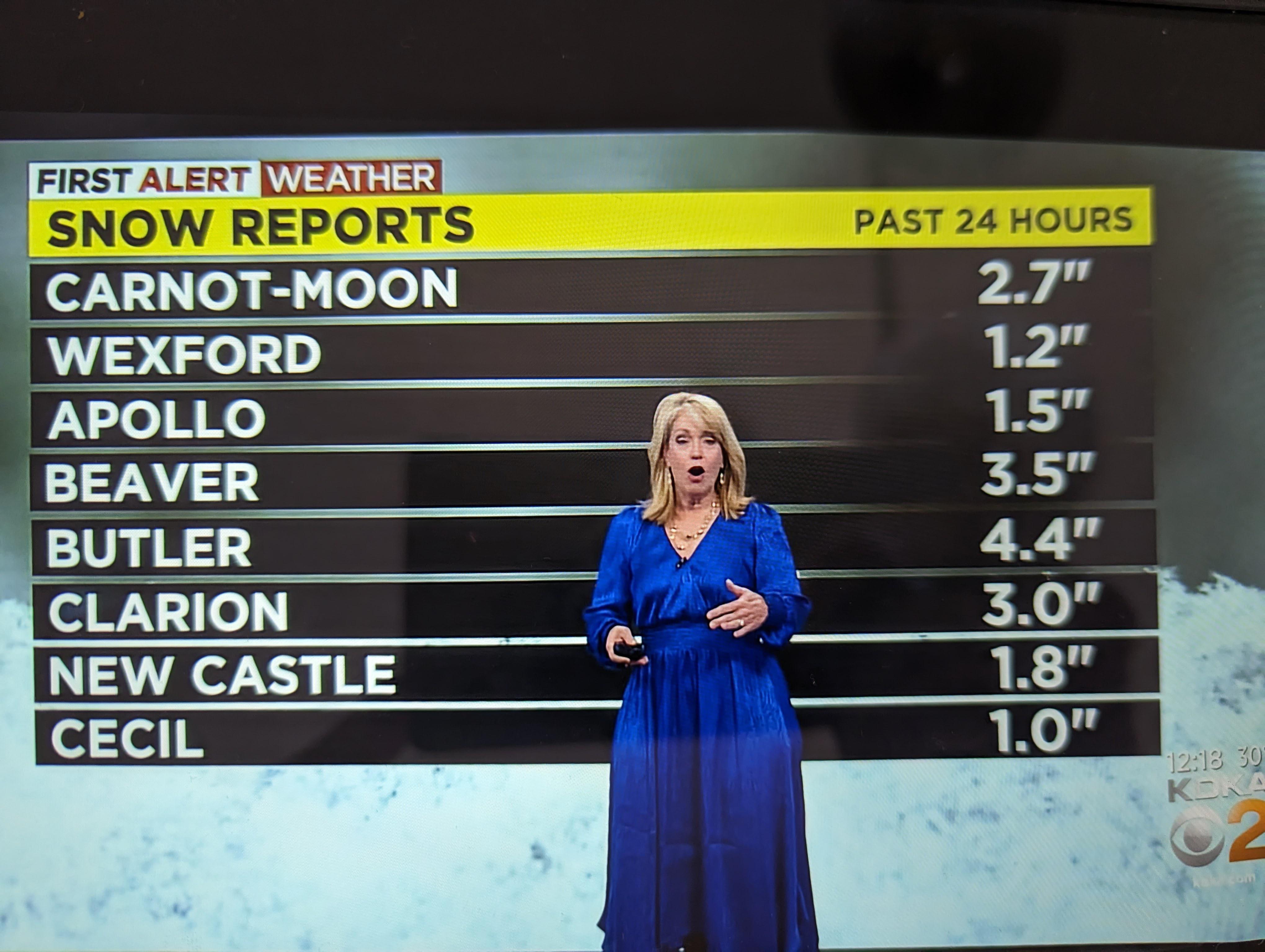
It looks like it's in alphabetical order by county, even though the county isn't noted in the graphic.
[deleted] t1_j5kvguo wrote
Still makes no sense/isn't practical. A map with data overlayed would've been much more useful and appropriate.
James19991 t1_j5l1zcr wrote
I agree with that
ElectronicDiver2310 t1_j5l29j0 wrote
And stock prices should be ordered by stock price, correct?
[deleted] t1_j5lbdpn wrote
Completely different set of data deserving of its own way of presentation. Sort tickers by alphabetical order, sort by value, etc. Tables are easy to manipulate.
The purpose of the table here though is to list snow total, and show that the northern areas got more snow. But not everyone knows where these suburbs are, and there's no obvious rhyme or reason to their order. A map with overlayed data would make it obvious that there was more snow to the north, even if you didn't know where these listed areas are.
ElectronicDiver2310 t1_j5ll6ft wrote
And it represented it perfectly. And not always northern areas get more snow. So you assumption is incorrect. Are familiar with conception of gradient? Yeah, it's a math conception but it's heavily used in meteorology. Very often days are presented to reflect gradient of something. And sometimes color is used to reflect gradients.
[deleted] t1_j5logn9 wrote
>And sometimes color is used to reflect gradients.
Just furthers my point - a map, be it color-coded or not, with snowfall totals overlayed would better show the gradient. Numbers in a table don't show how weather changed across a region if you have no reference points (that is to say, if you don't know where these places are, the numbers are pretty meaningless). It'd be fine for logging data for reference, but in this instance there were better choices for sharing that information.
Edit: this is an old article but the thumbnail shows the general idea of what I'm talking about
https://www.wtae.com/amp/article/pittsburgh-weather-snow-total-projections/38769632
ElectronicDiver2310 t1_j5m4he0 wrote
Nope, you are making too many assumptions. Data on the table shows everything. Taking into account how weather models wor and it discrete nature tables or N-Dimensional matrices table are very natural in this area.
Significant-Nail-987 t1_j5nd0j5 wrote
But also she didn't make the graphic. That's someone else's job. In the off chance she did make the graphic itnhas to go through someone else meaning there were problem regulations in place resulting in it. But more than likely she's just the messenger.
teetee34563 t1_j5l6dn7 wrote
What kind of comment is this? This chart is most equatable to the market cap of a company which is often ordered by value.
If this chart was showing volume of snow per city without accounting for area your comment might be funny
ElectronicDiver2310 t1_j5lm06m wrote
It's normal content -- when you following your portfolio you look at sliding window of particular stock(s) behavior trying to find moment when to sell and when to buy. And does not matter if data represented in a graphical format or as a table.
teetee34563 t1_j5ln53d wrote
Not that your comparison of weather to stocks is valid but have you ever heard of a stock heat map? There are many ways to visualize different types of data and using a map to visual weather is hardly controversial.
ElectronicDiver2310 t1_j5m9ekx wrote
It is absolutely valid because it's about data representation. And it depends on purpose of this particular data reforestation. And your (and only your) assumption is that purpose of this particular case is to show that North got more snow then South. And like I pointed out this is not always the case. So you are introducing a big no-no to data representation - - inconsistencies. While country order is always consistent.
teetee34563 t1_j5mcouz wrote
I made no such argument or assumption. I just brought to light that your snarky stock market comment was not a fair comparison.
ElectronicDiver2310 t1_j5vxrp7 wrote
It looks like your ability of abstracting is pretty low. 😋 I both cases those are Time series (you cannot represent accumulation without it). In case you have cumulative function, in another it is either simple f(x) =x or average skidding window. So comparison is very fair.
Viewing a single comment thread. View all comments