 Kristin Emery's snowfall charts ... WTF?
Submitted by mckzach t3_10jieut in pittsburgh
[deleted] t1_j5lbdpn wrote
Reply to comment by ElectronicDiver2310 in Kristin Emery's snowfall charts ... WTF? by mckzach
Completely different set of data deserving of its own way of presentation. Sort tickers by alphabetical order, sort by value, etc. Tables are easy to manipulate.
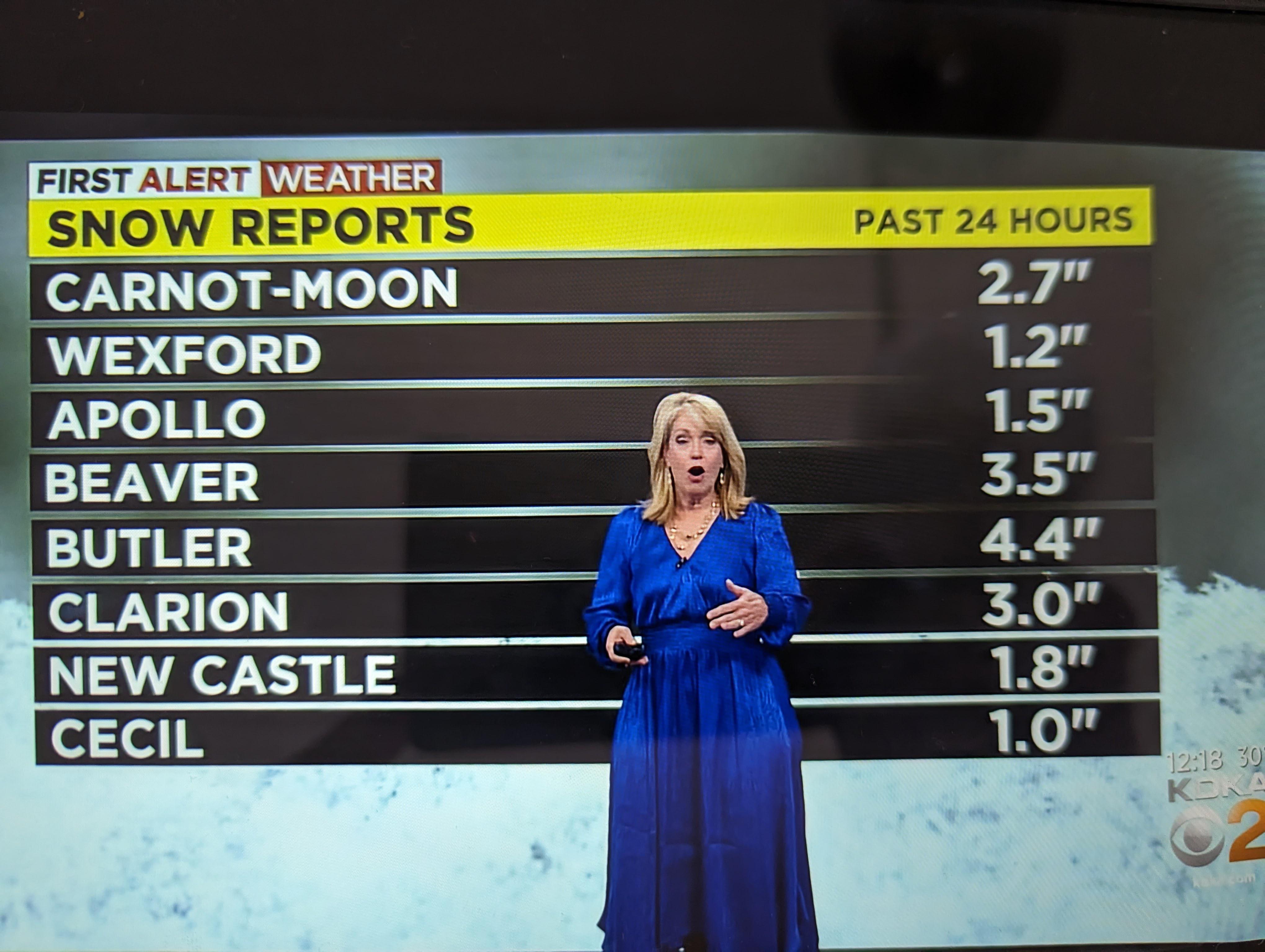
The purpose of the table here though is to list snow total, and show that the northern areas got more snow. But not everyone knows where these suburbs are, and there's no obvious rhyme or reason to their order. A map with overlayed data would make it obvious that there was more snow to the north, even if you didn't know where these listed areas are.
ElectronicDiver2310 t1_j5ll6ft wrote
And it represented it perfectly. And not always northern areas get more snow. So you assumption is incorrect. Are familiar with conception of gradient? Yeah, it's a math conception but it's heavily used in meteorology. Very often days are presented to reflect gradient of something. And sometimes color is used to reflect gradients.
[deleted] t1_j5logn9 wrote
>And sometimes color is used to reflect gradients.
Just furthers my point - a map, be it color-coded or not, with snowfall totals overlayed would better show the gradient. Numbers in a table don't show how weather changed across a region if you have no reference points (that is to say, if you don't know where these places are, the numbers are pretty meaningless). It'd be fine for logging data for reference, but in this instance there were better choices for sharing that information.
Edit: this is an old article but the thumbnail shows the general idea of what I'm talking about
https://www.wtae.com/amp/article/pittsburgh-weather-snow-total-projections/38769632
ElectronicDiver2310 t1_j5m4he0 wrote
Nope, you are making too many assumptions. Data on the table shows everything. Taking into account how weather models wor and it discrete nature tables or N-Dimensional matrices table are very natural in this area.
Significant-Nail-987 t1_j5nd0j5 wrote
But also she didn't make the graphic. That's someone else's job. In the off chance she did make the graphic itnhas to go through someone else meaning there were problem regulations in place resulting in it. But more than likely she's just the messenger.
Viewing a single comment thread. View all comments