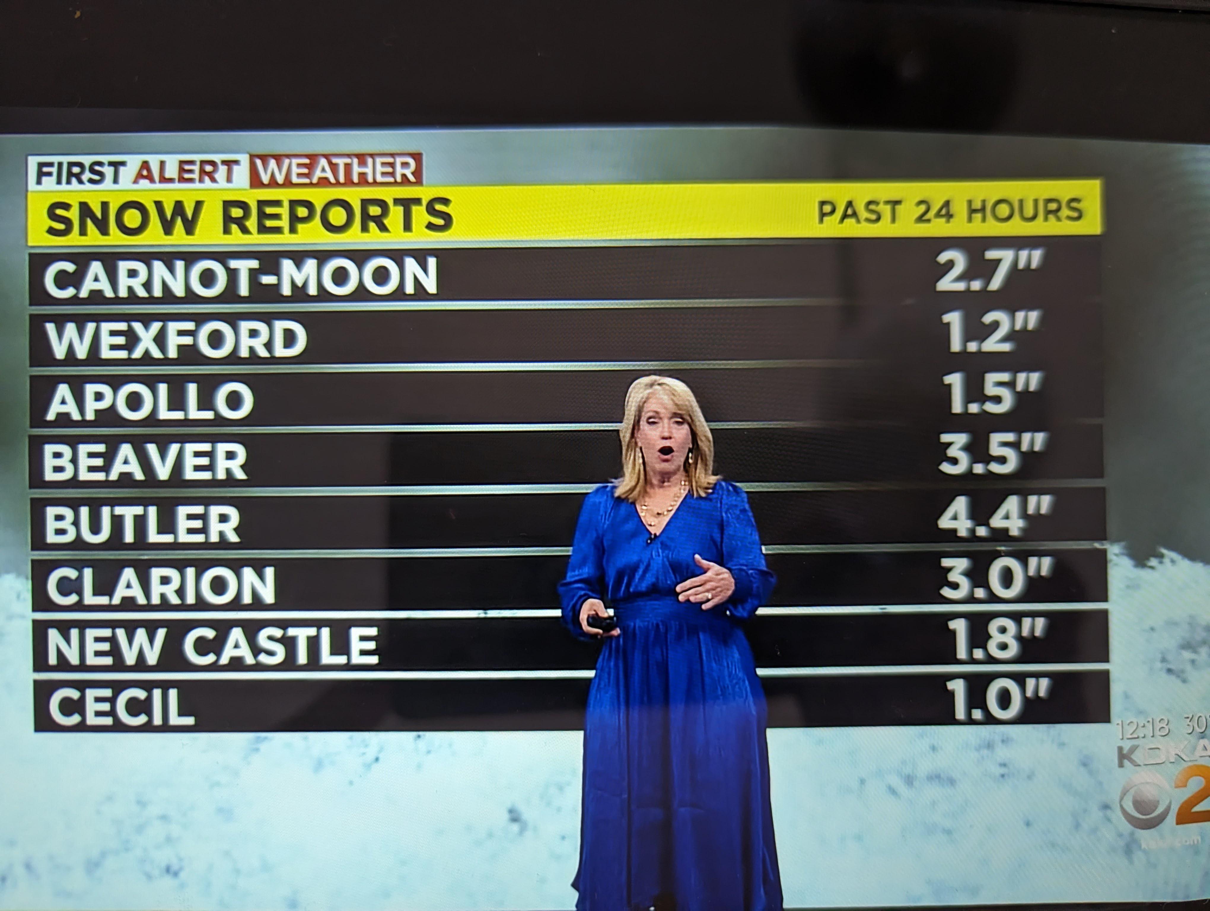
 Kristin Emery's snowfall charts ... WTF?
Submitted by mckzach t3_10jieut in pittsburgh
ElectronicDiver2310 t1_j5lm06m wrote
Reply to comment by teetee34563 in Kristin Emery's snowfall charts ... WTF? by mckzach
It's normal content -- when you following your portfolio you look at sliding window of particular stock(s) behavior trying to find moment when to sell and when to buy. And does not matter if data represented in a graphical format or as a table.
teetee34563 t1_j5ln53d wrote
Not that your comparison of weather to stocks is valid but have you ever heard of a stock heat map? There are many ways to visualize different types of data and using a map to visual weather is hardly controversial.
ElectronicDiver2310 t1_j5m9ekx wrote
It is absolutely valid because it's about data representation. And it depends on purpose of this particular data reforestation. And your (and only your) assumption is that purpose of this particular case is to show that North got more snow then South. And like I pointed out this is not always the case. So you are introducing a big no-no to data representation - - inconsistencies. While country order is always consistent.
teetee34563 t1_j5mcouz wrote
I made no such argument or assumption. I just brought to light that your snarky stock market comment was not a fair comparison.
ElectronicDiver2310 t1_j5vxrp7 wrote
It looks like your ability of abstracting is pretty low. 😋 I both cases those are Time series (you cannot represent accumulation without it). In case you have cumulative function, in another it is either simple f(x) =x or average skidding window. So comparison is very fair.
Viewing a single comment thread. View all comments