Comments
osoandino t1_j9r6ri9 wrote
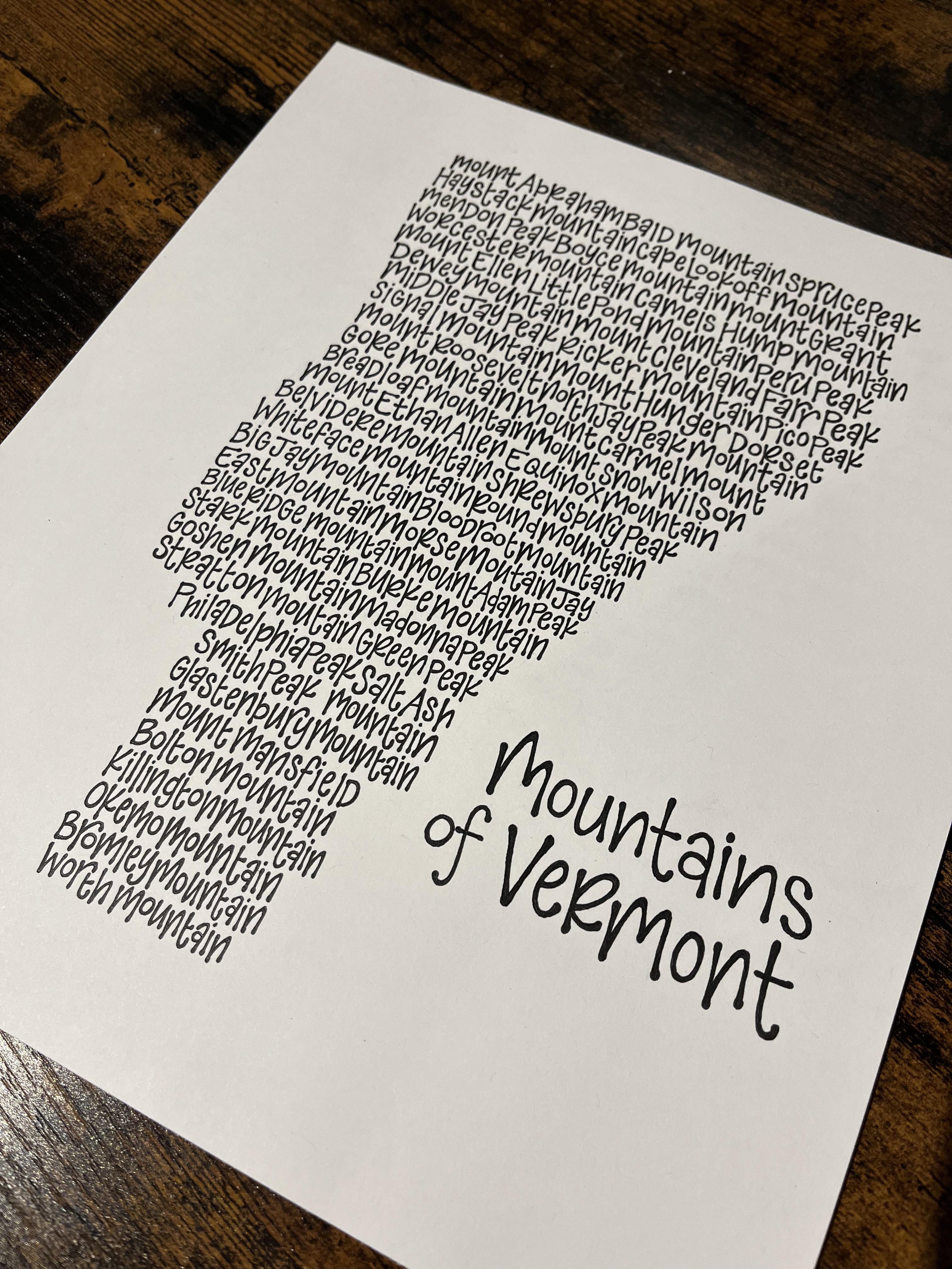
Could they not have eliminated the word “mountain” from all of these?
elseh2o OP t1_j9r77vu wrote
It was a toss-up on whether it would look better with or without 'mountain' included on each and knowing that some use these prints as checklists for their hikes I thought it would be fun for them to have them there for that. It is repetitive but since I chose to do just about 60 and not over that I wanted to also make sure the space was filled and that I didn't go too small with the font.
I'll keep it in mind that it isn't always appreciated though!
Tricky-Ad8731 t1_j9reap7 wrote
That's the real name though.
MagikSkyDaddy t1_j9u2k7b wrote
Or just Mtn?
HappilyhiketheHump t1_j9r35p9 wrote
Pretty cool.
[deleted] t1_j9rzuh2 wrote
[removed]
rick-feynman t1_j9s0kel wrote
Stark Mountain > *
bugluvr65 t1_j9uct4e wrote
ew rae dunn ass font

shoesontoes t1_j9rel13 wrote
I wish the names were at least in the general area of their actual location. Looks cool otherwise though.