 A spooky chart
Submitted by carlrom t3_yh8mgf in wallstreetbets
Various_Classroom_50 t1_iudf7ng wrote
Reply to comment by Goojus in A spooky chart by carlrom
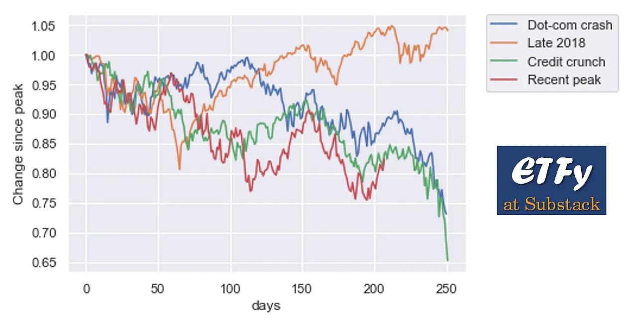
Comparing the percentage difference after different peaks is sensible I think. I just wish it wasn’t so obviously cherry picked.
Like maybe label and include every single major peak in the last 20 years and then it’ll be useful
carlrom OP t1_iudm0vg wrote
Fair point, it’s like survivorship bias in reverse. However, a chart with all major peaks would be very busy, and that’s assuming we can define what a ‘major peak’ is.
Viewing a single comment thread. View all comments