Submitted by anon57842 t3_yidhqq in wallstreetbets
Comments
VisualMod t1_iui184c wrote
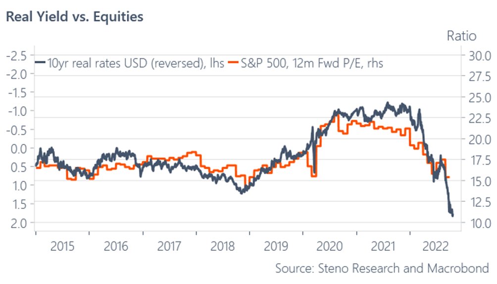
>The chart above shows the ratio of real yields (inverted) to forward 12-month P/E ratios for the S&P 500. A rising ratio indicates that equities are becoming relatively cheaper, while a falling ratio indicates that they are becoming relatively more expensive. As you can see, since early 2018 equities have become increasingly cheap relative to bonds. This is due to the sharp decline in bond yields (driven by Fed rate hikes and quantitative tightening), combined with only modest declines in equity valuations. We believe this trend has further to run, as we expect bond yields to continue declining while equity valuations remain broadly unchanged. This should lead to continued outperformance of stocks over bonds in 2020.
anon57842 OP t1_iui194p wrote
anon57842 OP t1_iui1xb7 wrote
derpy fanfic
needyouonthatwall t1_iui31yx wrote
Who is “we” and what year does visual mod live in?
CheeseSteak17 t1_iuihjzx wrote
The most real plot I’ve seen on this sub. Thanks.

VisualMod t1_iui173n wrote