TravelTime_LKB
TravelTime_LKB OP t1_jdw9g3t wrote
Reply to comment by DefinitelyNotMasterS in Compare Public Transport Network Connectivity In 10 European Countries [OC] by TravelTime_LKB
That's my bad with the zoom levels, although I had a look using the same scale for each country and Germany 'appears' to have better coverage to Switzerland still - I use inverted commas as obviously Switzerland's geography obviously has a big part to play in this!
TravelTime_LKB OP t1_jdw79zp wrote
Reply to comment by harkening in Compare Public Transport Network Connectivity In 10 European Countries [OC] by TravelTime_LKB
I'll hold my hands up and say for the sake of the infographic we had to use different zoom levels, I'll make sure to do it better next time!
Just did a quick screenshot using the same zoom level on our internal tool if you'd like to compare Great Britain with Belgium if anyone's interested. As a whole, I'd still say Belgium's connectivity is better, but obviously it's a smaller country so will be easier to get full coverage.
TravelTime_LKB OP t1_jdw4q8e wrote
Reply to comment by pingieking in Compare Public Transport Network Connectivity In 10 European Countries [OC] by TravelTime_LKB
It's quite similar to population density maps for Spain - you can see similar patterns here too https://twitter.com/simongerman600/status/1610307502553370627?t=1gcobn_UITwz6SNCZUtHAQ&s=19
TravelTime_LKB OP t1_jdw40r1 wrote
Reply to comment by historycat95 in Compare Public Transport Network Connectivity In 10 European Countries [OC] by TravelTime_LKB
We should try this next! We have an internal tool that maps our public transport providers in the US so thought I'd share the screenshot.
Spoiler: it's quite sparse!
TravelTime_LKB OP t1_jdw3cqv wrote
Reply to comment by lotosprendidos in Compare Public Transport Network Connectivity In 10 European Countries [OC] by TravelTime_LKB
Agreed! Population would help us understand transport demand, whilst geography will impact where stations can be located.
TravelTime_LKB OP t1_jdw35b9 wrote
Reply to comment by icelandichorsey in Compare Public Transport Network Connectivity In 10 European Countries [OC] by TravelTime_LKB
Just want to check I'm answering correctly, what do you mean as underserved? As the maps were created by pinpointing where public transport stops are, and a surrounding 15 min walking area, locations where there's large bodies of water would not be coloured purple as there's no station.
TravelTime_LKB OP t1_jdw0ofj wrote
Reply to comment by 11160704 in Compare Public Transport Network Connectivity In 10 European Countries [OC] by TravelTime_LKB
Thanks. I'll have our data team look into it but most likely if they're spaced out, once we zoomed it out and exported at a country level it wasn't too visible.
TravelTime_LKB OP t1_jdvyq33 wrote
Reply to comment by 11160704 in Compare Public Transport Network Connectivity In 10 European Countries [OC] by TravelTime_LKB
The database does include Campania transport networks. The reason it looks so different is because of transport density - whilst there are transport routes in this area, it's not dense. In the visualisation each stop only has a 15 minute walking catchment area around it, so if the stops are few and far between, at the zoom level it won't show a lot of coverage. You can see when you open up the map in more detail here that there are routes in the area.
TravelTime_LKB OP t1_jdvvrv5 wrote
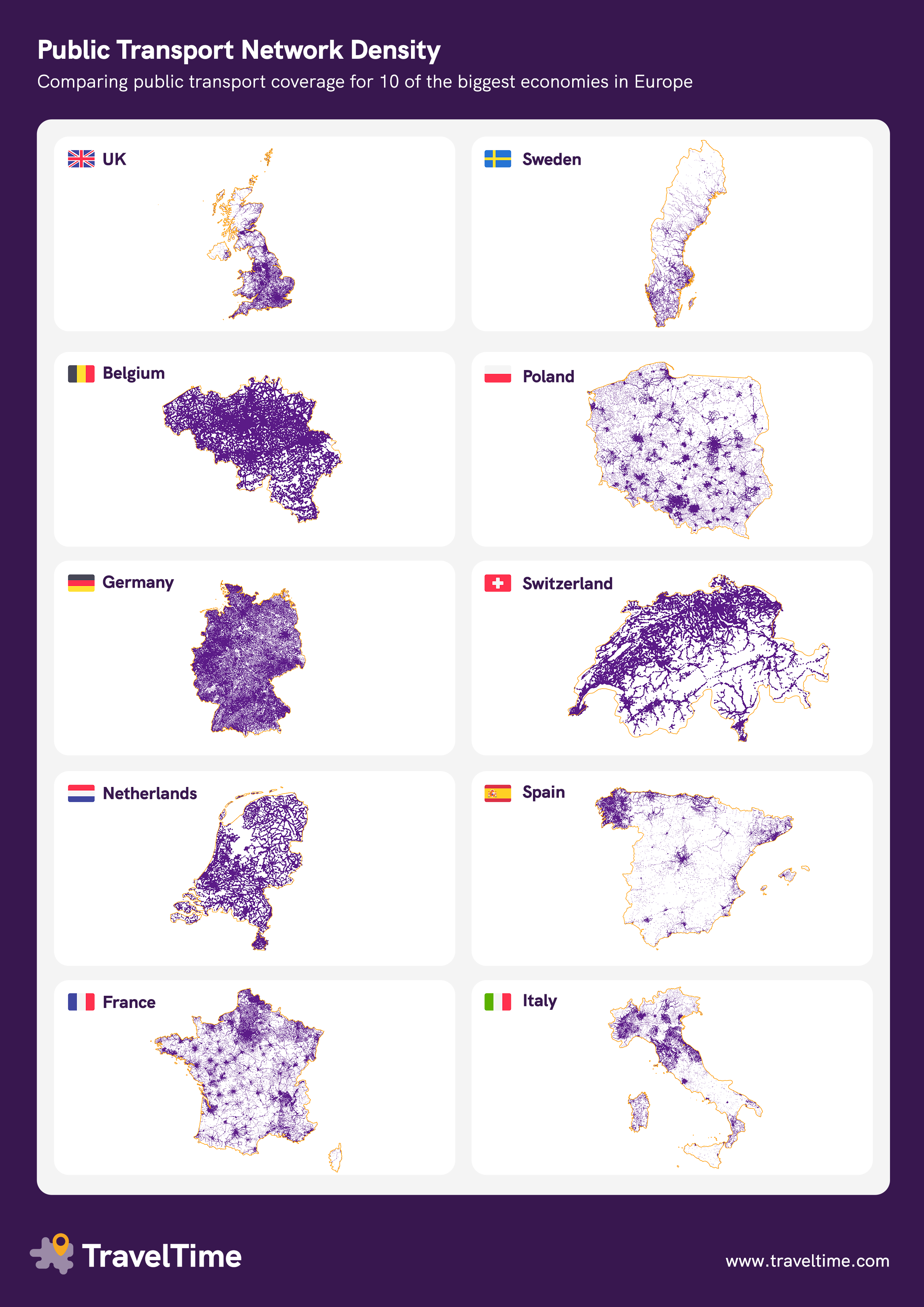
Reply to Compare Public Transport Network Connectivity In 10 European Countries [OC] by TravelTime_LKB
Visualising which areas of the country are reachable by public transport. Maps with higher concentrations of purple show higher public transport connectivity.
How we built the maps:
- We used our own public transport database to identify the lat/long of each public transit stop
- We drew a 15 minute walking catchment area around each stop to identify the other surrounding areas with easy access (using the TravelTime API)
- We then exported the SVG file using QGIS
Explore the maps in more detail here
 Compare Public Transport Network Connectivity In 10 European Countries [OC]
Submitted by TravelTime_LKB t3_123rl5v in dataisbeautiful
TravelTime_LKB OP t1_jdx1f42 wrote
Reply to comment by harkening in Compare Public Transport Network Connectivity In 10 European Countries [OC] by TravelTime_LKB
Just want to clarify why I used the term Great Britain - because the visual in the link doesn't include Northern Ireland.
I agree that Belgium's size makes it easier to have higher public transport density though!